

Looking at a page on your website and trying to see the problems that are hurting your conversion can be overwhelming. First of all, it’s your page so you don’t have an objective view of things. It’s like editing your own work. Second, it’s just hard to know where to start.
This was the case for Ecopaper.com when they submitted their homepage to us for our special Live Optimization Webclinic on July 21, 2010.
It turned out that there were some very simple mistakes they were making related to showing the true value that their company had to offer. They were burying it on their about page. Getting it out front and expressing it to their audience could be critical to getting a lift in conversion on their site.
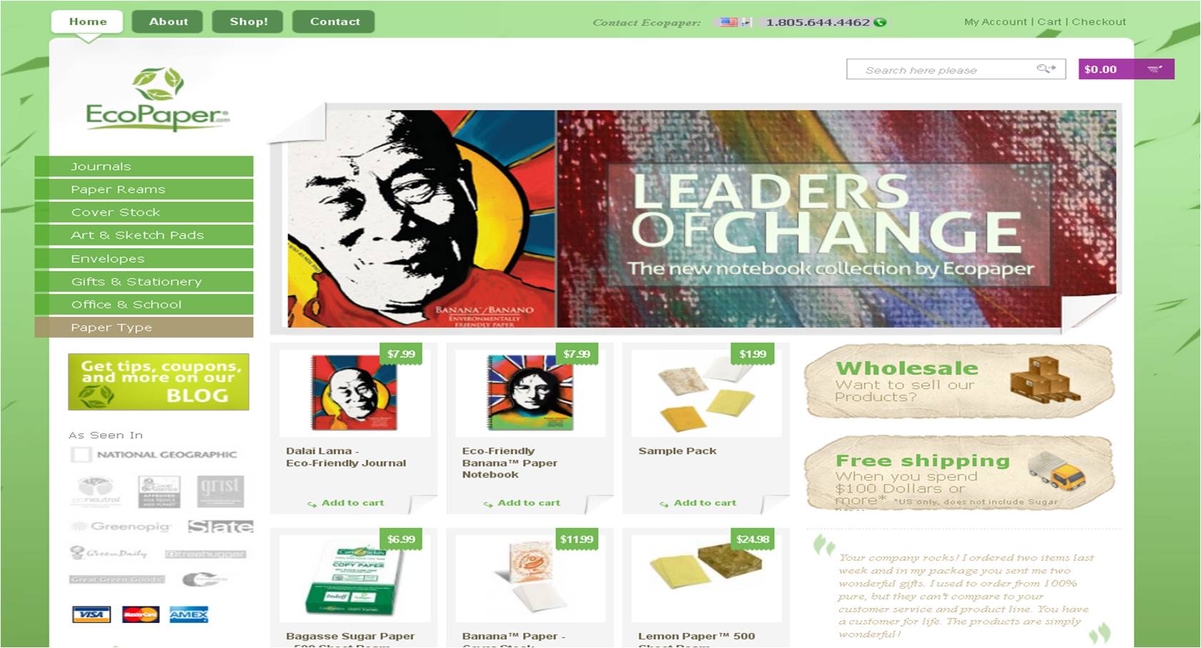
So here’s the page our Associate Director of Optimization, Adam Lapp, was presented with for review…

| The Background: | Ecopaper is a paper company that sells eco-friendly paper products made from non-tree materials. |
| The Goal: | To generate more purchases on the site. |
| The Intended Audience: | The environmentally conscious. Skews Female 35+ |
1. Uncover your value proposition
As Adam mentioned in the clinic, this company has a great story. And great stories make for great value propositions. However, on this home page, the value proposition and EcoPaper’s story is buried in its About page. This is what Adam refers to as “the buried treasure effect.”
The page needs to present readers with that story right away in the form of a value-driven headline and, perhaps, a short paragraph of text to provide orientation and to direct the visitor further down the page.
2. Create a clearer sequence of thought on the page
In general, the thought sequence could be clearer on the page. As we can see, visitors are simply presented with several random products and forced to sort through them on their own. We call this unsupervised thinking, and it usually hurts conversion.
Instead of simply putting your products on the page, guide the visitor through them in a logical sequence. The visitor more than likely wants to know why they are seeing the specific products on the page and (by extension) why they should buy them.
Are the products on the page because they’re popular, new, best sellers? Explaining why you are showing what you’re showing is a great way to tap into the visitor’s thoughts and increase conversion.
3. Reduce friction
Overall, there’s a lot going on with the page that distracts from the objective. A few things Adam mentioned to reduce the friction on the page:
- Eliminate the credit card icons. Purchasing with widely accepted credit cards can be assumed online. There’s no need to promote credit card brands on your own site.
- Don’t hide the testimonial with light text on a white background. Make it more prominent and darken the text.
- Make the primary objective clearer, more visible, more noticeable. Right now, the Add To Cart “buttons “for the products are simple text links. Making them clearer and more noticeable buttons could help your conversion.
In Summary
As Flint McGlauglin, Managing Director, MECLABS, pointed out on the clinic, this page doesn’t answer the three fundamental questions every website visitor has on their mind when they see a page:
- Where am I?
- What can I do here?
- Why should I do it?
Until you’ve answered those questions for the visitor, the page will continue to under-perform. As Adam added, “People are not on this website to buy paper. They have a specific and strong motivation to buy eco-friendly paper.” Answering those questions for them, and tapping into those customer motivations, are going to be key to optimizing this page.
[Note: This is one of series of upcoming blog posts about website optimization. Because I’m new here at MarketingExperiments, Daniel Burstein thought it would be a good idea for me to go back and take a look at the live optimization sessions of our Web clinics and report back on what you can learn from optimization tips our research analysts provided about your peer’s landing pages and homepages.]
Related resources
Copywriting on Tight Deadlines: How ordinary marketers are achieving 200% gains with a step-by-step framework (Our next web clinic where you can submit your copy to be reviewed live by our research analysts.)
Clarity Trumps Persuasion: How changing the first seven seconds of user experience drove a 201% gain
Landing Page Design: Eye path vs. Thought sequence
Landing Page Optimization Workshop with Dr. Flint McGlaughlin in New York
Excellent article. I would add that there is no need to show a variety of products on this page — save that for the Product page and instead focus on one product (a bestseller, or a new product, etc.) I would add something about their sourcing, or something related to the eco-friendly nature of their products on this page, and add a compelling headline before that info.