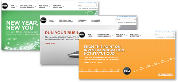
Editor’s note: After returning from teaching the latest Live Optimization Workshop in New York City, Boris approached me about a new test he would like one of our research teams to run. I wasn’t surprised, since these workshops are usually dynamic events with a lot of exchanging of ideas. I suggested he bring the idea directly to you, our blog readers…
As a Senior Manager of Research and Strategy, I am often tasked with deciding which marketing implementations we should test (and as Associate Editor, it seems Dan’s job is to suggest that all my ideas are his).
One area for experimentation that intrigues me is Flash banners that display multiple frames of creative – especially on home pages. These loops often present the top offers, value proposition highlights, awards the company received, etc. Many also provide a degree of control, letting the visitor “navigate” back and forth within the loop. In my experience, AOL and Yahoo pioneered this format with news highlights.
So as we finalize our research calendar for the upcoming year, I (not Dan) had the idea to come directly to you, our blog readers, to learn about your experiences with this technique. Have you or anyone you know tested it before? Do you currently have real-world implementations that might fit into our research calendar?
My hypothesis, based on the principles we’ve observed from years of testing, is that these loops will underperform a more standard, narrative presentation of the same information – even though the latter requires more room since the content of the loop would have to be laid out sequentially. As Dr. Flint McGlaughlin explained in the most recent live web clinic, the first few seconds are critical to conversion.
If you hide your call to action on the fifth frame, odds are your visitors will not stick around to find out what you’re trying to tell them. And if your page speaks to multiple segments, the personas that might be drawn in by what is displayed on frames two, three, and four will all be greeted initially by frame one, which likely won’t connect. In addition, the heavy graphics of the loop will likely overshadow your headline, inhibiting your ability to start a conversation with your visitor.
Let me caution that this is just my hypothesis, a tentative insight at best. That’s why we test. We don’t seek to guess what really works. We harness the power of testing to discover what really works.
So let me know your Flash-related test experiences, or current initiatives that would be worthy of testing, by leaving a comment on this post or visiting the MarketingExperiments Optimization group on Linkedin.
Editor’s note: If you think this exchange between Boris and I was a bit testy, you haven’t seen anything yet. Next year, Boris and I will begin a series of debates on this blog. The first question we’ll wrestle over is… Does the future of media companies, ad agencies, and content marketers lie in technology or content?


I’m really fascinated by this … and keep popping back in to see if anyone has commented. Not yet.
Really hoping people will share some of their experiences and insights on this topic!
I am really interested in participating in this discussion. We are in the process of redesigning our homepage and changing content management systems (to improve SEO, primarily, but it will also introduce the ability for A-B testing). There will be a lot of discussion around this very topic this year. We have recently started tracking conversions on our one large marketing banner- and we have decided to switch to two focused promotion areas for our two distinct audiences because we can’t get anyone to click on anything past promo #2. #1 is almost always the highest ranked, obviously… I am curious to see if splitting into multiple promos will help or hurt.
Great question! Companies tend to put their most important information in this scrolling billboards, yet it’s amazing how ineffective most of them are. There are several factors that make homepage banners, just as usability, ability to drive action (not distraction!) and placement/design, among others. I am currently redesigning my companies homepage, of which will include a Javascript sliding banner (as opposed to Flash piece, since Flash does not show on iPhones) and I have decided to do some A/B testing on this topic. One with just one image, and another version w/ scrolling, about 3 scenes. I look forward to the results in the coming months, and I hope others have some data to share also.