

Test Your Marketing Intuition: Which landing page achieved a higher conversion rate?
Paying for traffic to a landing page tends to help motivate marketers to optimize that page. Lifts can instantly translate to a tangible decrease in cost-per-acquisition and increased revenue. However, actually getting those lifts on the page is another thing altogether.
Denmark-based Saxo Bank was facing that challenge when they met Michael Aagaard, a MarketingExperiments student. Aagaard, Online Copywriter for LandingPages.nu, is a self-described split-test junkie who is also based in Denmark. He met the folks at Saxo Bank through his own split-testing audit service.
“They were having trouble converting PPC traffic via their landing pages. In this particular case, they wanted help converting PPC traffic for a sub-site called ForexTrading.com. The business model here is that prospects download a free demo version in order to get a feel for the platform. The goal being that prospects end up buying the full version,” Aagaard said.
With the stage set, Aagaard came up with a treatment based on a hypothesis he had about the original page.
It turns out, Michael got some impressive results. But we’re not going to share them today. Instead, we’re going to test your marketing intuition with the two different pages Michael tested.
Without giving too much away, here are the two creatives: the original and Michael’s treatment. I can’t tell you which is which or it would spoil the fun …
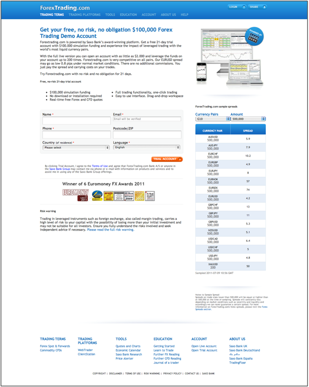
Landing Page A

Landing Page B

Which do you think performed best?
Closely examine these two landing pages, and let us know in the comments which landing page performed best. Also, go ahead and tell us how much you think it improved conversion. Whoever guesses the winning landing page with the closest conversion rate wins a gold star or the admiration of his/her peers (whichever they find more desirable).
Come back on Wednesday to find out which creative won and why. We’ll give you the full scoop on how Michael got a big win for this company.
UPDATE: The results are in. Check out today’s (Wednesday) post for the results and the winner of the closest guess.
Related Resources:
http://Online-Tekstforfatter.dk – Michael Aagaard’s Danish blog
http://forextrading.com – Saxo Bank’s forex trading platform
Custom Landing Pages for PPC: 4 Steps to 88% More Leads, Lower Costs
Marketing Sherpa’s 2011 Landing Page Optimization Benchmark Report
Optimization and A/B Testing: Why words matter (for more than SEO)
I would say Landing Page A won the test! and the conversion rose by 30%!
Hi Paul,
nice topic.
Well, I think the first one (A) is more oriented on the action. There’s a good pickup headline, point first structured, that declares since the beginning what I have to do, and what I get if I try the demo. There are also trust symbols at the end. I think the A landing page is compelling and performing.
IMHO, I prefer the Live Chat Button of the second landing page (B); and I would have given little more emphasis to the bullet point.
Thanks for sharing your works!
Landing page A by 50%
Thanks for the comments guys. Be sure to stay tuned on Wednesday for the results! In the meantime…keep em coming!
Landing page A, hands down. I vote that it increased conversions by 342%. There is a clear headline with a state value prop, authoritative buttons at the bottom, and relevant images (graphs) instead of simply a livechat button with a stock photo. Well done, Michael!
While page A has more of the standard markers of a good landing page, page B, with it’s “live chat” feature also has potential.
It COULD be that the folks visiting this page have seen so many typical sales pages that they no longer trust them, and the idea of having a live person available to chat with may be more appealing to them.
My feeling is that the winner is the surprise entry — page B.
By how much? Hmmmm, that’s tough to call, but I’ll wager that it was around 100% improvement.
If I was the target audience, I’d convert on A, not B.
Version A did a great job of telling me what I was getting for the price of my information (a free trial, a simulation account, minimal setup).
Version B confused me. It talks far more about what a full-blown account offers, and not what I get with my free trial. Plus, the wording put me off. Three of the bullets talked about what I’ll pay. If the conversion is on a FREE trial, I’m not expecting to pay anything. I’d put that stuff after the trial sign-up, maybe even as a day3 or day4 follow-up email offer. (Like what you see so far? Here’s what you get with a paid account.)
I’d also work on the button text: “Trial Account”. Open my trial account now? I know I’m supposed to click the button, but it’s just not compelling.
I bet it was page A.
Hard choice tho, because the live chat can boost conversion really well. Also having the human face on the page is good for reducing bounce rate.
I chose page A because there are trust symbols below the conversion goal. It’s a tough call.
My vote is page B. Not because of layout, headline, lift, live chat, and all of the typical reasons, but because of content.. specifically, the bullet points.
The bullet points on page B speak directly to currency traders. They clearly state what traders are looking for, which is liquidity, tight spreads, leverage and low commissions. These types of people have pretty good krap filters, and a live chat picture won’t influence them.
B’s gain over A? Maybe as much as 100%.
Ups! I forgot the conversion rate. I guess, with the page A, the conversion raises of about 95%.
I’m going to say A by 47%… although I think they should test adding the live-chat feature to version A which would boost it even more. I was going to say B simply b/c of the live chat, but A has a product image and MUCH more proof – so I’m going w/ that.
Jeremy Reeves
I vote for landing page A because it is clearly structured and displays enough information for the visitor. The live chat feature on landing page B seems to be quite attractive – but I see some danger in it for conversion: It is a second call-to-action and may divert traffic from the “trial account”-button.
My guess for conversion improvement is 50%.
I would say B. While A is all about the quick and easy ‘free trial,’ B educates the user about why this is a solid company, why they want to stay on as a customer. The live chat in the corner humanizes the experience and gives one more way to make a connection with the user and get closer to conversion to customer. I think A could fall into the groupon problem of ‘thanks for the deal, i only came for the deal, i won’t be back.’ Conversion rates probably rose by 40% with the B version (wild guess).
Going with B – more direct & informative, directed to the persona who is most likely to convert, less of a sales pitch – doesn’t focus on the “what ifs” when I sign up for the account – and when in doubt there is live chat. Conversion rate rose by 60% ( ?)
I’m also going with A. It seems the clearer page to get users to sign up for the Free account.
Landing Page A by 50%
Thanks for the comments guys. Congratulations to @Valentina for guessing the closest relative difference in the correct treatment. Check out today’s post for the full scoop.