

Last week I had the privilege of being in the world’s tallest hotel in the Western Hemisphere, joined by over 200 other “nerdy” marketers, for what was the first-ever conference hosted by MECLABS on the topic of optimization and testing. Overall, it was a value-packed week.
But what I found most uniquely valuable about the Optimization Summit was a surprise live experiment in which the audience was asked to optimize and test a marketing campaign during the course of the conference. I had a backstage pass to what would become a thriller of an experiment, with many ups and downs, bends and turns. The only thing I could compare it to while in Atlanta was trying to hold two suitcases while free-standing on MARTA (which I successfully did by the way).
All in all, I learned a lot about testing in the process, and in the next two blog posts, I’d like to break out some of the key insights I walked away with.
The Original Page (click to zoom)

.
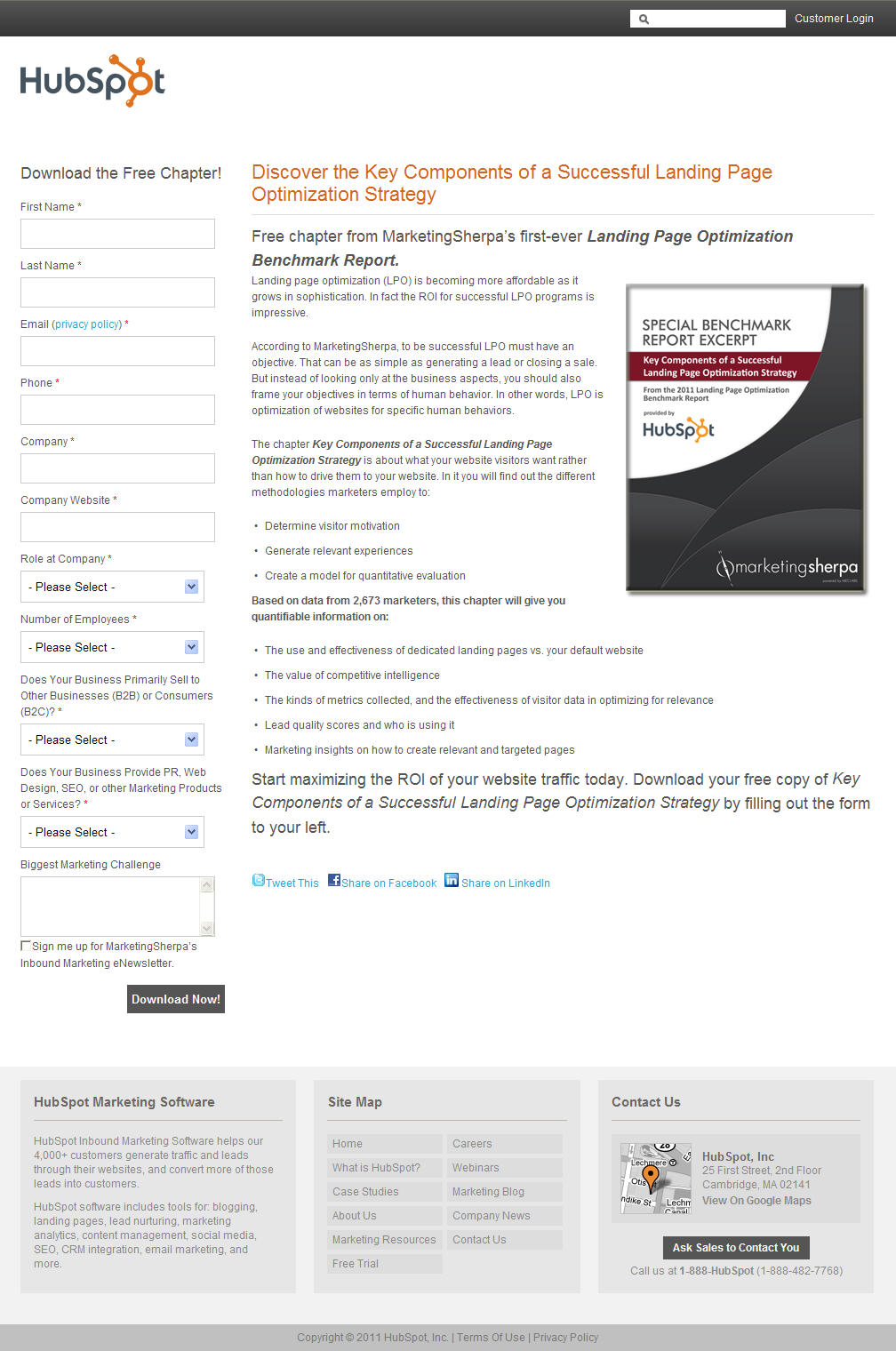
The subject of the test was a real offer from the Premier Sponsor of the event, HubSpot. They had partnered with MarketingSherpa to offer a free chapter of the 2011 MarketingSherpa Landing Page Benchmark Report.
The overarching goal for the campaign was to increase HubSpot’s knowledge of their current email list. So, the audience was charged with increasing the form submission rate.
Here’s the catch, they could only optimize five elements:
1. The headline
2. The product image
3. The call-to-action
4. The copy
5. The page layout
.
Democratic Optimization
If you’ve ever been in a contentious meeting with your team, you know it can be extremely difficult to get two marketers to agree on the most effective approach. So, how do you get more than 200 marketers to agree on any one of these elements? Well, first you wow them with flying pigs (hey, anything is possible with optimization). And then immediately afterward, you break them into small groups of about three to four, give them a limited amount of design options, and then force them to come to consensus in 15 minutes or less.
That’s exactly how this went down (minus any gravity-defying farm animals). The groups’ choices were then tallied up and whatever options got the most group votes made it into the treatment.
For instance, here were the four potential options for the image. For this variable (as circled in red) the audience overwhelmingly chose option #3.

Here were the different layout options and the winning vote:


Making sense? You can see the rest of the variable options (or values) here.
The Treatment Page (click to zoom)
")
After all the votes were cast and counted, the audience had decided that a single column layout with short copy, a stronger headline and benefit-centric call-to-action would perform better than the control.
From my perspective, the two major optimization advantages behind this new design were:
1. It strengthened the Value Proposition through specificity in the headline and image, highlighting the nature of the free content for download
2. It reduced Friction on the page by shortening the copy, and providing clear singular eye-path.
From here we launched the test, sending out 800,000 email messages, posting four blog posts (including this one here), and tweeting over 140,000 followers.
Overall, we received so much traffic that we could statistically validate a 1% change in conversion. And believe it or not, it would come down to that.
.
So, do you agree with 200+ marketers?
If there was one thing that I learned from this stage of the process, it’s that great (marketing) minds don’t always think alike. A couple of the test options were selected by a landslide, but most were so evenly split that we didn’t know the winner until the last vote was counted. There were many divided groups, heated discussions, and one marketer even got voted off an island. But overall, this whole experience helped me clearly see why online testing is so desperately needed: it helps marketers live at peace with each other.
With that said, if you are a marketer reading this, I know you have an opinion.
- What do you like or not like about the new design that the audience voted on?
- Which of the options would you have chosen instead? Why?
- Do you think the treatment will win?
On Friday on the MarketingExperiments blog, we will do a deep dive into the results of the experiment and the key insights that I learned from the outcome.
Related Resources
2011 MarketingSherpa Landing Page Benchmark Report
New Marketing Research: 3 profitable traffic sources most marketers are ignoring
Evidence-based Marketing: Marketers should channel their inner math wiz…not cheerleader
Landing Page Optimization Workshop: Become a Certified Professional in Landing Page Optimization
B2B Marketing Summit: Join us in Boston or San Francisco to learn the key methodologies for improving your conversion rates
I like the simplicity and good eye path flow of the treatment design. The only thing I would change is to replace the gray colored CTA button with something more colorful like orangish or greenish.
I agree with the treatment page selected but I don’t think friction can be reduced even more. There are too many fields to fill out. I think if the layout remained the same but the fields were reduced to 4-5, that would help reduce friction even more. I also agree with Peter, the CTA could be a more colorful button.
I agree with both Daisy and Peter.
I like simplicity but I think the form part lacks some graphic elements. I’d add just an arrow or a very basic icon. In the copy I’d focus more on bullet point to distinguish them better and give them more importance. Finally, as Daisy said, I’d reduce the fields: too many questions are boring for the reader, IMHO.
I actually received this email so its very interesting to read now how it was optimised. Yes, there were far too many fields to fill in & far too many compulsory red * entries. This was very off putting… why did they need so many details at this point?
I agree with the others about the form being WAAAYYY to long but I have to admit I did get this email too and I did fill it all out to get the info BUT (here is my strong motivation) I knew that it was from Marketing Experiments (the trust factor) and I know the info is always GREAT and I was familiar with hubspot too.
Also just another thing I just noticed is that your little green button below says “Submit Comment” and I thought that the word “Submit” was a BAD word 🙂 Maybe you could do an A/B test on it with a button that says “Share Your Thoughts” or something like that… Who knows you might get more responses to your posts?
@Thomas Strunk
Just to quickly answer some of the thoughts about the number of form fields…I would agree that in most cases fewer form fields helps get more submissions. But in this case, the stated goal of the campaign was to increase HubSpot’s knowledge of their list. The only way to do that is to up the number of required form fields. I DO think it’s interesting that the relationship between HubSpot and their readers is so strong that they can easily get away with it and still have a high conversion rate, (as Austin states in the follow-up post).
@Thomas Strunk
You are right, “submit” doesn’t imply any value. Thanks for the feedback. “Share your thoughts” is better, but still seems like it is too “action-centric” rather than “value-centric”. What does the reader get from sharing their thoughts? Why did you comment? What was in it for you?
Either way, excellent feedback. As Flint say’s often “Adequacy is the enemy of excellence.” We want to always be optimizing our blog, so thanks for keeping us on our toes… and oh, try not to skew our results when we test this button in the near future ;).
Thanks again,
Austin
Hey Austin,
I am not really sure what was in it for me? I guess I am just thankful for all the info you guys let us in on and I know that it is nice to get feed back on all your hard work. I am anxious to see what a “value-centric” wording will be on a submit your comment button will change to. Because I could totally use something better for my site too. Looking forward to see what you come up with 🙂