

It’s time for yet another marketing intuition contest. If you’re new here, every time we have a new web clinic, we give our blog readers a chance to predict the outcome of the featured test. In our last contest, we chose three winners who correctly predicted which of the two test treatments received a higher conversion rate.
For today’s contest, we’re featuring two treatments that will be discussed in depth in today’s clinic—Negative Lifts: How we turned a 25% loss into a 141% increase in conversion. Register and tune in today at 4:00pm EDT to find out the conclusion to the test here.
What’s at stake this time?
This time we have the same prizes: 3 copies of the book Inbound Marketing, courtesy of HubSpot (who are also generously providing educational funding for the clinic), will go to three intuitive marketers who correctly guess which treatment got a better conversion rate. All you need to do to enter is leave a comment on this blog post stating two things:
- Which treatment you think won
- Why you think it won
The winners will receive a book and also be featured on this blog as marketing experts!
With that in mind, let’s get into it…
Experiment: Background and Design
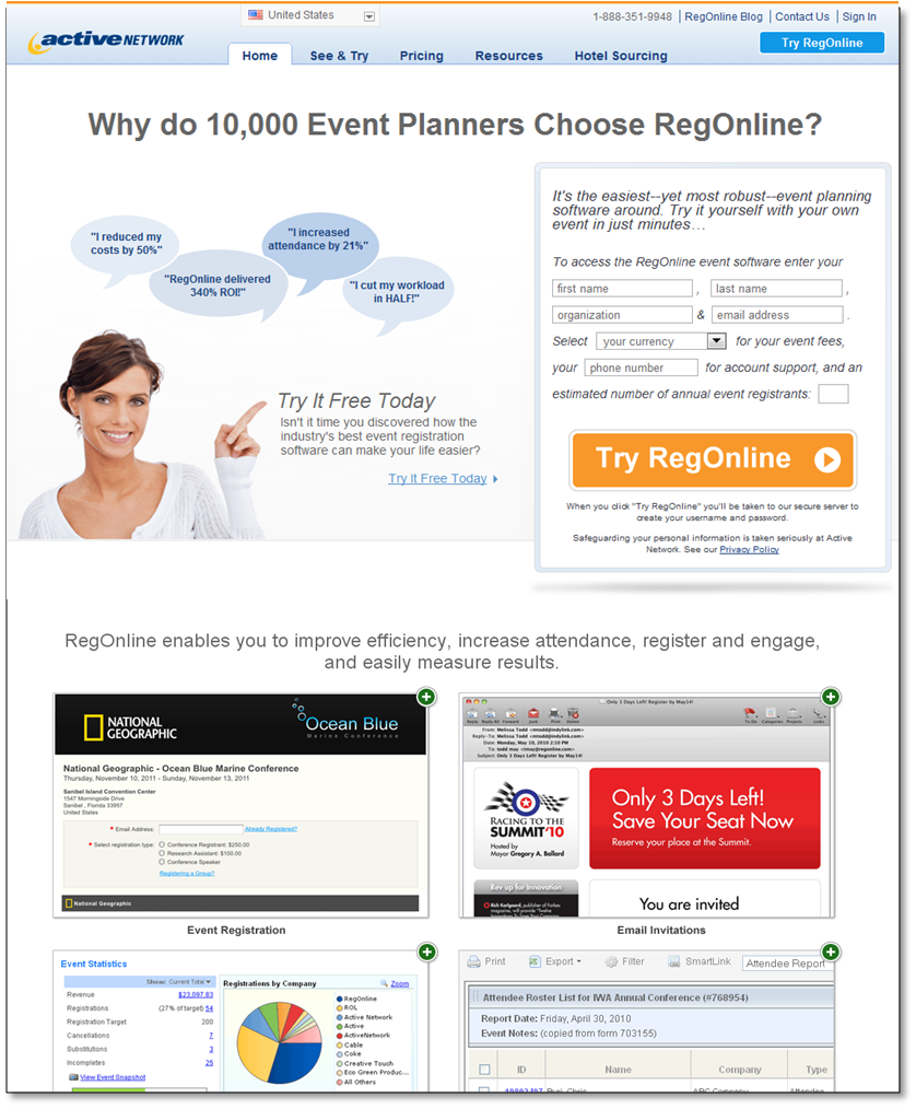
For this experiment, we were working with a company called Active Network on one of their products, RegOnline. RegOnline is event management software that lets you create online registration forms and event websites to let your attendees register for your events online.
The goal of this experiment was to try to increase the amount of complete leads from free trial sign ups on the homepage.
With that, we put together an A/B multifactor split test that featured the two homepages below:
Treatment A:
This version of the home page was two steps. There were two forms to fill out before the visitor could access the software in a free trial.
Step 1:

Step 2:

Treatment B:
Treatment B was a three-step process where visitors entered their information into the first form and were then led to a second and third form where they could receive free access to the software. Keep in mind that the goal here is still for complete leads. So we’re only measuring the visitors that fill out both forms.
That said, with the three-step process, we would be able to market to a whole new set of leads until they came back and completed steps two and three.
Step 1:

Step 2:

Step 3:

Which homepage generated more complete leads?
One of these versions of the homepage out-performed the other in terms of completed leads for RegOnline. Which do you think performed better? Why?
- Homepage Treatment A
- Homepage Treatment B
Tell us in the comments for a chance to win a copy of Inbound Marketing.
UPDATE: The Results
At the time of this update, the race is VERY close. So far we have…
- 9 votes for Treatment A
- 8 votes for Treatment B.
And the winner was actually… Treatment A!
Thank you to everyone who voted! It was close but you were right! For the second time in MarketingExperiments’ history, you readers, predicted the correct treatment. Here are the results:

In case you didn’t know, Treatment A was actually a control for the page we were testing and Treatment B was our treatment. In the end, the treatment lost by 24.5%. However, using what we learned from that test, we were eventually able to increase conversion on that page by 141%. If you didn’t get to see the Web clinic yesterday, we’ll have a replay up by the end of next week so that you can see the full story.
For the present though, it’s time to announce our 3 winners.
I should note here that of all the respondents, Ryan was definitely the closest. In the end, we found out that visitors were getting to the page and clicking on “price” in the navigation rather than signing up for the free trial. To finally get the lift on this page, we removed the navigation and channeled the visitor through the value of the product before we revealed the price. Also, it’s interesting that the final winning treatment for this page was a three-step process, which means that in this case 3-steps was actually less friction than 2-steps.
So take a look at what our winners had to say about the page and glean some marketing wisdom:
Treatment A Won
1) I found Treatment B to be too ambiguous and left questions in my head. I found myself looking for a price table as I thought the “free access” sounded like a gimmick just to hook me.
2) I read every single bubble on Treatment A all of which struck a chord with me. I was ready to click the blue “Try It Free Today” link.
3) Treatment B came on too strong asking for an email up front. I don’t know you! Why don’t we cuddle a little first.
As a side note, I’m fan of the soft sell. I’d try a radical redesign with more information before we ask the prospect for their life’s story. Give me more before I give you my email address, take the time to fill out a form and learn a new piece of software. -Ryan
Version A Wins
1. Less friction – the number of form fields are the same – 10 total. However, shorter check out path(2 pages vs 3 pages) lowers the friction as a whole.2. Version B 3rd page’s title is raise friction and lack clarity – “Your profile is completed” and “please create user name and password” – am I finished signing up or not? My guess is most visitor will drop off at this page.
3. Version A copy (landing page) speaks from the viewpoint of the visitor in specific terms – kind of answering unspoken question in a visitors mind. Version B feels like just ramble through a list of features – what activenetwork can do and never ask “what do you need?”
Just these three 3 things only pushed me to pick A over B. -Raymond
I believe that Treatment A won – primarily because:
1) it uses social proof as part of the headline(10,000 Event planners) – this provides a sense of comfort right away
2) It focuses on the benefits – reduced costs, cut attendance etc
3) The use of graphics lends a personalized touch not available with treatment B
4) the screenshots entices the visitor – “look how easy it is”
-Josephine
Winners, please note that you’ll be hearing from us regarding the books you won. Keep an eye on your inbox. Also thank you to everyone who commented. Here’s the rest of the commenters who got it right…
I believe that Treatment A won – primarily because:
1) it uses social proof as part of the headline(10,000 Event planners) – this provides a sense of comfort right away
2) It focuses on the benefits – reduced costs, cut attendance etc
3) The use of graphics lends a personalized touch not available with treatment B
4) the screenshots entices the visitor – “look how easy it is” 🙂
Treatment A won
The reasons
1. The user can relate to the screenshots of events
2. The form is one which is needed for conducting events. That makes the user focused on the requirement
I would vote for the second version, regardless it has some obvious flaws from my point of view:
1. Asking for the person’s email at the very first step is a rather risky thing, unless your brand is strong.
2. Three steps are more than two steps so there is more likelihood that some people abandon at one of the steps.
Reasons why I still choose the second version:
1. Simplicity of the forms to fill out.
2. Trust symbol that was added. That should reduce worry level
I have also suggestion on how it might be improved further:
Add some kind of locator which would indicate at what stage of a sign up process a person is and how many steps there are to take more.
I vote for Treatment B. Here’s why:
1. The registration form is much shorter and ‘feels’ less invasive. The form in treatment A asks too many questions for me and feels like I am ‘officially registering’ versus ‘trying’ the software for free.
2. Questions in the form of Treatment A like, “Estimated number of annual registrants” sounds like you are gathering information to (a)qualify me as a good (or poor) lead and (b) contact me to try and sell me even if I don;t sign up today. I think that would create friction for a lot of people. It sounds skeptical, I know. But I think people are generally skeptical of many online offers today.
3. In my experience, the less content that I can convince a client to include on their form, the better that form usually performs. That’s why I think the ‘B’ form works better. It gets me to page two and gets me in the flow of signing up without feeling imposing.
4. The terminology on the button in treatment B is more inviting. I think people would like ‘Free Access’.
Finally, I think treatment B might prove to perform even better with a stronger headline and by placing a photo and testimony up higher on the page, just above or below the form on the right.
Thanks for the challenge! I can’t wait to see the real results!
Treatment B for multiple reasons:
1. Try Regonline is a weaker CTA then Get Free Access
2. This page provides more reasons/value as to why I should go for RegOnline Free Access
3. Stresses Free Access throughout headlines and CTA’s
2. Reduced fields on Step 1 reduces friction
3. Step 2 has an indicator and testimonials to encourage I continue and reinforces value again with CTA
4. Overall version B has more continuity throughout the process – look, feel, and reinforcing value
This was pretty tough, as I think both version still could use some work. However, my money is on version B.
While I don’t like the 3 step process, and the last step saying “Your Profile is Complete” with additional form fields, I think the initial page, with the shorter form, does a better job at getting the user started. I agree that multiple steps are opportunities for users to abandon the process, but often times, just getting the user started is the hardest part.
I think version B does a better job at laying out what the product is. I’m left wondering what the screenshots represent in the lower half of version A. Plus, not sure what the woman is pointing at… is it the comment bubbles? the “try it free”? the form? It’s very unclear. I think her pointing is a strong visual cue, just not pointing to where I would want the user to go.
What I would like to see is a test of the first page with the shortened form to get started, and then the rest of the process as a single step 2.
Sorry if double posting, internet is acting funny:
Treatment B for multiple reasons:
1. Try Regonline is a weaker CTA then Get Free Access
2. This page provides more reasons/value as to why I should go for RegOnline Free Access
3. Stresses Free Access throughout headlines and CTA’s
2. Reduced fields on Step 1 reduces friction
3. Step 2 has an indicator and testimonials to encourage I continue and reinforces value again with CTA
4. Overall version B has more continuity throughout the process – look, feel, and reinforcing value
Treatment A Won
1) I found Treatment B to be too ambiguous and left questions in my head. I found myself looking for a price table as I thought the “free access” sounded like a gimmick just to hook me.
2) I read every single bubble on Treatment A all of which struck a chord with me. I was ready to click the blue “Try It Free Today” link.
3) Treatment B came on too strong asking for an email up front. I don’t know you! Why don’t we cuddle a little first.
As a side note, I’m fan of the soft sell. I’d try a radical redesign with more information before we ask the prospect for their life’s story. Give me more before I give you my email address, take the time to fill out a form and learn a new piece of software.
Homepage B, it is letting the customer know what is in it for them, and answers their associated questions when making the decisions to “Get Free Acess”. It makes the decisions process easy and unambiguous.
I would go for Version B.
Why Version B?
1)The conversion process starts with less field form which is not asking for more information.
2)A Benefit is highlighted in the main headline – “easy to use”. Considering most of the software in market are either complicated or difficult to use & as the planners are less tech savy(I think so! :)). So the headline makes the visitor at ease.
3)A supporting headline which lets the visitors know that the access to this product is for free & with a small description about how the software can help you(easily set up email campaign… and more)
4)As we move down, you have “what this software has for me? Is it useful for me if I use the free version?” This improves the clarity of the product. The small link about the screen shot helps to builds confidence & gives the visitors an idea as how it looks.
5)At the second half you have highlighted the USP by using the numbers(as how many people have used it). The Video testimonial is a proof for why 10,000 planners use it? A video testimonial is a better way to highlight what your past customers are saying about the product.
6)The three step conversion process is longer then the version A but when the information is taken in bits with credibility elements in the process, it reduces the friction and entices the visitors to complete the form.
This are top reasons I thought would have helped the version B to win.
Eagerly waiting for the results!!
Normally, I’d prefer the less cumbersome form found on Version B, but the following steps would lead me to close the form before completing the process.
Therefore, my vote must go with Version A. It is a bit daunting at first; however, by default that is my final answer.
😉
I think Treatment B probably won.
The focus of Treatment A seems to be more on the sales pitch, i.e. “you should buy this because…,” “try before you buy…,” etc. The fields on the initial sign up form reinforce that idea by making it pretty clear that someone is going to contact the user once registered. Also, the sign up form includes too much text and too many fields which will turn many users away. It’s also important to note that there is clearly something wrong with the headline on page 2 which may make users question the legitimacy of the organization. And the lack of content on page 2 and the change in formatting from page 1 to page 2 could also turn users off.
The focus of Treatment B, on the other hand, is on getting free access and what the free access offers. The word “free” is featured in large letters four times above the fold and it doesn’t seem to even mention the possibility of a paid version. The form, with fewer fields and very little text, is much less cumbersome and thus more inviting. While the addition of the third page gives the user more steps during which to change his mind, page 2 reinforces the message from page 1 and urges the user forward with testimonials from other users. I also like the addition of video to page 1 as many studies recently have shown video to increase results.
Now, if you asked which form generated more sales as opposed to leads, I might choose Treatment A. While it may generate fewer leads, those leads would potentially be higher quality as they are more likely to have signed up with the intent to buy whereas the leads generated by Treatment B are more likely to stick to the free version. But for strictly generating more leads, I think Treatment B is much more effective.
Version A:
Version B had too many steps. A had all the input forms on the first page and it was easier to complete quickly
Version A Wins
1. Less friction – the number of form fields are the same – 10 total. However, shorter check out path(2 pages vs 3 pages) lowers the friction as a whole.
2. Version B 3rd page’s title is raise friction and lack clarity – “Your profile is completed” and “please create user name and password” – am I finished signing up or not? My guess is most visitor will drop off at this page.
3. Version A copy (landing page) speaks from the viewpoint of the visitor in specific terms – kind of answering unspoken question in a visitors mind. Version B feels like just ramble through a list of features – what activenetwork can do and never ask “what do you need?”
Just these three 3 things only pushed me to pick A over B
So, who actually won? 🙂
@Helen
You’ll have to tune into the web clinic to find out. 😉
Lots of folks thought the winner was treatment A. I agree.
Clean design, simple call to action appealing to folks who want to follow what their peers are doing. Who wants to go against the crowd?
I think treatment B is OK, but who wants to go through 2 additional validation screens?
Treatment A seems cleaner, and easy on the user.
Version A wins for me — I could be wrong, but I think I’m pretty typical when it comes to attention spans. More than two pages and I feel my enthusiasm waning. From my experience in similar situations this appears to be true with most B2B pitches.
Treatment B seems more engaging. Although Step 1, with 3 simple fields, MIGHT be misleading (it seems that that’s all you need to get free access), Step 2 removes any anxiety with the testimonials. The big yellow button helps to understand that “You still don’t have accesss, but we’re almost done.” On Step 3, the fields for USERID & PASSWORD feel like you already know who I am and all I need to do is LOG IN. Treatment B is one step longer, but in my opinion I would have ignored Treatment A should I have seen those pages.
I choose very subjectively Version A. The benefits are very well formulated and speak dircetly to me: ROE increased 340%, I reduced my effort by 50% etc.
@Paul Cheney “This Webinar is over”
Common, it is not fair. 🙂 I demand the truth to be uncovered. It is just one letter.
All right everyone… the results are in. Check the updated post above for the results and our HubSpot book winners! Thanks to everyone who commented.
I will win text time the contest. This time I also won.. some really useful experience. Thanks a lot. It was really interesting.