

As marketers, we all dream of expensive radical redesigns of our websites that check off every item on our wish lists. Over the years here at MarketingExperiments, though, we have routinely discovered that with a proper understanding of customers, the smallest changes can often yield the biggest results.
A recent test from our friends over at NextAfter demonstrates this fact.
Background
As Tim Kachuriak, Chief Innovation and Optimization Officer, NextAfter, noted when he joined us for our August Web clinic, Personalized Messaging Tested, NextAfter works exclusively with nonprofit organizations to discover what truly makes donors give.
Dallas Theological Seminary (DTS) is one such organization that NextAfter has partnered with to help answer this question.
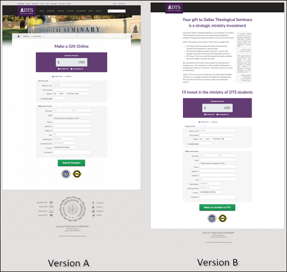
In an earlier experiment with DTS, Kevin Peters, Vice President, NextAfter, had found that visitors arriving at the organization’s primary donation page were highly motivated to give. He discovered this by testing two forms of the page.
The first version of the donation page cut immediately to the chase, asking donors to “make a gift online.” The second version of the page posited that perhaps DTS was asking too much, too soon, and prefaced the “ask” with copy highlighting the unique value proposition of DTS. Quotes from well-known figures in the Christian community were also leveraged to build additional credibility.

When running the test, Kevin found that the supporting information used in Version B actually decreased conversion by 28% at a statistically significant level. Instead of building value for potential donors, the additional copy actually introduced friction for visitors who were already extremely motivated to convert. In short, the copy was viewed as a roadblock, rather than a launch pad.
While many companies would be thrilled with the apparent high motivation of their visitors, pat themselves on the back for building the perfect site and take the department out for a steak dinner to celebrate, Kevin and the NextAfter team wondered if other factors might also be contributing to the irregularly high conversion rate.
“The headline had no value proposition whatsoever, but they had a conversion rate in a very high percentile … We knew that the only people getting there were already convinced to give,” Kevin said.
What if friction elsewhere on the page was causing only the most highly motivated visitors to actually make it to the donation page?
NextAfter decided to put this theory to the test.
The Test
To test whether certain page elements were making it more difficult for lower motivated customers to reach the donation page, the team started with one simple change to the organization’s homepage. Take a look at the Control and Treatment below, and see if you can spot the difference:


If you noticed that the “Donate” button has been given extra purple emphasis in the Treatment, congratulations on your impeccable eyesight. If you didn’t see it or it took you some time, don’t feel bad; it took minutes of intense staring for the author of this post to spot the difference himself.
The Control

The Treatment

Results
Despite the change being so simple that an experienced designer or developer could execute it in a matter of minutes, calling out the donate section with a purple box yielded a statistically significant 190% increase in clickthrough to the donation page.

What the team found equally interesting and surprising was that when customers with lower motivation were moved further up the funnel, the average donation increased by 860%.
Though Kevin responded that this number could not be statistically validated, and exceptionally large donations create outliers that can dramatically skew the average gift, most would expect the opposite to happen.
The NextAfter team is currently exploring separate donation pages for lower and higher motivated customers.
Key Takeaway
As Web design continues to evolve and new trends continue to emerge, it’s easy to feel the need to constantly reinvent our sites and pages. More often than not though, a well-optimized page results from methodical thinking and a series of seemingly minor tweaks, rather than brash, sweeping changes. By recognizing the motivation level on the donation page and then fine-tuning a single page element, NextAfter nearly tripled clickthrough to the donation page and increased its knowledge about what makes DTS donors give.
If you are interested in learning more about what makes donors give, NextAfter will be hosting a nonprofit edition of our Marketing Master Class, “Driving Success through Email Optimization,” here at the MECLABS Institute in Jacksonville on October 22-23. For more information about this unique opportunity, click here.
You might also like
MarketingSherpa Summit 2016 — At the Bellagio in Las Vegas, February 22-24
Personalized Messaging Tested: How little changes to an email send led to a 380% change in response rate (Web clinic)
CRO matters the most in Digital Marketing and AB testing is the main weapon. This article is insightful and shows how little things matter.
Great stuff Ken, Keep it up.