

Friction is one of the greatest obstacles to your conversion process, and though most marketers currently have some idea of what Friction is, many are only seeing half the picture.
When asking marketers to identify the Friction associated with a conversion process, the response is often very confident. Usually, the number of form fields on a page will be pointed out first, the number of steps in a process next, and occasionally a third comment might focus on the length of the individual pages themselves. The overall consensus from marketers is that if you can eliminate these simple elements, then you can eliminate Friction.
However, our research suggests that most of the Friction in a conversion process goes undetected. Further, this “hidden” Friction often is the most lethal to conversion. So, in this post I wanted to lay out 7 of the most undetected ways that Friction might be threatening your conversion rates. I have dubbed these The 7 Silent Killers of Conversion.
SILENT KILLER #1: A Misguided Eye-path
The first, and probably most common of these silent killers is a misguided eye-path. A Web page’s eye-path is the natural way in which a visitor’s eyes move through a Web page.
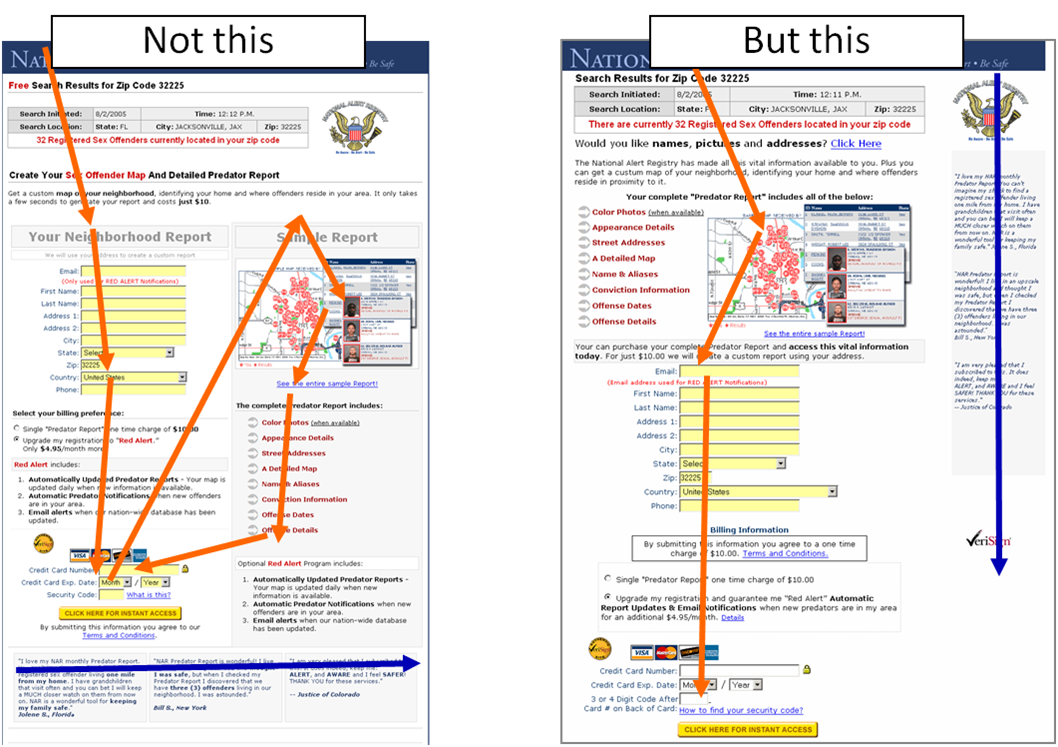
Often times, the eye-path of a visitor is sent all over a page without any logical order (see example). When this happens, a visitor will experience a level of Friction that lessens their probability of converting.
We discuss how to properly direct the visitors’ eye-path here.
SILENT KILLER #2: Multiple Equally-Weighted Objectives
Another common problem is providing two or more equally-weighted options for the visitor to choose between (see example). Giving your visitors multiple options to choose from might seem polite, however, more often than not, our tests show that this only increases the Friction a visitor experiences in a conversion process. Your visitor needs to be led. They need to know where they can get the most value. So, point them in a clear and decisive direction to a main call-to-action.

But what do you do when you have multiple CTA’s on a single page (like a homepage)? We discuss how to handle this here.
SILENT KILLER #3 Underemphasized Calls-to-Action
Related to the last problem, many Web pages work hard to convince a visitor to convert and yet drop the ball when it comes to designing something as simple as a button. Often, a visitor has to hunt for the call-to-action, and this creates unwarranted difficulty.

If a button’s primary goal is to elicit a click, it should be emphasized using size, shape, and color, in the main eye-path, and most importantly, look clickable (see example).
SILENT KILLER #4: Multimedia
What? Multimedia? Say it ain’t so…
For online marketers, there’s often much excitement that surrounds video, Flash, and other forms of interactive media. However, our research suggests there is a lot of Friction that goes under the radar when it comes to multimedia. In fact, for many pages we have tested, the “coolest” aspect of a web page was actually hurting conversions the most. We hypothesize that this is for two main reasons:
- Reason #1: Multimedia assumes a technological standard on the visitor (e.g., “Everyone has flash.” Or “Everyone can stream this without having to wait”). When this standard is beyond that of the visitor, Friction is created.
- Reason #2: Multimedia often comes with a steep usability learning curve. This is especially the case with multimedia that leans heavily on interaction. If your visitor has to learn how to engage with a particular type multimedia, there is another layer of Friction.
 Now, I am not forbidding the use of multimedia. I truly believe it can actually be a great tool for expressing the Value Proposition and/or leading your visitor through the conversion process. We just need to be aware that multimedia is often a double-edged sword, and we must ensure that our use of it brings more value to the table than Friction.
SILENT KILLER #5: Overuse of Different Fonts (sizes and styles)
This seems to be less of an issue nowadays, but still watch out for the overuse of different font sizes and font styles throughout a Web page. This can make readability very difficult. As the saying goes, “When you emphasize everything, you emphasize nothing.”
Instead, use variation in font size and style sparingly to lead the visitor through the text (emphasized headlines and section headers), and to call out specific points of value (impactful phrases, key points, testimonials)
SILENT KILLER # 6: Unorganized Content
Another big silent killer is poorly organized content. This is particularly relevant to ecommerce Websites offering a wide array of products (see example), but also applies to any Web page that has a substantial amount of content. If the content is not organized clearly, then most of your visitors will experience confusion. And in the midst of confusion on a webpage, there is really only one way for the visitor to regain clarity – by clicking the back button.
So, how do marketers ensure that their Web pages are organized properly? Well, when our researchers seek to organize a page, they start out first by ensuring the page answers three critical questions for the visitor:
- Where am I?
- What can I do here?
- Why should I do it?
I think this is a good place to start, and for more on how to answer these three key questions, see this Web clinic.
SILENT KILLER #7: Difficult Color Combinations
Finally, the seventh silent killer: difficult color combinations. Now I love color and I love creativity. But there is an often-crossed line where creativity actually hinders conversion. Our research suggests that certain color combinations can actually decrease the readability of a webpage, and subsequently increase the Friction.
To minimize Friction associated with color combinations, make sure you select high-contrasting colors. Our research has led to the following consistent – though not absolute – observations.
And it doesn’t end here…
As stated at the beginning of this post, Friction is not limited to form fields and page lengths. It’s not all about getting everything above the fold. It goes much deeper, and requires a marketer put themselves in the shoes of their customers.
These 7 Silent Killers of Conversion are a good start at doing that, but keep in mind that these seven are not the only ways that Friction hides on a web page. In order to really identify and address Friction holistically (both length and difficulty), we must begin to see our web pages from the perspective of our visitors. We can’t just rely on a list of seven rules. Ultimately, as with all optimization, we must strive to understand our visitor’s thought sequences, and experience the conversation process from their point of view.
QUESTION: What other ways have you seen Friction hidden on a Web page? Let us know in the comments…
.
Related Resources:
No Unsupervised Thinking: How to increase conversion by guiding your audience
Homepages Optimized: How using the homepage as a channel led to a 59% increase in conversion
Clarity Trumps Persuasion: How changing the first seven seconds of user experience drove a 201% gain
I think the images are another points of friction. If you use some images that doesn’t have sense in the content, you riquire a new effort for page visitator.
What’s your opinion abit this ?
With respect,
VanRaz
@VanRaz
Absolutely VanRaz,
Images that don’t connect to the value of the offer, not only are a waste of space, but can cause confusion as the visitor tries to make sense of it.
Further, as mentioned in the post, images that are heavy graphically can skew they eye-path if not used strategically. Overall, we have to be very careful with the way we use images.
Here’s a blog post that goes a little deeper on the use of images: https://www.marketingexperiments.com/blog/general/stock-images-tested.html
Thanks,
Austin
I simply love these two points–
SILENT KILLER #2
SILENT KILLER #6
Thanks for sharing.
Lack of white spaces, small text, and long paragraphs are big friction point for me.
Registration is another huge silent killer! Forcing people to register in the first place is a huge friction point, and then there are lots of length/difficulty issues within the registration process that often kill conversion. Inspired by your Landing Optimization Summit, I captured some registration friction points (and quoted Flint and MECLabs extensively!) in a recent post at: http://www.neoinsight.com/newsletter/1107.html.
Killer #8 — Lots of text and few images.
All too often, I see emails/newlsetters that look like they came from essay contests. At my company, Global 360, we concentrate on short descriptions that drive people to call to actions / more information. In our short-attention-span world, shorter is better.
@WeeksTweets
Great article. I like Peter’s comment about long paragraphs – although I know that some copywriters are in love with them, they are a big turn off for me.
I think #1 and #2 are the most important guidelines of all.
So many conversions are lost through broken sales funnels.
From a copywriting standpoint, I think it’s important to stamp out any ambiguity from your pitch. Simple language that an infant could understand is the way forward. You always have to appeal to the lowest common denominator and I think a lot of marketers assume that customers have much better ability to soak up information than they actually do.
And of course, selling the benefits rather than the features is a must…
Hello Austin, this is a very well done solution that helps conversions.
Great info. Looks like #4 contradicts #2 a little. And how does #4 fair in the world of videos sales letters?
Austin,
One item that causes friction that I have seen lately is showing everything at once. It’s a variant of SILENT KILLER # 6: Unorganized Content, but still worth mentioning. Instead of making the hard decisions as to exactly the best way to engage users through the conversion cycle, I have seen a lot of sites just throw in the towel and show users every potential product variant all at once. Showing all options can work when you show one product with 3 or less variants but when you have more than 3 proudct variants I have seen performance just tank because of friction.
Great article and I especially like the use of the term “friction” as it applies to the conversion process. Although many feel shorter copy is better, I do see a need for longer copy in more complex sales funnels… the key is to present the copy in a short version with access to the longer as needed.
Very timely article Austin. We’re in the midst of redesigning our pages. We’ll be reviewing this as a team. I’d like to add ‘Inconsistency’ to the list of silent killers. This can sneak in after multiple revisions of a page and we forget to update all the specific details each time.
Your article is very interesting and quite enlightening. Everything can work like Friction. We basically have to pay attention to many factors at the same time, and test different options. However, we have so many things to do that many times we don’t pay attention to various details. Thank you for your lessons!
A poor value proposition and direction. “Who are you, what makes you unique and what can I do here?” These are the basics before worrying about eye path and colors. If I can’t understand what you are saying, it doesn’t matter how you are saying it. I can understand a sloppy dressed person if they are clear. I can’t understand a well-dressed person who is speaking incoherently. Same holds true for web pages.
@Robert Stanley
Great observation. The “but this” example does show equally-weighted objectives and could probably be improved further. This was an audience-submitted test, and there was much more we would love to see done. But either way, what was really interesting about the new design, equally-weighted options and all, was that it produced a 78% in revenue over the original which emphasized multimedia.
Very interesting article and comments.
Thank you
This is a very good article. My experience is still limited in the online biz. A proper curriculum in student training is important, because we were taught differently in schools. The next thing we know is, we are not making good conversions.
#3 again reminded me of “giving” to my visitors and emphasize what visitor gets rather than what they must do. Thank you!
I just came across this via a link from an email – I am amazed this is all very basic IA and UI been around for over 12 years plus to my knowledge. Some items well before the internet.
Where have you all been hiding?
I STRONGLY DISAGREE WITH YOUR #4 KILLER:
You should have broken this up into categories. Video should be in it’s own category. Of the sites our company builds, it’s video that is winning by 5x over all other calls to action.
I love 99% of what you guys post but please do more research in this category.
Killer number 1 and 6 – are very strong killers, yeh.. Content must be structured and visualy light (for example- dont use dark backgrounds on pic, etc)
And about killer 4 – multimedia- is very good, but prices must be very visible.
(sorry about my english- i am from Russia)
2Austin – very good topic? tnx!
Great content and responses. Good design is like feng shui–the energy must flow unobstructed! Every element must harmonize while leading the viewer to the ultimate goal–take action! It may be trite, but here goes: “less is more.” and “KISS: Keep It Simple S___.”
Excellent article!
Nice article!
Multimedia can generate friction for different reasons:
1. technical: slow/difficult connection or expensive (for mobile), device dependant (screen or cpu, could be valid even for javascript)
2. user preferences/content: multimedia can take time, freedom (user can freely navigate other content with more control over what to see and read, multimedia let you navigate only one flow/path and isn’t “hyperlinked”), user doesn’t know where multimedia will lead him, with text/images ou can anticipate web page’s section content.