

I’m pretty sure I dislike pop-ups. Maybe it’s just a gut reaction to some pre-pop-up-blocker memory of my computer being overtaken by hundreds of pop-ups in mere seconds, but whatever it is, I just don’t like them. Immediately, I think of spammy, over-hyped, flashing messages with really bad clip art.
But am I throwing the proverbial baby out with some really obnoxious and annoying bath water? Well, at MarketingExperiments we test even our most strongly held website prejudges. We constantly challenge, test, and many times find holes in commonly-held “best practices.” And so, feeling a bit adventurous, our analysts took the opportunity to test the effectiveness of that frequently offensive marketing tactic – the popup.
 Test Background
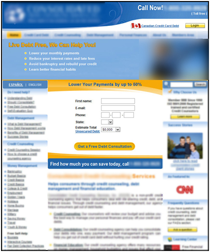
The Research Partner we were working with was a B2C company offering counseling services in credit consolidation. The primary objective that they identified for their homepage was to increase the amount of quote requests.
Currently, their homepage featured the quote request form front and center, but we wondered if the current format got lost at all in the design of the homepage. So we tested a couple of designs attempting to bring more attention to the form offer.
Treatment 1

The first treatment integrated the form into the most attention-getting element of the homepage – the top banner. The banner was blue and utilized strong imagery. The team’s hypothesis was that if we placed the form in the banner, more visitor attention would be drawn to it.
It is interesting to note that even thought we added the form to the top banner of this homepage, the form still remained in its current location. This gave the visitor two separate places to see the quote request form.
But how much would banner blindness mitigate the attention brought to the offer? Would people just skip over the image? Are banners like this effective for primary objectives? These were all secondary research questions we were seeking to answer with this treatment
Treatment 2
 In another treatment, we tested using a popup to emphasize the quote request message for first-time visitors. The overall homepage design remained the same, but was grayed-out behind the popup. The popup could be closed by clicking a simple text link in the top-right corner, filling the screen with the normal homepage in full color. Like the first treatment, the form still appeared in its original spot.
The hypothesis was that the popup might eliminate all other distractions focusing the visitor’s attention squarely on the free quote request offer.
But would using a popup cause any additional annoyance or concern? Would narrowly focusing on a single offer hurt the effectiveness of this homepage? Are there any prejudices against pop-ups? These were all secondary research questions we were testing with this treatment.
The Results
Will a popup really work? Is the top banner strategy better? Or will the control remain king with its simple front and straightforward approach? Questions like these underscore the importance of testing, for even in our most brilliant moments, we cannot be 100% sure of our intuition. But that’s not to say that some marketer intuition is better than others.
And the winner is…
UPDATE: As some of the blog comments predicted, the winner was Treatment 2 (the pop-up) – by 63%. That’s right, despite all the negative baggage that comes with a pop-up, it appears that in some cases it will perform best. It is also interesting to note that the first treatment, which is a more common approach, underperformed against the control by -2%.
If there is one key principle that can be gained from this test (and there are others), it’s that sometimes best practices don’t work. And sometimes the very tactics you know won’t work, do. That is why it is important to get beyond gut feelings and test. This is not anything you haven’t heard from us before…but too often, common knowledge is not common practice.
What do you think?
Why did the pop-up work in this test? What are some cases in which a pop-up wouldn’t work? Should we start using pop-ups more often or are there still enough negative conations associated with them?
Related Resources
Homepage Design: The five most common pitfalls and how to overcome them
Homepage Optimization: Lessons you can reuse from ReUseIt.com
Homepages Optimized: How using the homepage as a channel led to a 59% increase in conversion
I find pop ups to be annoying, and therefore ineffective, I tend to just close out of the pop up and pay no attention. I think that a top banner would be more effective than something that pops up into your face as you visit a site.
The pop-up will probably look much like a Survey request, plus there is no context when it comes up right away. These would tell me that it would fail.
HOWEVER, this isn’t an aggregator site, it probably has a URL like http://www.reduceyourdebt.com or something, so the user does have *some* context on the way in, and that would argue in favour of the pop-up.
I’m going with the pop-up. I don’t like them, but I’m going to say that in this instance it was more effective than the other two pages.
I also believe that anyone exposed to the form in the blue banner would ignore it, however, I wouldn’t be surprised if it drove higher usage of the in-page form.
Love these quizzes, looking forward to the answer.
I think that many users just close pop ups and pay no attention, like Nick Stamoulis said.
Which is the solution? I think it depends on the context.
That popup will convert much higher is my guess. It may seem annoying to marketers, but to ordinary visitors it’s hitting the target and giving what they want straight away.
10:1 odds. Let’s see if I’m right…
I hate popups as do most people that post an opinion about them. You never see “Oh, I like those little messages that want my attention like needy children, they’re so cute!”. 🙁
But I think for many sites they we perform better. Why? 1) The user cannot ignore them, 2) If the user has any interest in the topic, it’s an easy way to quickly get some information, and 3) People are sheep or cattle and it is natural for them to be herded, fed, branded, and sheared/milked by others.
No doubt about it, the pop up will out convert all else. If you are focusing on a single action, the less “outs” there are – the more focus will be targeted at your desired action.
Form on the site has many many “outs” while the pop up has only two (close pop up button and browsers back button)
I believe the form within the banner ad will simply be ignored due to “banner blindness”. Heck, I ignored it at first even in this article. The original form gets lost in all the clutter. I agree with the previous entry that the popup will do better in this case because you are already coming to this page with some context in mind. Even if I didn’t fill out the popup, I would most certainly then notice the on-page form if it was still there.
I hate pop ups but I’m betting they win this test because there is no ignoring them. You have to do something even if it’s just closing them.
My hunch is that “Treatment 1” with its 2 similar but not identical forms will confuse site visitors and do worse than the control and the final treatment.
I know the answer now because I attended the awesome session yesterday…! I have been to a few of these webinars and this was one of the best and seemed the shortest. Thanks!!!
@Chris Nielsen
I’m waiting for the answer with bated breath…
It’s easy to see why treatment 1 performed poorly- 2 competing calls to action on the same page can be overwhelming
I know people who have been banned or given a final warning from Adwords recently, and the only negative that can be attributed to their landing page is that they used a popup (well modal window as this example)for an email subscription.
Here is a link to one of the comments
http://andybeard.eu/3100/google-adwords-rules.html#comment-445789
Also worth taking into account Armand Morin’s post linked from there.
I won! 10:1 odds!! Yippey!
@Andy
You have to be careful of which JavaScript modal window you are using. Some get triggered as MalWare by Google (in search and I’m assuming Adwords) – probably the same cause.
Using the latest CSS and Javascript, it’s not hard to have a successful and beautiful looking popup.
@Donovan Well done, mate 🙂
@Flint, thanks for the webinar – very interesting. I loved the bantering and teasing of Adam – it kept the thing moving nicely. Thanks.
I find myself to just ignore pop-ups and close them or the web site that their on if I can get the information offered on another site without pop-ups.
Great post, I like the way that you give a in depth perspective into what many have grown to hate, pop-ups. Its great that you explain how your software operates in a very effective manner. Currently I have been researching the topic of Banners and Pop-ups and have found a website that gives good information on some of the same material. The website is called Dalai Group ; this site discusses the importance of effective campaign that includes the use of Pop-ups and Banners.
Thanks for the research. We done!
The ugly grey popups that don’t allow you to leave are annoying.
The good looking popups with eye pleasing graphics work!
Peel effects work. Tabs work. Timed “buy now” buttons or optin buttons work too.
Kevin
UpCreator.com