

Class was in session again at MECLABS, and this eager beaver right here decided to join in on the learning once more. Of course, I had the MarketingExperiments audience in mind, so I took my handy dandy notebook and jotted down what I saw and heard.
Once again, Senior Optimization Manager, Adam Lapp, was front and center teaching our Research Analysts about, you guessed it, optimization. But, this class he focused on radical redesigns and the importance of multivariable testing when transforming a page in such a drastic way. After a lesson, it was time to put the learning into practice. And once again, being the cool teacher that he is, Adam set up a fun optimization contest. With bragging rights, being the main prize.
This time it wasn’t a battle of the sexes, but I can say it had a few surprising twists at the end. On one team you had MECLABS Research Analysts Aimee Bolton and Spencer Whiting and on the other you had Dustin Eichholt and Zuzia Soldenhoff-Thorpe. Their mission was to create the most effective radical redesign for a homepage. I will show you their designs as well as some advice from the teacher, pupils and myself. Hopefully you can apply it on your next testing adventure, especially in the case your design is a bit…um, far out.
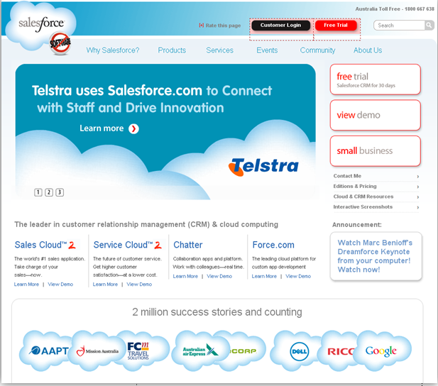
The teams had to create radical redesigns for the following Salesforce.com homepage (which had been submitted for live op during our Homepage Web clinic):

LET’S TAKE A CLOSER LOOK, SHALL WE?
Before I get to the teams’ redesigned pages, I’d like to note that in class Adam often goes around the room asking what the research analysts thought of the control (the original homepage).One of the things the research analysts agreed on is that the page made good use of third-party endorsements/indicators. On the bottom you see their clients’ logos and a complementary headline overhead that reads “2 million success stories and counting.” That seems reassuring and provides some credibility, right?
But, after that, the research analysts pointed out some major problems in the original design during the discussion. I’ve listed the ones that stuck out the most:
- The free trial is hidden in right navigation. When you’re offering a free trial for customers, they should be able to see it without having to look for it. In this case, you have to browse the page a bit, because the free trial button is out of the visitor’s eye-path. This incentive becomes useless if a visitor can’t find it and that means losing potential customers.
- Rotators do not help to communicate value proposition. In this case, the rotator is that huge rectangular box that has taken up most of the real estate on the page. Rotators are a great function to display images and your value proposition (as in what sets you apart from your competitors). Having the right value prop and conveying it effectively is such an essential component for a company, and that should be displayed on the homepage. It sets you apart from your competitors.But in this case, the rotators, which could have been a great place to show that, don’t express any value prop. It’s great that Telstra uses your services Salesforce, but how does that help me (speaking as a potential customer, of course)? That statement does not show me what Salesforce does, let alone what it can do for me.
- The cloud graphic they use to display the third-party indicators is overused. It’s also too similar to the Salesforce logo in the top left corner. That can create some confusion. We understand that they were probably going for a cohesive look, but the clouds are just too overwhelming and don’t let the company logo truly stand out and show visitors where they’re at.
- Another visual issue was the circle-shaped graphic right below the company logo that reads “software” with a big red line across it. We’re assuming it’s supposed to make the point that Salesforce requires no software download, but the graphic is not very attractive and somewhat unprofessional, aesthetically speaking. Expressing that the product does not require downloading any software is great, but it could be presented better in copy. Sometimes copy is more effective than an image, and vice versa, depending on the situation of course.
My two cents:
An extra point I’d make is about their sub-headline under the rotator. It reads, “the leader in customer relationship management (CRM) and cloud computing,” but that is a qualitative statement. Where’s my quantitative data (how many businesses have they helped? How long have they been the ‘leader’?, etc…) Where’s the information that is going to support that statement? Anyone can say they’re a leader, and Salesforce might just be the leader in their line of work, but without some substantive data to back it up, their statement does not inspire trust in the visitor.
AND THE WINNER IS…
Before I reveal the results and radical redesign treatments, I’ll set up the story (in a dramatic way) of how a winner was picked that day. I’ll start it off like Sofia from the Golden Girls would when she was storytelling.
“Picture it…” MECLABS optimization class, 2011. Adam had already reviewed both radical redesigns. Two teams anxiously awaited his decision. Then Adam throws a curve ball (Baseball season has just begun, he had to) and asks me (at the time, I happened to be sitting slouched down in my chair hoping not to be noticed) to pick a winner. I couldn’t decide.
My indecision ultimately made it a tie (and based on the research analysts’ facial expressions, that was not cool). But then, something unexpected happened! Dr. Flint McGlaughlin, Managing Director (CEO) of MECLABS, walked into the class. All smiles, he said he just wanted to see how the class was going. Well, Adam took advantage of this and asked him if he would do us the honor of picking a winner.
Upon careful review, Dr. McGlaughlin made Amie and Spencer the winners. Now, let’s take a look at why….
Here’s their treatment:

This duo decided to emphasize the free trial incentive on the page. Here are their test suggestions:
- They started off by simplifying the page, featuring two key sections (“Free Trial” and “What Salesforce Is”) and getting rid of the three equally weighted calls-to-action in the control.
- They provided a clear headline, which let visitors know where they were the benefits of being there.
- The way they presented the free trial also gives the visitor more power. It allows them to customize their free trial, by picking one or more of the four core products to try free (I personally would have reworded the free trial headline by using “risk free” instead, but theirs is still an improvement)
While they didn’t address some of the issues I listed earlier, such as the logo being too similar to the third-party indicators and the “software” graphic under the logo, they did a great job.
Here are some of Adam’s suggestions to further optimize the page:
- Provide a brief description of each product under its title, which can be resized so it doesn’t take up space
- Make each product title clickable or have a “learn more” link next to the brief description
– Visitors may not be ready to do a free trial
– On click, this could open a new page, a popup, or simply change the content on the right side of the products
- Add a sub-headline above the “What Salesforce Is” section
- Add a call to action at the bottom of the “What Salesforce Is” section
– Learn more
– View solutions
– Etc.
NO ONE GOES HOME EMPTY-HANDED!
Congrats Amie and Spencer! But, Dustin and Zuzia also had a redesign worthy of mention and some praise. Here’s their super radical treatment:

Adam thought this design deserved to have an honorable mention, because of its very radical take. Dr. McGLaughlin also applauded this out-of-the-box approach.
Here’s what Adam liked about this super radical concept:
- It’s not a best practices optimization, but something that really challenges the model
- The main section engages the visitors
- It allows visitors to click or hover into the different products
- Expandable sections allow visitors to read more, see screenshots and take a second action
- For software companies, sometimes it’s important on your webpage to communicate technology in its components and the expandable section does just that.
Both Adam and Dr. McGlaughlin agreed that Dustin and Zuzia’s very radically redesigned page was one that should be tested, but not right away. Adam said, in that case, you would have to optimize, optimize, optimize, and when the needle isn’t moving, try something different.
“You’re only going to get incremental results if you make incremental changes. And this radical design might get a 500% decrease. But that’s the concept of testing. It could get a substantial increase as well, but you’ll never know. “– Adam
So, while it looks like this redesign could fail in the testing stage, you wouldn’t know that until you test, and the same goes for the winning redesign.
(Which one do you feel should have won? Do you agree with Dr. McGlaughlin? Or, are you like me and can’t decide? Let me know your thoughts and optimization suggestions, by using the comments section below.)
Related Resources
Homepage Optimization: Creating the best design to quickly meet multiple visitors’ needs
Homepage Optimization: Lessons you can reuse from ReUseIt.com
Homepage Optimization: How your peers use keywords and communicate with visitors
This Just Tested: Could you spot the better homepage if a 59% conversion difference were at stake?
Great article! I love how they got rid of the equally weighted calls to action. The multiple buttons can be hard to part with for web designers.
Thanks Joelle for this great article. Well written and goes over important key points. Out of curiosity, I looked at Salesforce’s Web site to see what changes they implemented as opposed to the initial homepage shown above. While the home page design looks cleaner and more professional in appear, I have to play Devil’s Advocate. I completely agree with your qualitative vs. quantitative statement where including supporting facts help build visitor trust. What’s in question in my mind is the amount of success stories that this company has. From the slide above they state they have 2M success stories and as of today’s site they have 3M stories. Either they have an amazing sales and marketing team or something doesn’t add up and that diminishes my trust in their credibility. Regardless, I think they have an impression client base and put video testimonials to good use. I think more sites would benefit from these types of testimonials.
Thank you Jordan! Yes, those multiple calls-to-action and buttons are definitely too much. They can overwhelm and confuse the visitor. Sometimes keeping it simple is best.
Hi Marie. Thank you for your comment, I really appreciate it. While I can’t speak to what happens behind the scenes at Salesforce, I can say that the page on this post is the one we were sent for live optimization at the time. But you raise such a valid point. When building credibility one must be consistent and be able to back up any quantifiable statements made. So, if they truly had a bump in success stories in that time frame, maybe they could have expressed that on the page somehow to relieve any doubt in a visitor’s mind. If not, it might come off as an embellishment and like you wrote, diminish trust in their credibility. Backing up data and being consistent is also key in credibility. You made a great point and I’m glad to see you followed up on whether they’ve been making changes.