

After watching The 21 Psychological Elements that Power Effective Web Design (Part 1), a MarketingExperiments reader commented and asked …
“What type of information/content do you provide your designers with to create those initial wireframes? When Flint was showing Meghan’s wireframes and talking about web design in general, it felt like content would fill in the wireframe instead of creating content and then creating wireframe for that content.”
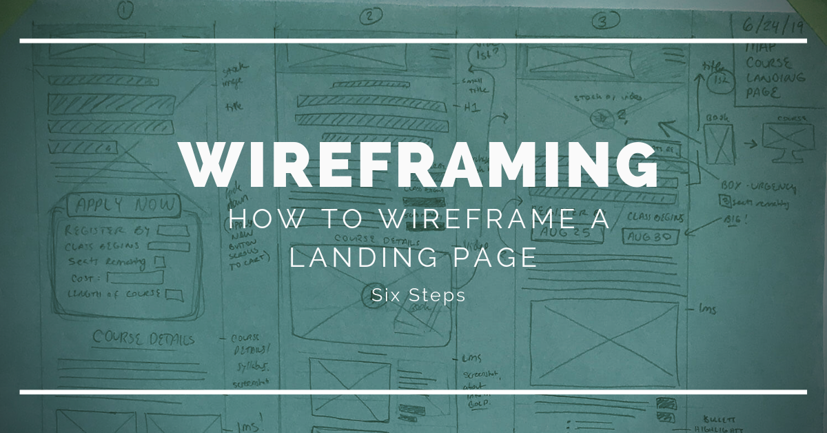
And really, that spurts a bigger question — how do you wireframe a landing page? Here is a rough look at a process we use for our own websites at MECLABS Institute (MarketingSherpa.com, MarketingExperiments.com, and MECLABS.com). It’s not set in stone, it can vary based on the project, but I hope it gives you a few ideas for improving your own process.
(This article was originally published in the MarketingExperiments email newsletter.)
Step #1: Meet to discuss the objective
Before anything is created, Meghan begins with a meeting about the page’s objective.
“I often don’t have the specific content beforehand. But I don’t need it. The more important thing to begin with is the objective,” Meghan Brown, Graphic Designer, MECLABS Institute, said. “Even without specific content, you know that there’s going to be a headline, images, call to action, etc. So you design the layout based on the elements talked about from the objective meeting.”
If you’re a marketer working with a designer on a landing page or website, here are some questions you should answer in the objective meeting:
- Who is the ideal customer?
- What is the conversion goal?
- What is the process-level value proposition? What other value propositions should be communicated on the page?
- Who are your top competitors? (Observe their websites.)
- Are there any examples of landing pages and websites you like? Don’t like?
- What website will it go on?
- Are there any brand guidelines?
- Any specific functionality considerations?
- How many pages are needed in the customer flow (e.g., a landing page with a thank you page, a five-page microsite, etc.)?
- What elements need to go on the page (e.g., video, form, approximate amount of copy, etc.)?
- When is the deadline?
“Talking about the objective is the most important part. A key question designers will have as they concept layouts is how much time do they have to work on these wireframes. I can whip something up in two days and it’ll do the job, or I can spend a couple of weeks intensely focused on a bigger project and be creative with the designs. It all depends on the business needs,” Meghan said.
Step #2: Create pencil sketch wireframes of the landing page in a notebook
In my early days as a copywriter, I used to concept with an art director who would draw those ideas up on paper. We used to call them “markers,” and that’s all they were, really. An idea drawn up on an oversize sheet of paper with a bold, black magic marker.
You could tell I was on deadline for a campaign because the walls of my office and my art director’s office would be littered with these crudely drawn comps taped all over our walls.
Yes, we did have computers. QuarkXPress. Adobe Photoshop and Illustrator. But we didn’t start there. We started with the idea— essentially, the minimum viable communication of the idea.
So I love seeing Meghan walk around the office with her pencil sketches of landing pages. I can’t help but think that something is lost when we jump too quickly into execution and technology. Despite all the great new marketing technology, it’s just a tool. Marketers win with better ideas.
After the objective meeting, Meghan creates low-fidelity wireframes by doing basic sketches in her notebook.
“It’s faster for me to get my ideas down,” she said.
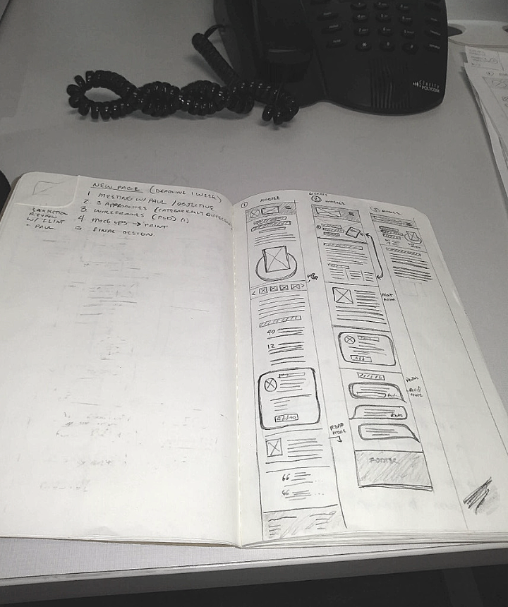
She lays out multiple ideas side by side — usually about three if she is time boxing herself — making sure each one is categorically different. For example, one might put more emphasis on the headline, one might put more emphasis on a hero image, another might lead with a product image with a headline and bullet points. “Most of the time, I get my bad ideas out first, and then it leads to better ideas. I don’t want to start by going directly to a program like [Adobe] Photoshop with a bad idea, sink the time in, and then have to start all over,” Meghan said.
She usually only wireframes mobile pages at this point. “I start with mobile because there is less space to work with, and it’s easier to transfer content from mobile to desktop versus the other way around. I draw wireframes for tablet and desktop only if I have the time; otherwise, I just skip this part for later,” she said.
Step #3: Review ideas
Once she has settled on the general concepts in her notebook, she creates much larger and a little more detailed versions to present, using a pencil and a large pad.
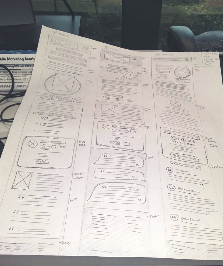
Since these are still just pencil drawings, they are clear ways to communicate the idea quickly.
The goal at this stage is to collaborate with stakeholders and decision-makers in a way that makes revisions and optionality easy. In fact, instead of redrawing the wireframes, sometimes Meghan simply adds sticky notes with new ideas to the pencil-drawn wireframes.
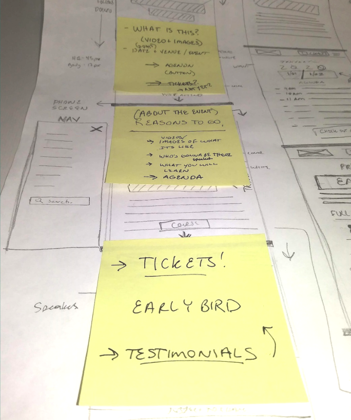
This is also an easy way to play with ideas and vet them out further by giving greater clarity and specificity to what it would take to execute the landing page or website.
For one, this helps developers get a better idea of what a marketing director wants to build, to give a more accurate estimate of what it would take to build that landing page, checkout flow, or website.
But beyond that, when an idea for an overall product or service is at play, it can help to sketch out a landing page for it — ideally, in combination with a competitive analysis — to get an early understanding of what the offering would be from the customer’s perspective and if it really sticks out in the marketplace. If this early workup instills confidence in the marketing and product development team, they may decide to invest in a value proposition workshop next to begin bringing the product to market.
Step #4: Create high-fidelity wireframe on a computer
Once the entire team has buy-in on which of the three concepts they want to move forward with and they’ve decided on any changes to that direction, Meghan goes to the computer to make a high-fidelity wireframe using a tool like Adobe XD. (Another tool you might want to consider, used by other members of our team, is Axure RP.) At this point, she’ll make the single concept in three sizes — mobile, tablet, and desktop.
“It’s halfway to an actual design. The goal at this stage is to get the layout down and make room for copy,” she said.
To the original question from a MarketingExperiments reader, this is where the actual content of the page comes into play. “This is the stage where I start demanding copy and content — images, videos, icons, everything. It’s hard to go further without it because you’ll have to adjust the layout a lot based on copy length, number of testimonials, number of images, etc. So the sooner I have the content, the faster the wireframe gets done,” Meghan told me.
There is another round of collaboration, approval and feedback at this stage.
Step #5: Make the comps on a computer
After two levels of collaboration, Meghan is now investing the time in creating a full comp of the landing page. After getting images and editing them in Adobe Photoshop, she uses Adobe XD to create an interactive prototype with real branding, images, colors, copy and whatever other content is necessary.
She still collaborates though, making sure to get feedback and buy-in along the way so she doesn’t waste time getting too far down the road in one direction and get off base from what others on the team are thinking.
“I get three rounds of feedback at this stage. I fully comp the mobile version and get feedback. Then tablet, then desktop. It may seem like it takes more time to stop for feedback, but I’ve found it actually saves time to get feedback after creating each comp,” she said.
Below is an example for the comps of an ecommerce flow on desktop. You can see the final page here, and how close at this stage the final comp is to the page.
Step #6: Give full design to the developer(s)
After the feedback, Meghan makes the final rounds of changes and creates final files to give to the developer(s) — grouping together the assets and elements a developer would need to build the page, making sure all the images are the optimal sizes and resolution for web design on different device types, and providing the CSS slices.
That is an entirely different topic, and if you’re looking for information on the technical aspects of website redesigns, you can find it here.
The main thing for the designer and marketer to be concerned about at this stage is a fidelity review. Don’t just hand it to the developer and walk away. Do the final designed pages accurately reflect what the team was trying to make? On all device sizes?
And now, a few caveats …
Caveat #1: Is one version of a landing page enough?
For simplicity’s sake, this article focuses on wireframing and designing a single landing page. If you engage in A/B testing for conversion optimization, it may be the landing page you test against the control.
But if you don’t have a control and want to engage in testing, you would want to create at least two (if not more) landing pages to test as treatments. You can follow the same process, just multiply the number of options and pages created.
You can get a behind-the-scenes look at creating an A/B test here.
Caveat #2: Not every landing page requires this intense work
I don’t want you to think every page we create has this intense of a process. Or even a wireframe at all.
For example, for some landing pages, we’ve created a template in Instapage that we reuse. Here’s an example.
In fact, if you don’t have design and development resources while you’re starting out, this might be the best option for you. “For marketers doing it for themselves, use a tool like Instapage, or another webpage builder. It saves you so much time,” Meghan advised.
Related Resources
MECLABS Institute Landing Page Optimization on-demand certification course — Designed to help teach you the science of landing page optimization without the cost of hiring an expensive consultant
Research-Backed Landing Page Templates to Scale Up Your Testing Program
The End of Web Design: Don’t design for the web, design for the mind
Awesome article! I bill myself as a “visual sales strategist” and have a very similar process for keeping sales/marketing/design on the same page. Thanks for sharing yours!
Thank you for writing a response to one the video viewers question!
Indeed the great time! To Wireframe a landing page steps that have been mentioned in the post are very informative and helpful. I have had an amazing time reading this post and I would definitely like to read more such blog posts from your end.
Thanks for sharing these awesome details here. A landing page wire-frame not only provides a blue print of the page structure but convey the overall direction of user interface. The key is to keep this wire frame as simple as possible at first, so as to not overwhelm the stakeholders involved.