Today on our Web clinic – Technology Blind Spots: How human insight revealed a hidden (and almost missed) 31% gain – we will be releasing never before published research from our laboratory. And you know what we like to do with our audience when we have fresh research that they have never seen before…
That’s right; we like to turn them into guinea pigs.
We like to see if our blog readers, knowing the basic circumstance surrounding a recent test, can predict the outcome. How good is their online marketing radar? Can they spot a good webpage when they see one? How is marketing intuition performing these days?
But honestly, what really matters is the cheese they will be racing for today – one good-ole slice of free online certification course cheese with a little Twitter-love wine to wash it down.
Leave a comment below to enter and let the games begin.
The Experiment
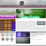
The Research Partner we were working with provides online consumer brokerage services through a subscription-based model. This page, in particular, was aimed at visitors interested in signing up for the foreign exchange trading (FOREX) solutions.
After analyzing the current landing page, we concluded that there were some significant factors contributing to confusion on this page. For one, there were many competing graphical elements and objectives. In almost all cases, this type of layout negatively impacts conversion. We also believed that the value of this offer could be communicated with a little bit more oomph.
So we tested three designs against the control to address some of these issues.
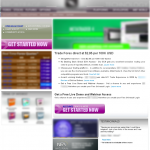
The first treatment is probably the closest to the control. However, there are some strategic changes.
First, we added a headline that better communicated the value of the offer. The copy also has been reorganized in a clearer, easier to read fashion.
And finally, we added a call-to-action button in the main section of copy.
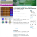
The next treatment used a more long copy approach than the control. It also incorporated a stronger headline and clearer copy layout similar to that of the first treatment.
It is important to note that some of the visual elements from the control have been removed from the bottom of the page. However, the left-hand column remained the same as the previous two designs.
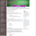
Treatment 3 (click to zoom)
This version of the page is almost identical to treatment 2’s long copy layout.
The one big change for this version was that the elements in the left-hand column were changed into a simple navigation.
(Update) The Results
If you are reading this post now, the contest mentioned above is over. Congrats to @terryrydzynski, a marketer who’s intuition got him a free seat in one of our online certification courses. If I were you, I’d follow this brilliant guy’s twitter account.
Which one was the winner you ask? All of the treatments outperformed the control, but Treatment 3 had the highest conversion rate with a validated 31% increase over the control. Now the results were not too surprising if you read some of the reasoning behind our designs above. Treatment 3 significantly reduced the amount of friction over the control by removing the competing graphical elements and focusing the visitor on one objective.
So what can we learn from this experiment?
If there’s one thing that we can all take away from this case study, it is that many times we are trying to accomplish way too much with our pages, and if we could just simplify our message and make options clear for our visitors, we would potentially see an increase in response.
But this is just scratching the surface, if you would like more information about this case study and some of it’s implications, you can find a more detailed explanation in the replay of yesterday’s web clinic, which will be available next week. To be notified when the replay is available, feel free to sign up for free research updates from MarketingExperiments.



Treatment 3, @empower3w
Treatment 2. I like the confidence the Awards and Testimonials sections on the right inspire.
Treatment 3 is also nicely organized, but I think the inclusion of the left-hand navigation serves as a distraction.
@dkrier
Treatment 2, @SebastiaanR
Treatment 3.
I like the neat simple non-graphic layout. I prefer to read rather then be distracted by too many graphics.
@BushHluhluwe
#1 – high and tight
@trentabrams
NO 1 as your target is already interrested in the product and this layout is short and concise. @berniebelliveau
Treatment 2!
I don’t think the long copy is an obstacle in clicking on the call-to-action.
my twitter @conseil_wa
Treatment 3 @Pajex
Treatment 2 @martinduys
Treatment 1. The bullet points are easy to read, and there are two call to action buttons above the fold. Plus the second ‘free demo’ headline is more visible.
#1 Good choice of place for main CTA button, but too many competitive CTAs
#2 Awards & Testimonials looks great, but left side column still captures too many visitor’s attention.
#3 It is the winner.
BTW, I think that it is not clear (at least for me :)) is account creating free or not, so I’ll suggest to test variations of main CTA button’s text.
@Ed
Twitter handle @edbrocklebank
My pick is #3. The offer is clearly stated, and the body copy is more readable than the other versions.
The awards and testimonials on the right are great confidence-builders and lead people to click the call-to-action below.
I think most likely #2, @dougvs
#3
Twitter handle: @dericloh
Control:
It seems to be 3 alternatives of driving signing up for the foreign exchange trading (FOREX) solutions through:
1. Get Started – call to action button
2. Chat with a Live agent
3. A more subtle banner registration (which might or might not be the linked to the core conversion)
Thoughts for the control would be:
Which of the actual successful conversions generated through option 1 or 2, is more cost effective ? Through paid and non paid traffic ? That would shed more light on the definition of a successful defined conversion for the control.
Treatment 1:
It seems to be 3 alternatives of driving signing up for the foreign exchange trading (FOREX) solutions through:
1. Get Started – call to action button
2. Get Started – call to action button (with new copy added onto it – main section of copy)
3. A more subtle banner registration (which might or might not be the linked to the core conversion – consistent with the control version)
Thoughts for Treatment 1 would be:
– Friction
Inclusion of new internal site links on the copy body (5 internal internal links on copy body – less the grayed out area) which might potential shift the prospects’ attention to be focus elsewhere on the other section of the website (through clicking through the internal links) and lose that very opportunity to convert (unless the internal link page has a very direct and prominent next step – call to action to prevent losing that very prospect from bouncing off)
Treatment 2:
It seems to be 2 prominent alternatives of driving signing up for the foreign exchange trading (FOREX) solutions through:
1. Get Started – call to action button
2. Get Started – call to action button (with new copy added onto it – main section of copy)
Thoughts for Treatment 2 would be:
– Friction
Inclusion of new internal site links on the copy body (3 internal links on copy body and the other 2 found on testimonial and awards column – less the grayed out area) which might potential shift the prospects’ attention to be focus elsewhere on the other section of the website (through clicking through the internal links) and lose that very opportunity to convert (unless that very internal link page has a very direct and prominent next step – call to action to prevent losing that very prospect from bouncing off)
Treatment 3:
It seems to be 1 prominent alternatives of driving signing up for the foreign exchange trading (FOREX) solutions through:
1. Get Started – call to action button (with new copy added onto it – main section of copy)
Thoughts for Treatment 3 would be:
– Friction
Inclusion of new internal site links on the copy body (4 internal links on copy body and the other 2 found on testimonial and awards column – less the grayed out area) and the multiple internal site links found on the left-hand column navigation bar which might potential shift the prospects’ attention to be focus elsewhere on the other section of the website (through clicking through the internal links) and lose that very opportunity to convert (unless that very internal link page has a very direct and prominent next step – call to action to prevent losing that very prospect from bouncing off)
Conclusion:
– Cost effectiveness needs to be taken into account to attribute the overall success of the alternative treatment
– Treatment 2; should the 2 call to action buttons leads to the similar next step direct action landing page
– Treatment 4; addition and testing of the Live chat call to action (to identify whether through the Live chat, are we enabling more opportunities to close the conversion due to a Live individual addressing the doubts and questions the prospects might have – as compared the what they prospect see is what they get on the landing page; which might be perceive wrongly or making them think on what to expect)
To close off: Let’s TEST, Learn, TEST Treatment 4 or new alternatives, instead of debating it endlessly here.
Twitter handle: @dericloh
Treatment 3, @adamtal
Treatment 3 @terryrydzynski
Treatment 1 @sarahd23
@roadcyclemaniac Treatment 2
My ‘why’ is that the opt in button occurs in two places. Once at the hotspot on the top left and once again at the bottom of what could be referred to as a sales plage. Second the page has both awards and testimonials and bulletized information. One of the biggest reasons why I would personal pick two besides what I mentioned is I hate busy pages. While three was an obvious choice for less busy, it lacked character and seemed rather generic. One was waaaay too busy, so two it is.
Treatment #3 @bradleyhunt
Treatment 1. It has clear call-to-action messages above the fold where they can be easily found. It also lists testimonials and all the things a consumer might look for in “easy to locate” places.
Treatments two and three have too much ongoing content that need to be broken into sections.
Treatment #1; @flyingbean
This particular audience wants things to-the-point. The second big button, nice and high, directly in the eye path, is the clincher.
#3, @flythesky
I would go with Treatment#3. With the elements in the left-hand column changed into a simple navigation,it doesn’t distract from the main body of the copy. The awards and testimonials on the right build trust. Good concise details in the copy to help make a good decision. Clear and big CTA button.
Without seeing what’s in the top green banner it’s hard to say with any real accuracy.
There could be an offer in there that is more compelling or distracting.
It also looks like that banner changes in every treatment, so without any knowledge of what that element is, it introduces a major unknown into this process.
IF pressed I would say Treatment 3, but even that suffers from a Call To Action that is in the wrong place below the fold.
Of course there could be a CTA in the blurry green banner at the top. There’s what looks like a blurry purple button similar to the other CTA’s in there.
But as I’ve already said, without being able to actually see what’s in there, it’s hard to say.
If there is no CTA above the fold, then I would certainly add one to this treatment.
Also, I wouldn’t have thought traders in Foreign Exchange would be too worried about a $2.95 trade commission.
There are probably other things that are more important to them.
But you’d have to survey the companies users to find out what the key motivators actually are. As I said, I doubt if $2.95 is the top priority.
I will say treatment #3. @mrjwhit