

Webpage designers often overlook the element of color and the role it plays in a site’s performance. In fairness, it’s often not completely their fault.
“Most of us don’t know how to use the elements on the page to control the eyes so that the eyes go across a set of visual cues that are synchronized with the ideal sequence of thoughts.” – Flint McGlaughlin, Managing Director, MECLABS
Smaller business owners may not have the experience to design and test on their site or a large budget to hire experts. Even many larger organizations find themselves in a company-logic entrapment in which their Web design’s color scheme is dictated by executive decisions with no regard for the analytics screaming otherwise.
Today’s MarketingExperiments blog post will share the five common mistakes designers make with color, from one of our recent Web clinics, which you might find helpful depending on your design situation.
However, before we explore those mistakes, some transferrable key principles are needed to understand why color affects conversion:
- Marketers should not try to optimize Web designs; they should optimize thought sequences. Yet often, our webpage design is NOT created with intention of guiding the visitor through a clear sequence of thought.
- Primarily, five design elements enable a marketer to guide visitors through a conversion process.
“Each of these elements draws its power from the principle of relevance,” Flint said.
In other words, the strength of each of these elements — color, for example — is relative to the influence that the other elements have on it. The five design elements include:
1. Size
2. Shape
3. Color
4. Position
5. Motion
- Of the five elements, color is likely the most overlooked and misused.
Now we’re ready for a look at common mistakes designer make with color …
Also, to help you get the information you need faster, the links below will start the Web clinic replay at the beginning of each mistake segment.
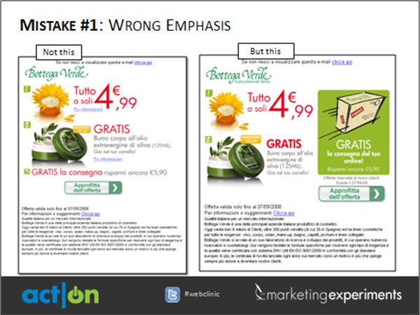
Mistake #1: Wrong Emphasis – Colors can be used to guide thinking by placing stronger emphasis on particular elements and less on others.

If you need to learn more on testing color emphasis, this section of the Web clinic will show you how one organization increased its clickthrough rate 81% by strengthening the communication of its value proposition using color, copy and layout changes.
Mistake #2: Wrong Amount – The amount of color being used can be too much, resulting in the primary objective of your page getting lost in a sea of colors.

To help you overcome the wrong amount of color; this section of the Web clinic features an experiment that shows how a debt consolidation service increased its clickthrough rate 63% by changing the amount of color used to emphasize the call-to-action.
Mistake #3: Wrong Combination – When watching television, sometimes you change the contrast setting to improve picture quality. When webpages have discordant color schemes that hinder thought sequence, visitors don’t change a setting … they simply leave.

The experiment featured in this section of the clinic reveals how an art community offering subscriptions to content was able to increase its clickthrough rate nearly 20% by adjusting the contrast dial on its homepage.
Mistake #4: Wrong Message – When customers associate familiar brand colors with an implied value proposition, the performance of your page can be affected if you’re not testing to determine which colors are associated with your brand in the minds of your customers.

“Tests are designed to fill in the gap between what you know about the customer and what you SHOULD know about the customer,” Flint said.
Mistake # 5: Wrong Flow – Although you may have tested your way into the right color combination, placing the elements on the page in the wrong sequence puts the same problem of underperformance into a new package.

In the last section of the Web clinic, you can learn how a financial organization was able to increase conversion 51% by changing the color flow of page elements.
Related Resources:
How Do Website Colors Impact Conversion? (Slides for this clinic via Slideshare)
MarketingExperiments Web Clinics (Learn more about our Web Clinics)
The 4 Most Startling Marketing Discoveries from 2012: Including the 3 words that changed everything for a top financial product – An invite to our next Web on Wednesday, December 12, 2012
I am terrible at color-for me, the more, the better-so this blog post was very helpful. Thank you, John.
Great stuff. We need to spend more time considering the psychology of visitors. I especially like the last example about the white background separating the call-to-action.
Thanks for the examples. Could use some larger screenshots next time though. 🙂
Great stuff,
Always good ideas that can make a lot of difference for any marketer. Thanks again !
Good post – very thought provoking. How a small change can make a real difference to ROI – I am a great believer in the cumulative effect of small marginal gains.
Just in time! Will be doing some landing page redesigns, so this will come in handy. Thanks!
Excellent article. However, I question the graphical change in number 5 where the people were removed from the image. Did you test this separately from the CTA? Several studies I’ve seen show having a person in the image will actually increase your click-through. I would be interested to learn more about this particular study. Thanks!
Hi Katrina,
Great question. I followed up with some of the research team members that worked on the test and they did not test the specific effect of the people in the banner. The team explained that when they initially assessed the image in test planning, it was determined that the image did not add value to the offer, instead it distracted from the credit card offer which was the main value exchange of the ad so they did not carry it over into the treatment design.
The team’s primary hypothesis was that the presence of fences created confusion and friction that was unnecessary. Ultimately, the result of the treatment was a clickthrough rate increase of 131%.
The senior research manager who worked on the project also offered these thoughts on the additional research you mentioned. “We are constantly reminded that “best practices” for online efforts do not always result in increased effectiveness, and this is why we always test before adopting a new strategy.” I hope this answers your question.
Thanks for the additional information regarding the study and excellent point regarding best practices. My team was just reminded of this today! Thanks again.
Great information and examples. I learn so much from the webinars and posts you offer. I do have a questions about #3. In a couple of Marketing Experiments’ webinars it’s been mentioned no to use dark back ground and light text. I realize the treatment is much better than the control in the example, but was there a reason not to lighten it up for the treatment?
Thanks for sharing, great information details leads to easy understanding of the topic. Learned a lot upon reading your article, Awesome! thanks again.
Here I have got a great information and i think it is very essential for new marketer for planning all about.
Thanks a lot.
Wow, never thought a color could make such a difference…
Small changes, great benefits. With just changing the color, you can improve the landing page.