Optimizing Web Forms: How one company generated 226% more leads from a complex web form (without significantly reducing fields)
The following research was first published in the MECLABS Quarterly Research Digest, July 2014.
It has long been an axiom of mine that the little things are infinitely the most important.
— Sir Arthur Conan Doyle, A Case of Identity
It is highly unlikely that Sir Arthur was contemplating website forms when making the above statement. However, the sentiment certainly translates to our digital world, and is spot on in the case of web forms. Web forms might not elevate your heart rate, but these mundane little segments of your website actually contain some of your best opportunities to increase conversion.
In marketing, “friction” is anything that slows down the mental momentum that is driving the customer toward a buying decision. Web forms are essentially the definition of friction. By nature, people are wary of sharing their personal information. Asking them to enter that information requires two commitments from them:
- To decide if your offer is valuable enough to give out their contact Information
- To then take the time and effort to fill out the form
So to some extent, web forms cause mental and physical friction.
This is widely accepted. Most optimization strategies focus on reducing friction to increase conversion. This is worthy, but could there be a different approach? A strategy that is ultimately more effective? We ran a test to find out.
Experiment: Can form friction be negated?
The experiment, Test Protocol 1636, was conducted in partnership with a large news syndication company. The goal was to increase the number of leads the company received from a “Request More Information” web form. The form itself was not a core cog in its lead generation process, but the form received enough traffic to run a valid experiment.
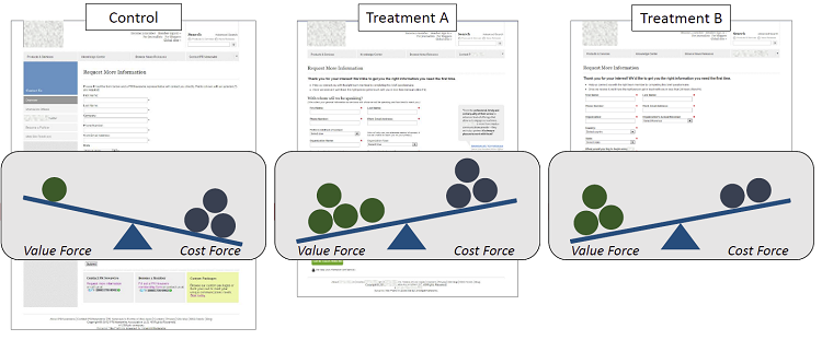
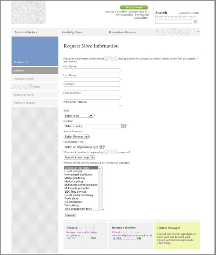
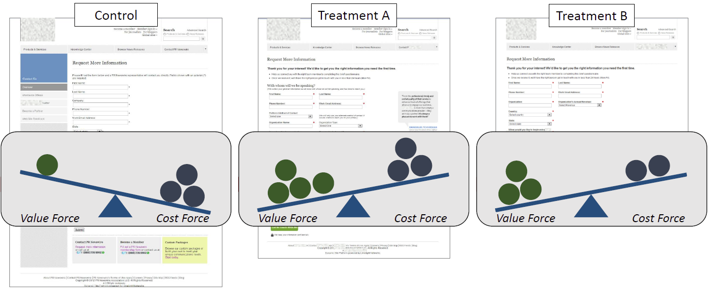
The control form, as seen in Figure 1.1, contains 11 form fields, with 10 being required. It also features sidebar navigation and three equally weighted calls-to-action at the bottom of the page. We ran two treatments against this page.
Figure 1.1 (Click on images to enlarge)
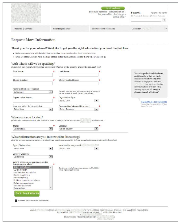
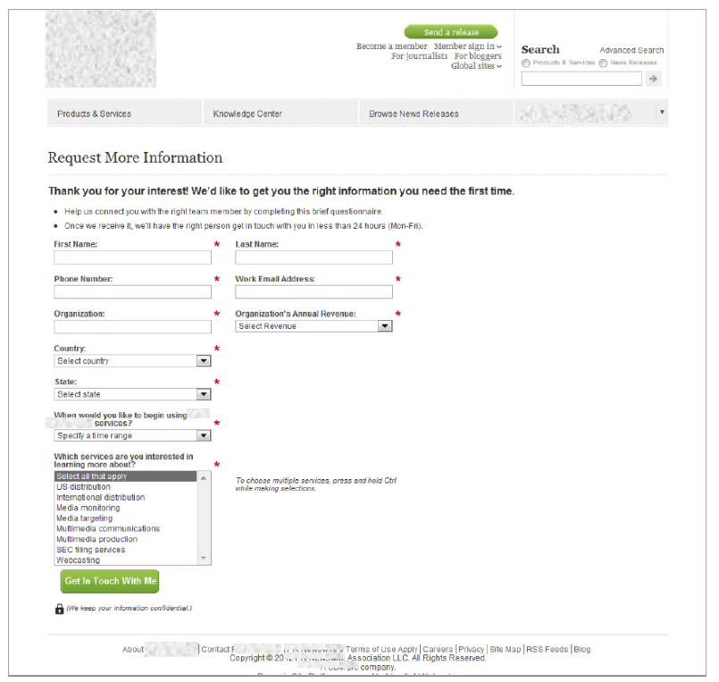
Treatment A (Figure 1.2) eliminates the navigation and calls-to-action, but it also increases the number of total form fields to 15 — nine required ones. In Figure 1.3, Treatment B is similarly designed, but reduces the total number of form fields from 11 to 10, all of which are required.
Figure 1.2
Figure 1.3
Did either treatment improve the lead rate? If so, which treatment?
Both treatments outperformed the control. Treatment A produced a 109% lift, while Treatment B generated 87% more leads. Clearly, removing the side navigation and distracting calls-to-action were major contributors to the treatments’ successes, but when we further examined the test metrics, we discovered two puzzling and fascinating anomalies.
Web Form Anomalies that Impact Conversion
Anomaly #1. While Treatment A contained six optional form fields, every prospect who landed on the page filled in every field — without exception.
Marketing intuition, and prior testing to some extent, trains us to assume that every additional form field decreases the probability of a prospect completing the form. Conversion rate decreases for every extra field you add. We know this, but now the data from this experiment stares us in the face and causes us to ask a simple question: Why did everyone who saw this form fill out every field, even the optional ones?
Anomaly #2. Even though both treatments outperformed the control, there was no statistically significant difference when we compared Treatment A to Treatment B.
The results conclusively showed the treatments both performed significantly better than the control.
However, when compared to each other, the treatments performed in a statistical dead-heat — we could not declare a winner. This raised another simple question: Why did the higher number of fields (more friction) not affect conversion rate?
Getting Higher-quality Leads without Sacrificing Conversion Rate
When we first began to analyze the control, we considered the objective of the form, which was to set up a phone call between the prospect and the business. Our analysts hypothesized that by helping the customer through the form, we could set an expectation for a productive in-person conversation. This led to the design choices you see in Treatment A (Figure 2.1). The tone of the copy is conversational, and at each step of the process, we ask a question that both personalizes the form and explains why the information is being sought from the prospect.
Figure 2.1
The result of this tone change is that the questions actually helped to reinforce the value proposition of the phone call the prospect was being asked to set up.
With whom will we be speaking?
(We collect your general information so we know with whom we will be speaking and how best to reach you.)
Where are you located?
(We collect information about your location in order to route you to the appropriate [company] representative.)
What information are you interested in discussing?
(In order to make our conversation as productive as possible, we would like to know a couple of pieces of relevant information.)
The last question in particular was a key factor in building value. By explaining what they wished to discuss, prospects began to visualize the conversation and see themselves receiving the information they needed. This section consisted of the new optional fields added to the control’s form fields.
Fascinatingly, we increased the cost, in the minds of prospects, of filling out the form in Treatment A by adding form fields, while we decreased the cost in Treatment B by eliminating the optional field, as you can see represented in Figure 2.2. Yet, we generated the same lead rate on both pages because the value offered in Treatment A outweighed the value in Treatment B, as seen in Figure 2.3.
Figure 2.2 – Cost force
Figure 2.3 – Value force vs. Cost force
By guiding the visitor through the form and increasing the process-level value proposition, we were able to counterbalance the additional friction in the form — capturing higher-quality leads without sacrificing quantity.
How to Increase Conversion on Your Own Forms
In a bubble, this is an interesting case to study. But what does it mean for your own web forms? We uncovered three key principles to help you in your efforts.
Key Principle #1. Every action a customer is asked to take — even completing a form field — creates a psychological question in the mind of the customer: Is this really worth it?
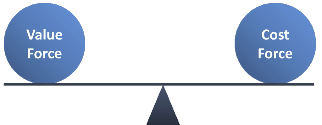
It’s a weighing question – that’s what the fulcrum represents in the Value Proposition Heuristic (Figure 3.1). Is the cost greater than the value? Is the value outweighing the cost? Those are the questions the customer is asking.
If you can start seeing and breaking down your pages by cost and value, then you have a lot of control as a marketer.
Key Principle #2. Thus, optimizing web forms transcends simply reducing the number of fields. We must ensure that we build the right amount of value to offset the cost. Sometimes, the right “ask” at the right time can actually imply value.
The way we present and communicate the “ask” can greatly impact how prospects interpret the amount of value. By communicating the benefits prospects will experience by answering the questions, we can offset the cost of giving up that information.
This resulted in two positives for this experiment. We could ask more questions without hurting conversion, and this, in turn, led to higher-quality leads.
Key Principle #3. Finally, we must see through our customers’ eyes. Our prospects personify our forms. They give them a tone, a voice, a personality. It is more than a transaction; it is a conversation — a conversation that you must guide.
How do we see through our customers’ eyes? We can’t think about our products and services in a company-centric manner. We should go through our checkout processes and fill out our forms as if we are the customers. Experience the experience of the customer. Only then can we engage them in meaningful conversation that will guide them in a way that makes sense.
When you begin to see your web forms through the lens of a conversation, rather than a transaction, you will immediately be better equipped to communicate value to the prospect. When you communicate value, you might actually increase cost and friction in the mind of the customer by asking for more information, and still keep your conversion rate the same.
If you are ready to tackle your forms and gain more leads from the traffic you already have, we have provided a seven-question checklist to get you started:
- Does my form gather the information my company needs?
- Can I reduce the number of required fields?
- Should I increase the number of required fields for a higher-quality lead?
- Can I group similar form fields and reduce the perceived length of my form?
- Is there a justification (direct or implied) for why each field is presented?
- How can I increase the perceived value of every field in my form?
- Does the form logically guide the visitor through the process of filling it out?
NOTE: We took the discovery we made in the “request more information” form and were able to export it to another part of the site. With only one testing cycle, we were able to achieve a 226% lift in lead rate.
Related Resources
Learn more about friction in the MarketingExperiments web clinic replay, Hidden Friction: The 6 silent killers of conversion
Review the methodology MECLABS uses when running tests for Research Partners
Learn about online testing and how to run a valid experiment in the MECLABS Online Testing Course
See how testing form field length reduced cost-per-lead by $10.66
Learn how optional form fields can affect form completions in the MarketingExperiments web clinic replay, Do Optional Form Fields Help (or Hurt) Conversion? How one required form field was hindering a 275% lift in conversion:
Read this MarketingExperiments Blog post to learn more about process-level value propositions, as well as the three other essential levels of value propositions:
Discover seven ways to reduce the perceived cost of lead generation offers


