On a webpage, the visitor experience begins and ends with the slightest movement of a finger. Potential customers can terminate our existence in a matter of seconds when first arriving to our website. Getting a new visitor to not only stick around for more than seven seconds, but to actually take an action can be like ice skating up hill.
But this is nothing new for most of our blog readers out there, and today we would like to test your marketing intuition on a landing page experiment we recently ran with one of our research partners (and like last time there will be a prize).
Background: The company we were working with provides end-to-end market solutions for small- and medium-size businesses. As you will see in the pages below they offer access to mailing lists and leads. The page we tested received most of its traffic from PPC ad campaigns using more “generic” search terms. Its primary objective is to generate as many form completions (or leads) as possible.
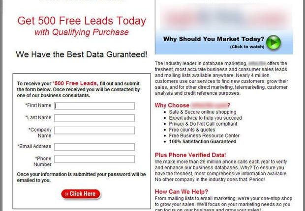
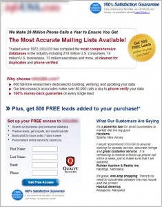
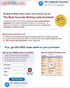
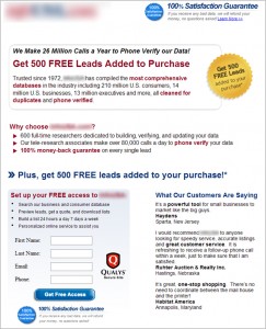
Test Design: This was a simple A/B/C/D multi-factorial test focused on strengthening the communication of the value proposition. Here are the page versions (click to zoom in):
Control: Treatment 1:
Treatment 2: Treatment 3:
Results: So now that you understand the experiment background and have seen the treatments, can you spot which page performed the best? Before we reveal the results, here’s a chance to test your own marketing intuition (one person’s intuition will get them a chance to have their own landing page optimized live by Dr. Flint McGlaughlin on today’s web clinic – normally priceless).
1. Which page generated the most form completions?
- A. Control
- B. Treatment 1
- C. Treatment 2
- D. Treatment 3
UPDATE: Treatment 1 (option B) was the winner. It performed 201% better than the control. Congratulations to Flavio from Q-11.de, the only correct response we received. Subscribe to the MarketingExperiments Journal to be notified when the web clinic replay and research brief are available so you can see the correct answer, the results of the other treatments, and how these experiment can help you shape your own marketing campaigns.



I’m going to try for Treatment 2 – C, but I’m not ready to submit my page for review just yet.
I like the “see an actual prospect list” feature – I might try that!
Thanks for all you do guys.
Drew
Good test…tough one between B. Treatment 1 and C. Treatment 2
C. Treatment 2
I’m going to try for Treatment 1 (that is option B), but I’m not ready to submit my page for review just yet (April 2010)
Thanks!
Flavio
I’d say treatment C — seems the strongest with the least friction.
No page to submit now.
I’d vote for Treatment 3 as there are more graphic elements to the overall page design, making the text copy and calls to action stand out more. Would also hypothesize that users going to click on the prospect list (cool feature btw that would help draw them down below ) and would be preciptiously close to the fill-in form to the immediate left as they go to execute the action, thereby increasing the chances of their form-filling, aka your goal. My logic is impeccable and – alas- possibly impeccably wrong! [ No landing page to review right now ironically- gladly will be ready should opportunity present!]
My coworkers and I looked at this and the consensus is Treatment 2. We think people would like to see a sample report before filling out a form. (happy to provide a landing page for review if/when we win 🙂 ).
I would go for C treatment 2 as the best. I like the idea of seeing a free sample.
I think treatment 2 because the buyer gets a chance to see what the prospect list looks before purchasing it.
Treatment 2 is the best choice. A peek at the actual list would sell me.
My guess goes to D as in treatment 3, althought all options have good elements. You guys may want to try MVT on this, it is landing page testing on steroids.
Do you have any statistics to support the 201% better statement? I’d like to know how long the test was run, as well as how many chose option B vs C, D, etc…
Rex
Great question! We addressed this question during the web clinic when we did a deeper analysis of the experiment. However, to answer your question here, the Control conversion rate during the test period was 4.86% and the Treatment 1 CR was 14.65%.
And as you probably know, the mathematical expression for computing Relative Percent Change is: [(Final – Initial) / Initial] which in this case translates to [ (14.65% – 4.86%) / 4.86% ] = 2.0144. Rounding and formatting as a percentage yields a 201.4% relative difference between the Control and Treatment.
Also, to answer your question about duration, I checked with our Director of Sciences, Bob Kemper, and he reported the test ran for 20 days during September-October and the improvement in Conversion Rate validated at the 94% statistical Level of Confidence.
Hope this helps and let us know if you have any other questions. You can also get the whole clinic here: https://www.marketingexperiments.com/improving-website-conversion/claritytrumpspersuasion.html
Thanks for the concise response as how you came to the 201% conclusion! Also thanks for explaining it as a Relative Percentage Change. We’d love for you to upload the results to our http://www.abtests.com/ site! Any chance you could do that?