

So often, beautiful design gets trumped by marketing objectives – and rightly so from a marketing perspective. The graphical elegance of a Web page might be worthy of an art exhibit, but if it doesn’t sell anything but “oohs” and “ahs,” what service does it really provide to anyone?
True, but it is at this point that we tend to divide. It’s them or us. Are you a marketer or a designer? Whose side are you on? As one popular design blog analyzes its relationship with marketing, “You can spell ‘team’ from the word ‘marketing,’ but I’ve yet to see a sense of it in marketing.”
But I think we (marketers) can and should live in both worlds. I believe design can be done in such a way as to actually contribute to the perceived value of an offer without being a distraction. I think marketing, whether they can measure it or not, is leaving money on the table when design is viewed as optional icing on the cake. Yes, I have a dream…
But, feelings aside, we must always default to testing – not our gut instincts. And so I was glad to see a recent experiment bring a little shimmer of hope to those of us who long for the day when these two often opposing worlds come together.
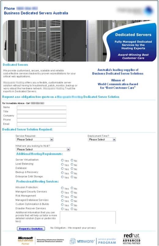
The Original Page (click to enlarge)

The original page was for an Australian company that offers dedicated hosting solutions. The primary goal of this page was to get the visitor to request a quote. These quotes were essentially leads that were then followed-up with and nurtured.
Nathan Thompson (who happens to be making his debut appearance on today’s Web clinic) was the key researcher for this page. Upon analysis, he identified the following three conversion threats:
1) There is significant friction due to the volume of questions (many unnecessary) posed in the form.
2) There is not enough value being communicated with headlines, images, copy and CTA.
3) The overall low aesthetic quality of the design may be creating anxiety as to the actual capabilities of this company.
Of these issues, number three stood out as the most interesting hypothesis and I was eager to see the treatments he would put together to address this issue of design-induced anxiety.
The Optimized Page (click to enlarge)

The page that Nathan and the team created:
1) Significantly reduced the form fields required on the first step from 20 to four.
2) Removed distracting banner images and strengthened the visibility of the headlines to better communicate the value.
3) Included a six-point expandable/interactive display of value proposition copy.
4) Added testimonials and cleaner, more modern images.
5) And then, finally, Nathan and the team focused on creating a more aesthetic design in order to improve the perceived credibility of this company. The thought was, if you are a business looking for a company with professional online capabilities, then a more professional design would generate better response. Let’s now go to the numbers.
The Results
Well, as the title reveals, the results of this newly designed page were significant. The new page outperformed the control by 188.46% with a statistical confidence level of 95%.
There are so many things that can be said about this test, and we will be drilling down much deeper on this experiment and others on today’s web clinic, but what is most notable to me right now is that the more graphical appealing page was the clear winner. This is different than what we have seen in past experimentation.
Now, we cannot forget that this is a radical redesign, multi-factorial test. There are many factors here being tested at once, and no doubt the results reflect that. But, with that said, all of these changes did happen within the context of a purposefully and strategically more aesthetic Web design. That’s noteworthy in my book. And for those who often feel the tension between marketing and design, it’s my peace offering for today.
What do you think?
Is this page more aesthetic or am I being too kind? How would you improve it? Did the more aesthetic design actually contribute to conversion or was it the other elements being tested?
Related Resources:
TODAY’S WEB CLINIC: Optimizing Landing Pages: The four key tactics that drove a 189% lift
The Creative vs. The Marketing Team: Yin And Yang, Oil And Water
Online Marketing and Advertising: How your peers provide and communicate value to customers
Nice improvement !
However I think that this test makes too many changes to make the statement that the design distract the potential customers.
From my experience, just changing forms from 20 to 4 fields can make a huge difference in conversion.
Still, I agree that you did improve this page a lot.
Yannick
Yep, no doubt reducing the friction in the form length contributed mightily to these results. I may be optimistically giving too much credit to the design.
Good point and great thoughts.
Thanks for the feedback, Yannick.
As you’ve pointed out the success of this redesign is not just down to the hefty reduction on the form, they’ve also used some tried and tested persuasive design techniques within the copy. The strapline at the top “Australia’s most trusted & Accredited”, the 6 bullets referring to customer service and using words such as “guarantee” and “flexibility”, the testimonial and not forgetting the phone number.
All add hugely to gaining user trust, as well as only asking the must have questions.
Great redesign.
Yes, I’m with you Sarah. I think both the reduction of the form and the design elements you mentioned all worked together to get the increase.
Unfortunately, this test isn’t enough to determine the direct impact of each change, and we are left somewhat to educated speculation. Hopefully, further tests will give us more insight on the effectiveness of each design change.
Thanks for your comments.
I love the treatment of the headline and the spacing throughout. Didn’t you say in your #webclinic to backup claims such as “Australia’s Most Trusted and Accredited”? Anyone can make this statement correct? How do you separate yourself from your competition? Could this subhead be stronger in pointing out factual claims?
Yes, statements that use the words “most” are usually met with skepticism if you do not back them up. Nick, You are dead on. this headline could be doing a better job of including quantitative info rather than qualitative.
Now to the the team’s credit on the design of this page, they do a fantastic job backing up this claim thoroughly in the copy with statements like, “We have the highest level of global accreditation. We are the only data centre to hold the ISO27001, AS/BS7799, SunTone, RedHat, ASIO and DSD certifications,” and the statement “XXXXXXXX is the world leader for customer care, winning the World Communication Award for ‘Best Customer Care.'” Pieces from both of these statements might have made the headlines more credible.
Great observation. We might walk away from this test thinking we have found the best page. But even a great test like this can be shot through with conversion leaks. Test on.
Thanks for the comments Nick. Hope to see you on more clinics.
The only way to know for sure if the design has any impact into conversion would be to create a version of the landing page with the same same copy but using the “uglier” design and then split test them.
I think you did a great job. I also liked the fact that you added a person on the page. Psychologically this has a big effect even when you are not aware of it I worked on redesigning a web site content redo and to some degree I was allowed some input on design (tooth and nail on that) but definitely all your changes worked to the better so kudos to you. I had one question, many know blue is the trust color, red the power or passion color, was there a reason you did not expand the color palette as another element in the design? I am trying to figure out optimal number of colors and what they are,(3?) when not limited by the colors in a company’s logo which has to be present throughout the pages for consistent branding.
I’m with Nick. There’s no way to tell if it was the copy, the design, the waaaay shorter form. The bright blue button…
However, a 189% increase in leads is quite a jump. So this is one of those times you say “it doesn’t matter what caused the jump” and move forward with testing against the new control.
Cool stuff, either way.
When you say today’s web clinic – don’t you mean the web clinic on Sept. 22nd? or is there a mistake in the dates and that clinic on homepage design is today??
@wendy james
My post was originally published on August 11 and was referring to this web clinic: https://www.marketingexperiments.com/site-optimization/optimizing-landing-pages.html
Sorry for any confusion.
It would be interesting to know the initial conversion rate & the resulting conversion rate. Does the conversion rate increase stand up when more marketing is applied to bring in more traffic? Great review!
This is a fascinating case study, thanks for sharing. Since you’ve now made a “a six-point expandable/interactive display of value proposition copy” as part of the new version, I think a fascinating idea would be to track the individual clicks on each expandable section (doable through Javascript, I imagine), to see whether there is a correlation between people clicking any of them, and then filling in the form (and going on to buy).
At the very least, you could pass the data on which ones were clicked to your follow-up team through the form, giving them a bit more knowledge about the prospect’s true “hot buttons”. In addition, you’ll gain even more data about what visitors are particularly interested in.
Just an idea. If they’re clicking on something, it would be great to track those clicks.
@Judith Copeland
We haven’t ever seen any color-emotion associations in our testing, but we do know that colors can effect response and must be tested.
There is no clear cut answer about the limit of colors you should have on a page. Really, color should be used strategically to direct the visitor’s eye-path to important elements on a page. The way color works is relative. If everything is black and white except a bright red headline, the headline will get attention. This is helpful tactic in calling out things of importance.
But keep in mind that it can be a double-edged sword if you have too much color. If everything is emphasized… then really nothing is emphasized.
@Paul Hancox, PresellMastery
Paul, that is a really good idea. Click tracking can be a very valuable tool for understanding the motivations of your visitors and yet not many people utilize it.
For this test, Nathan did design the page to specifically track this data, and I hope we see some future tests that integrate the secondary info we collected about visitor motivations during this test.
But you bring up a really good point that I didn’t in this post. Thanks.
Austin,
Great case study but I have to agree with many previous commenters that so many things changed it would be a real stretch to pin the improvements on the “aesthetics”. For example, it appears the the headline and copy are far more benefit driven and for certain the reduction in “form field friction” had a positive impact. Nonetheless, the improvements point out that direct response marketing principles cannot be ignored in landing page design and that split testing is always a good idea… no matter how certain you are that your original design is a winner.
Ugly works and so does ugly bold colors – lol. My site is about as ugly as it gets. I could probably tweek it a bit – but it goes to your point about “asthetic design”..I will take conversions over pretty anyday…Great post..
Robert C – The Wholesale Products Guy
@Austin McCraw
I agree with Judith that positioning a person next to the form area was a nice design element – connecting filling the form out with connecting to a person. And as we know from all SM sites, the next comment should have the user’s face on it to make it more likely they’ll visualize themselves making the comment – so the readers could be the person in the picture in charge of a succesful servers bank.
As pointed out before the main change in response must be due to the # of fields (as well tested/documented I should think).
Reps like information on leads, but mainly they just need more leads, right? At the same time, the drastic elimination of all “what are you interested in” questions seems like it could go too far…What about a drop down under the 4 fields that is optional for the person to submit a category that he wants to be contacted about (with a choice of <5 options)….it would be interesting to test this creative with that additional option to see how much more it can be pushed.
Next time to test a new design for a page like this – go for two designs same number of fields as the current one and one with the one more field?