I’ve come across some beautifully designed 404 pages over the years. However, once the one second of artistic appreciation ends, I’ve been left confused and lost. The designers of those pages, whether Web designers or marketers, missed a great opportunity.
Your 404 page should have two objectives:
- Notify visitors they’ve encountered a problem of some sort while landing on the page they wanted
- Guide the visitor to what they wanted or to something else of value
A 404 page doesn’t have to be a dead end, or even a “Go to [Homepage]. Do not pass Go. Do not collect $200” card. It can be a user-friendly and functional page. It can have a greater purpose.
Read on to learn six tips to creating more effective 404 pages. You’ll also see “Not this, But this” examples demonstrating the tips.
Consider this blog post a creative swipe file of 404 pages, if you will.
Reduce Friction and Anxiety
Tip #1. Establish where visitors have landed
Not every visitor on your website who lands on a 404 page will have come from somewhere else on your site. When another site links back to your website incorrectly, or with an expired link, you potentially have visitors who are brand new to your site.
If your 404 page provides no way for new visitors to know where they are, chances are they’re going to press the back button never to be seen again. You just lost an opportunity for a new customer or reader. On the same note, if you provide no useful link for them, the back button is where they’re probably going to go.
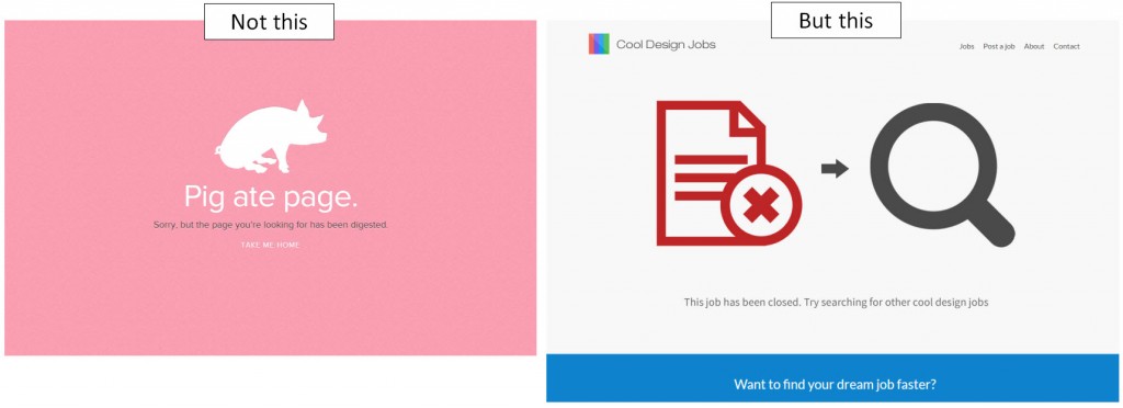
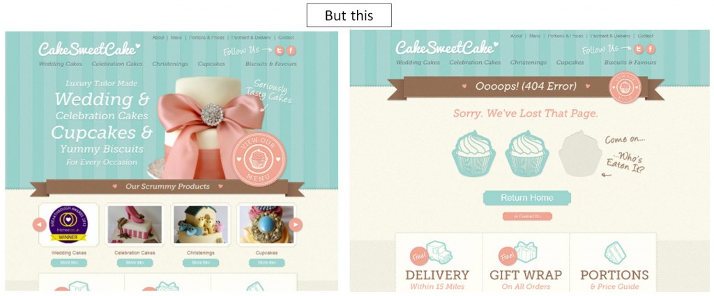
The “Not this” page gives me nothing. Am I on a farm page? A livestock for sale website? A personal site for someone who really loves pigs? I have no clue based on the webpage.The “But this” example keeps its logo in place so visitors immediately know where they are. The copy of the page also gives clues as to where they are and what they can do on the site, even on the 404 page.
When visitors land on a new page, they need to be able to quickly orient themselves. In just seconds, they must be able to answer the question: “Where am I?”
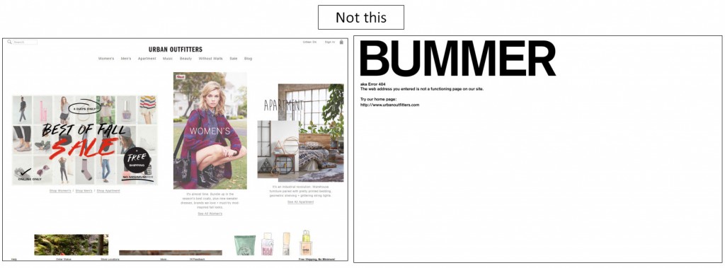
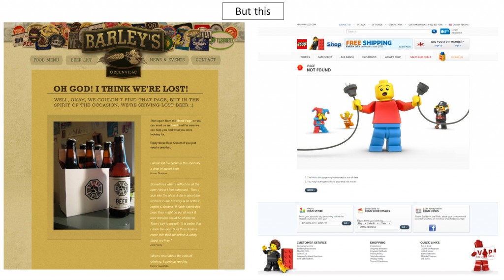
If your 404 pages greatly deviate from the design of the rest of your website and your company branding, visitors may feel even more lost.
The brand website is listed at the bottom, but without the company logo, there’s no way to instantly know where you have landed.
Even if you land on the 404 page from another site, you instantly know where you are on this page.
Tip #3. Make sure your error messaging is clear
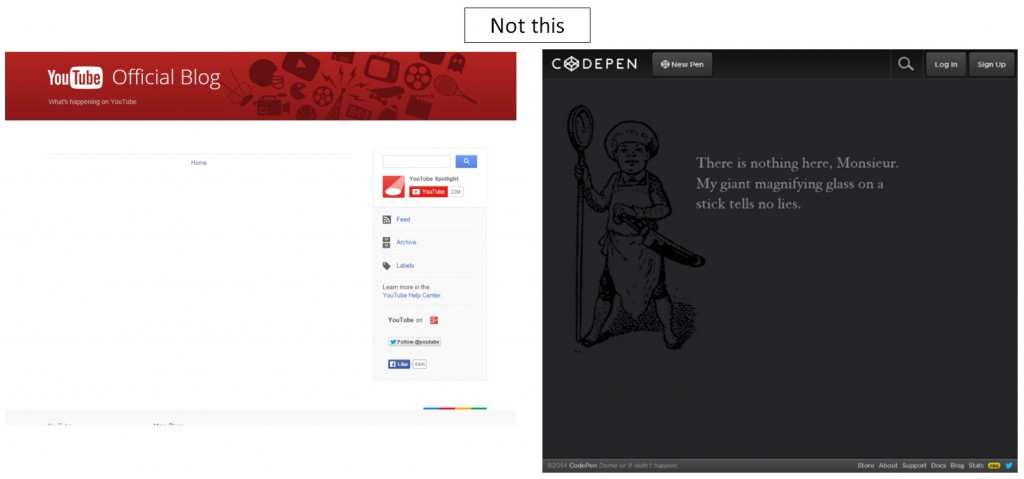
In addition to recognizing the site they’re on, visitors should also be able to immediately determine they have landed on a 404 page. They are already not where they want to be; don’t make them figure out a puzzle.
It doesn’t take much, yet some sites don’t include any copy or clues as to what has happened. Others require more than a quick second to conclude the problem they’ve encountered. A clear message doesn’t require “404 Page Not Found,” though that message does lend itself to quicker understanding.
Add Value to Guide Visitors
Tip #4. Provide how-to steps to find the correct page
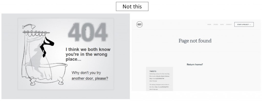
Now I know I landed on 404. I know which site I’m on. Now what? What should I do next? Many 404 pages present only one link: home. However, depending on your site and what they’re looking for, that could be just as much of a dead end, or perhaps way too many choices. Either way, leaving your site might appear to be the easiest course of action for a lost visitor.
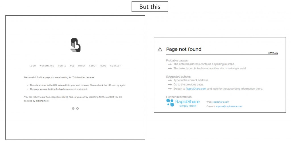
The first one leaves me wondering what’s behind the door. I mean, come on. I’m already lost, and now you want me to click a link to a mystery place. The second one is not much better. You tell me where the link will go, but you ask it like a question. If you don’t know where I should go, then how should I know?
Both of the above examples provide possible causes for why visitors are finding themselves on the 404 page. They also provide actions visitors can take to find what they were originally looking for.
Tip #5. Present valuable alternative content
When visitors land on a 404 page, we don’t know what their motivation level might be. If it’s low, the mental cost of searching for a specific page like a needle in a haystack might have them retreating from your site. For those people, providing them alternative content right on the 404 page could decrease that friction enough to keep them on your site.
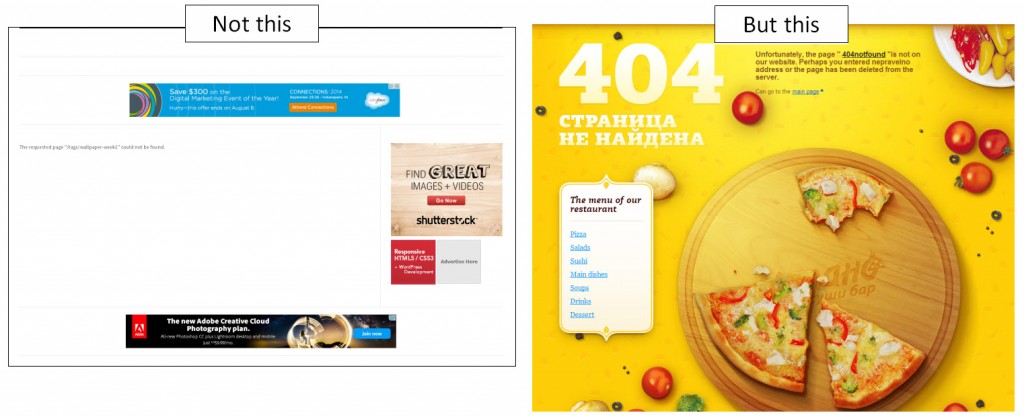
Look at the “Not this” example. The only clickable content on the page are ads that will take visitors away from the site. This basically leaves visitors with two options: leave the site and go the site of one of the ads, or leave the site through the “back” or “close tab” buttons. Either way, they’ve left your website.
The “But this” example provides a sub-navigation for the menu. That’s a type of content that visitors to a restaurant’s site would logically find useful.
What are some ways to provide content? Provide or link to:
- Recent or popular blog posts
- Popular products
- Product categories
- Sitemap
Tip #6. Offer a way to report the error
Sometimes visitors land on the dreaded 404 page due to a mistake in their own typing of the URL. However, oftentimes, the fault does not rest with the visitor. Promotions end and products are discontinued. We could decide to send those pages to 404 pages, or we could instead consider redirecting those pages.
Other times, the link is simply broken. Those require a fix, and asking visitors to help point out those mistakes will resolve errors much faster than finding them internally.
Then you have the times where the fault is not with the visitor or with your website. Links from other sites could be incorrect, and potential new customers could be lost when faced with the 404 page. With the help of visitors, these incorrect backlinks can be solved and conversion secured.
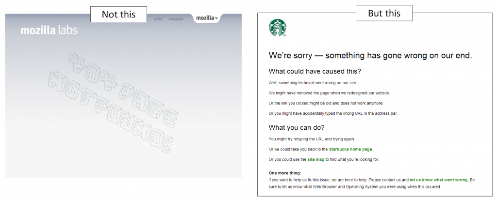
Mozilla provides visitors with nothing but a page telling them where they are, and even that could be difficult for some to read.
On the flip side, I think Starbucks’ 404 page has accomplished this list pretty effectively. The logo immediately tells me where I am, and the headline tells me what kind of page I’m on. They also offer up action items I can try. Then, they present visitors with the chance to help with the problem. It’s a simple page, but it achieves what it needs to do without friction or distractions. It informs visitors where they are and guides them to the appropriate actions they should take.
Just remember to keep the true objectives of a 404 page in mind:
- Notify visitors they’ve encountered a problem of some sort while landing on the page they wanted
- Guide to what vistors wanted or to something else of value
With these objectives as your guiding points, your 404 pages will better serve visitors.
You might also like
Customer Motivation: 3 steps to help you stop thinking like a marketer [More from the blogs]
Landing Page Optimization: Addressing customer anxiety [More from the blogs]
Hidden Value: What buried treasure are you ignoring in your marketing? [More from the blogs]


Such a nice post on 404 error pages you have shared here, thanks a lot. As 404 error optimization is a significant part of on page SEO so this post covers all the aspect of designing a user friendly as well as search engine friendly custom 404 page. It will not only give the right and meaningful information to website users but the search engine crawlers also so it can recognize important pages to index as well.