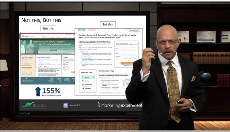
Navigation is often considered a core element of website usability.
If you routinely put navigation on every single page of your website, you will likely be shocked by one of our recent discoveries …
You can watch the full free Web clinic – “The Usability Myth: 4 surprising discoveries we learned after testing the most common usability principles” – to hear Flint McGlaughlin, Managing Director, MECLABS, explain three other surprising findings from our optimization testing and experimentation.
Our goal is show marketers key principles that can be used as a framework to aid usability and optimization efforts.
Related Resources:
Web Usability: The Squint Technique and other insights from your peers
Landing Page Optimization: What would a 1% conversion rate improvement mean to your marketing ROI?
Copywriting: Long copy vs. short copy matrix
Marketing Optimization: 10 resources to help your online testing efforts


John, thanks for posting this. Interesting experiment and data – while navigation has always been framed as a tool for the user, you’re re-defining it as a tool for the vendor to drive the user toward a conversion. Fascinating concept.
Agree with everything said, but something has always puzzled me: the “keep the visitor on the product page, don’t let him get away” is contradicted by the ‘recommended products’ links that ecommerce sites employ. You’d think that an ecommerce site would be interested in selling the stuff the visitor is looking at, instead, they offer (look at ebay or any big online store) 3-5-20 alternative products… Seems like they’re more concerned with the visitor bouncing than making the sale… hoping the visitor will buy something if s/he looks at enough products…
Interesting point, Zsolt. I think the ultimate answer is to test to see what works best for specific types of products.
But here’s my hypothesis. It depends on the conversion funnel.
When customers are looking at similar and slightly differentiated products, and are finding it through a general search for a product type, the recommended products links likely helps. These people are likely “tire kickers.” They’re looking for a cell phone, but aren’t sure whether to get the iPhone or the Android, etc. I think this would go along with what Flint said about “customers moving towards an offer.”
However, when you have a focused conversion goal for a product — like in the test examples, it is a free trial offer for a specific product. Or it’s a search, email, or ad for a specific product and model number, focusing on conversion for that product alone (and not including recommended products) would likely be most effective.
But again, just my hypotheses, you would have to test, as the performance would likely vary by the unique motivations of different audiences shopping for different types of products. And to be clear, the overall goal of this blog post isn’t to say never, ever have other links on a page. Rather, it’s too challenge the dominant paradigm, and really question if those extra links are even necessary. For example, here’s another test that saw a 19.95% increase in revenue per visit to the checkout process by removing links — Less is More: Maximize conversion by removing website distractions
While we’re on the subject, one other thing you can do is extend the product recommendations beyond the website into the email, like in this case study — Email Marketing: Jewelry retailer integrates product recommendations into email campaigns to lift opens 9%