

“Start Free Trial” | “Get Started Now” | “Try Now”
One of the above phrases reduced clickthrough rate by 26%.
DON’T SCROLL DOWN JUST YET
Take a look at those three phrases. Try to guess which phrase underperformed and why. Write it down. Heck, force yourself to tell a colleague so you’ve really got some skin in the game.
Then, read the rest of today’s MarketingExperiments Blog post to see which call-to-action button copy reduced clickthrough, and how you can use split testing to avoid having to blindly guess about your own button copy.
How much does call-to-action button copy matter anyway?
The typical call-to-action button is small. You typically have only one to four words to encourage a prospect to click.
There are so few words in a CTA. How much could they really matter?
Besides, they come at the end of a landing page or email or paired with a powerful headline that has already sold the value of taking action to the prospect. People have already decided whether they will click or not, and that button is a mere formality, right?
To answer these questions and more, let’s go to a machine more impressive than the Batmobile … to the splitter!
A/B/C/D/E split test
The following experiment was conducted with a MECLABS Research Partner. The Research Partner is a large global media company seeking to sell premium software to businesses.
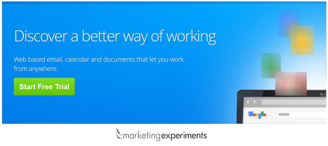
The button was tested on a banner along the top of a webpage. Take a look at that banner below.

Five different text phrases were tested in that button. Since I’ve already teased you on the front-end, without further ado, let me jump right into the findings.
Results

Those few words in that teeny little rectangular button can have a huge impact on clickthrough.
As you can see, “Get Started Now” drove significantly more clicks than “Try Now.” Let’s look at the relative changes in clickthrough rate so you can see the relationship between the calls-to-action.
“Try Now” reduces clickthrough rate by 26%
As you can see, while “Try Now” reduced clickthrough rate by 26% versus “Start Free Trial”; “Get Started Now” increased clickthrough rate by more than 11%.
Did you guess correctly?
An even better question is …
Why guess when you can test?
Subtle changes in words can make a significant difference in performance. By split testing, you can discover the words that will work best for your unique audience and your unique products. More importantly, you can mitigate negative results, like a 26% drop in clickthrough, from these subtle changes by understanding their effect in a controlled environment.
I’m glossing over the real question you want to know the answer to, I know.
Why did “Try Now” and “Get Started Now” respond so radically differently?
For the answer to that question, my colleagues Austin McCraw and Jon Powell taught an entire Web clinic about call-to-action effectiveness, and you can watch the free video replay of that clinic. In 44 minutes and 56 seconds, they’ll teach you five principles for increasing customer response to calls-to-action.
You may also like
Web Optimization Summit, May 21-23, New York City
Conversion Optimization: 3 keys to a successful call-to-action you can learn from childhood
Marketing Analytics: 4 tips to boost confidence in your analytics reporting
Analytics: How metrics can help your inner marketing detective
Thanks for sharing Daniel. It’s interesting (and good) to see that offering something for free can be beaten by something as simple as prompting for an action with “now” to create a little sense of urgency and immediacy.
On another note, I’m curious how the headline would affect clickthrough. The current headline does give “get started now” more weight so to speak, you want to “discover a better way of working” now. But if it gave more weight to a free trial, my guess it would increase that CTA’s clickthrough rate. So maybe it’s not the CTA alone that increases clickthrough, but a combination of a headline and a correct CTA to allow user to act on that headlines value.
What did you use to conduct the split test?
Hi Jon,
Thank you for your question! MarketingExperiments is vendor-neutral so we cannot reveal that information. However, this blog post features some advice from Senior Research Manager Taylor Kennedy, here at MECLABS, about free and open source tools to help you test: Testing and Analytics: What’s stopping you from testing?
-Erin Hogg
Copy Editor
MECLABS
I agree with Viktor. It is interesting to see a “free” CTA as the runner up. Very useful. Thanks for sharing
@Erin Hogg
Erin, Thank you for responding!
At the risk of cliche, I wonder how much of the response rate in this particular example had to do with a conscious or unconscious aversion to the term “Try” as it relates to anything in the business/marketing world. As so many inspirational authors and speakers have pointed out, framing something in “try” terms is considered comparable to setting it up to fail, as opposed to proactive “Do” terms like “Get Started Now!”. And much more important than inspirational authors and speakers to our shared cultural consciousness – Yoda said the same thing.
“‘Try’ there is not. Only proactive CTA phrases for improved conversion rates there is.” I believe that’s what Yoda said in that movie, verbatim.
Also, I wonder if potential clickers would (again) unconsciously associate something like “Try Now” as lazy and unenthusiastic. If the product or service’s provider can’t be bothered to offer more than “Try Now” (without even the enticement of something Free), what’s their product or service gonna be like and why should anyone be bothered to try it out?
Another reminder that direct, action-oriented calls to action work. Sadly when it comes to buttons, we all too often fit the text to the button, not the button to the text
Was the button size fixed or did it depend on the text length? It seems that the longer the text, the higher the conversion rate. I’m wondering whether the rate might have been higher not because of the text, but because of the button size.
Hey Mirek,
That’s a great point. Based on what I remember from the test, I think we had a previous test that ruled that out.
-Paul