


Product pages are often the moment of decision for a visitor. They may have worked through categories and directories to land on the most relevant product to their needs; or they may have weeded through a sea of search ads to have finally arrived at your page. And now, only one question remains, “Is this product worth its cost?”
Recently, our research analysts were given the opportunity to test varying designs for a given product page. At the end of our experimentation, we had discovered a product page layout that increased revenue by 24%. What follows is an overview of the test and our findings.
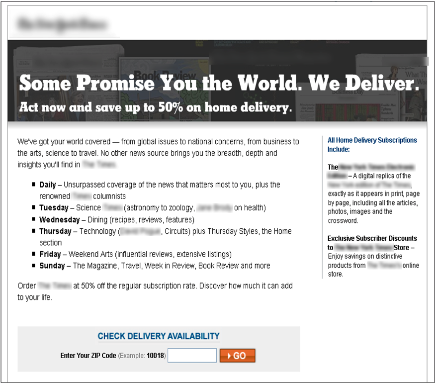
The Original Page (click to view)

 The company we were working with offers financial software in both the B2B and B2C markets. The particular product page we were testing features accounting management software for small businesses. Increasing the amount of revenue generated by the product page was the primary objective of the test and the design was a variable cluster A/B split test.
After analyzing the original page, our analysts identified the following potential areas of improvement:
- Page layout (friction)
- Page copy and images (value prop)
- Product selection process (friction)
However, we also were curious to know not only the best layout, but also the best presentation of product information.
This product could easily have many pages written about it concerning its usefulness and dynamic features, but we wanted to test exactly how much information was needed to make the sale. These potential areas of improvement informed the following treatments.
Treatment 1 – Single column w/ drop-down selection (click to view)
 The first design we tested against the original featured a complete new page layout. It had a simple, single-column flow aimed at decreasing the amount of friction.
Treatment 1 added more copy (intro paragraph with bullet points), and also had a single, strong product image and a 60-day money-back guarantee.
Finally, it utilized a drop-down box for additional product options and add-ons.
Treatment 2 – FAQ long copy (click to view)
 The next design we tested was a another simplified layout, only this time it featured two columns with copy in one column and the call-to-action in the other.
This page was designed to feel like a FAQ page. It is long copy, going through common questions asked by visitors and providing the answers to those questions. Would visitors be more likely to purchase if they were provided more product information?
Instead of a drop-down box, this design used radio buttons for additional product options.
Treatment 3 – Radical tabbed layout (click to view)
 The final version we tested was the most radical of the three approaches and utilized a page layout that organized the information into tabs.
This page also had very strong product imagery in the top banner that included screenshots of charts and graphs generated by the software.
We also removed the additional product options in this version to hopefully narrow the visitor’s attention to the featured product.
.
The Results (updated)
The shorter single column layout product page outperformed the control by 13%. Below is a breakdown of the results. What you need to understand is that by eliminating the competing objectives, simplifying the flow, and adding copy and images that emphasized the value, we were able to not only increase conversion but the revenue per vistor by 23.91%.

But where is the real the gain from this test? Is it just in the numbers – a 24% increase in revenue per visitor? No doubt it is in the numbers, but often, though a test may improve a page’s performance, its greatest gain often comes from what it teaches you about your visitors. This is because the value of customer insights extends far beyond a single test.
In our recent web clinic, “Double the Value of Your Online Testing: Don’t just get a result, get the maximum customer insights”, we discussed the potential impact of a properly established system of interpretation and the three key questions that must be asked of every experiment. Activate your free subscription to be notified when the replay of this Web clinic is available.
.
Related Resources
Double the Value of Your Online Testing: Don’t just get a result, get the maximum customer insights
I’d give my vote to treatment 3 !
I’m going with B
treatment 3 is the most visually appealing – look forward to hearing the results.
Option D – Treatment 3
waiting for result ..
Tough call, it also depends on how much info customers may need and what their preferences and webexperiences are. I’ll make the list complete with option C
I will go with the treatment 3 – Radical tabbed layout.It suits the layout for a product page.
Hi Austin – in the last “Double the Value” webinar, we ran out of time as you were optimizing a home-builder’s landing page. Dr. Flint said you’d share the audience results on the blog. I’ve been watching for this, but haven’t see it yet. Will you be sharing the audience feedback on that page? Would love to hear Marketing Experiments thoughts on that page as well! Thanks!
@Skip Shuda
Skip, thanks for keeping up with this, but you are just going to have to wait a little longer on this one.
The post has taken longer than expected, and is currently hung up in analyst review, but I’ll keep you posted for when it goes live.
Thanks for checking in.
Thanks sharing. I followed the webinar. Interesting.
I would also have gone with #3. I wonder if the results would have been different for a non e-commerce B2B site? People come to my site for information about our products, not to buy them because they are custom and they need to speak with an engineer. Do you have any tests for non e-commerce sites?
Sandy,
Our Research Directory is filled with tests of B2B lead generation sites. Also, here is a recent blog post about a homepage test for a B2B company offering email marketing solutions that might interest you.
Wow! Super surprised by the result. I would have thought T3-Tabbed. The type of industry/product probably affects the results as well (purchasing software vs. information product vs. shoes). By the way, something is wrong with your FeedBurner link – tried to subscribe to the feed and it didn’t work. Just a heads up!
Thanks for letting us know about the FeedBurner issue, Holly. We are aware of the issue and working on a fix.
The RSS feed for this blog is now fixed. Click here to subscribe to our blog RSS feed.
This was very informative. I could see the strengths of the different layouts. (The visual and easy access angle.) I’m thinking about setting up an author-style website – I think three would work well as tabs for books or as an entry point into genres.
Based on your results. It seems more simplistic pages are doing the best on the web these days. I have also noticed people are starting to take all design elements from the landing pages and just putting the copy and call to action. Either way, great article!
@Skip Shuda
Skip, the link to the post you are looking for is now up:
https://www.marketingexperiments.com/blog/clinic-notes/online-testing-optimization.html
Well…the article is good, however it would be better if the images showed up. Every image within the article is broken.
Will, the images should be working now.
Thanks,
Austin