

Often, marketers confuse the purpose of an email message with that of a landing page. Our research shows that selling your product twice – in an email and then the landing page – disrupts the reader’s thought sequence and could possibly hinder conversion.
By focusing an email on a single goal — such as inviting recipients to an event or location — you can see whether there are distracting elements driving recipients away from the desired action.
Many marketers lose connection with their audience by overstating value, or simply burying it in a wash of information and unnecessary language. Though all correspondence should state value before a call-to-action, it’s important to remember the goal of an email – a clickthrough – and use the copy as the catalyst for further discussion, rather than as an impromptu landing page.
–
Background
Our Research Partner (anonymized to protect company’s competitive advantage) is a leading international oil field services provider. They develop products, services and solutions that aim to optimize customer performance in a safe and environmentally sound manner.
When the company agreed to sponsor a major conference for the International Association of Drilling Contractors (IADC), they developed an email to promote this partnership and help draw interest in the new drilling products and online resource center microsite they were set to unveil at the conference.
–
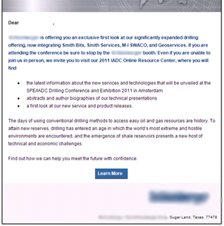
Treatment #1: How can I “learn more” when there’s not much left to learn?
I would bet a Buffalo nickel that this company has a lot more than 170 words to say about this particular topic. But you’d be hard-pressed to find any piece of info on the company’s microsite that the reader didn’t already see here.
The first treatment opened with a lengthy intro and value statement:
–
“____________ is offering you an exclusive first look at our significantly expanding drilling offering…”
–
Right away, the user was removed from any potential conversation. Because the company chose to open the email by repeating the company name, it reads as if a third-party was reiterating the message on its behalf. If email is to serve as a proponent of a larger, more personal conversation, then this needed to be more personal and direct.
 The intro then introduced more specific details about the company’s offering, even though the reader’s interest had already (ideally) been piqued by the terms “exclusive” and “significantly expanded.” On a Web page, these supporting details would be welcome and necessary. But, an email’s goal is – say it with me, Cleveland – to get a click, thus these supporting details actually diminish the value of the corresponding microsite.
This intro paragraph actually ended with a call-to-action for the company’s online resource center, but it was buried beneath the lengthy two sentences that preceded it.
The bullet points, though a touch wordy, were effective and supported the previous call-to-action. However, a confusing decision was made to add a third paragraph to this email – a paragraph that would actually better serve as an introduction on the microsite. After providing readers with a wealth of details about the company’s specific services, it seemed awkward to follow with a broad stroke overview of the industry at large.
The major impact of this third paragraph? It pushed the call-to-action button down the page, possibly below the fold.
–
Treatment #2: Don’t make me read when you want me to click
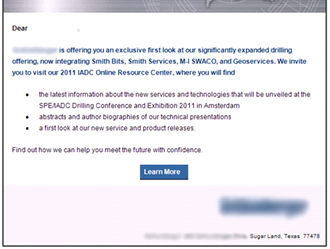 Clearly, 170 words are too much for an email – especially one so laden with industry terminology. Remembering that the sole purpose of the email was to get readers to click through to the Online Resource Center, our team opted to remove nearly half the copy. The results were as follows:
In the second treatment, our research team reduced the body copy to 95 words, eliminating much of the unnecessary text, including the entire third paragraph. As a result, the intro paragraph is more direct, leading to the bulleted information.
Though the bullet copy was still rather lengthy, the shorter first paragraph flows more naturally into the three points of interest, and as such, makes the copy more scannable.
With the elimination of the third paragraph, the strong closing statement/value offering (“Find out how we can help you meet the future with confidence.”) and call-to-action button were moved well above the fold, where readers could easily see that there was a logical next step without having to scroll.
Indirectly, moving this closing statement next to the bullet points served to strengthen the statement’s value. By implying that the three preceding bullets would help the reader “meet the future with confidence,” the reader could then infer that even more helpful information would be had by clicking through.
–
Results
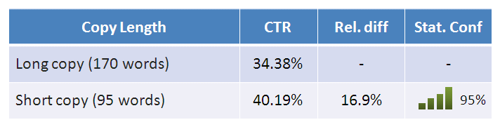
Clearly, this audience wanted to learn more about IADC 2011, as both treatments performed exceedingly well. The short copy generated a 16.9% higher clickthrough rate (40.19% vs. 34.38%), with an average test clickthrough rate of 37.34%, and a confidence level of 95%.
Because this email reached such a niche audience, one could surmise that higher clickthroughs were inevitable due to its highly targeted information. However, even with such an audience, time is still valuable. By reducing the copy and making the value statements more visible in the body text, more emphasis was placed on the call-to-action and the value that lied behind the “learn more” button.
–
Future Test Ideas
As a writer and editor, this test intrigued me on multiple levels. Though copy length was the variable on this test, a strong argument can be made to test this copy again, using a less passive voice and tone.
Let’s revisit the opening sentence. Imagine what this sentence would look like without the suffix “-ing.” Often, people use gerund phrases and present participles (the two most common “-ing” uses in the English language, according to Noah Webster and friends) to emphasize an action or series of actions. The truth is, using these phrases just adds letters, and can actually serve to diminish the action by burying it in a wash of similar-sounding terms.
Here is the original opening line again:
–
“____________ is offering you an exclusive first look at our significantly expanding drilling offering…”
–
Not only is “offering” used twice – once as a verb, the other as a noun – but these instances bookend two other “-ing” words. Though this was likely done to add immediacy and action to the copy, it may have had the opposite effect.
Let’s say we changed it to:
–
“You are invited to an exclusive first look at our expanded drilling services…”
–
By doing this, have we lost any of the importance or value? In addition to making the email more personal by opening with “You…” the statement is now more scannable. Now, just by glancing, the reader sees “exclusive…expanded drilling services…” – and in the end, this is what the email is all about.
Of course, the only way to find out for sure is by testing. This first test was just one of many in the testing-optimization cycle, and as this Research Partner tests more, it will also learn more about the most effective use of language for its audience.
–
Related Resources
Crafting an Engaging Email Message (Web Clinic)
Internet Marketing for Beginners: Email marketing optimization 101
MarketingExperiments Email Marketing Course
Live optimization with Dr. Flint McGlaughlin at Email Summit 2011
–
Summary: Cut the crap, so more people will read your email and respond. Works for Web pages too.
Great article, love the details on execution.
Good tips. I’ve found similar success in non-email copywriting as well. Keep it short and to the point and the message becomes that much clearer. Thanks!
This is an excellent article that I would love to share with my co-workers via email. I can share it via Facebook, Twitter, Digg, etc., but cannot find the share via email. Is the feature here, but I’m just not seeing it? For now I’m just going to email the url to them. Thanks for the info!
Thanks Donna,
That’s true. We do not offer the “share with email” feature. When deciding which sharing buttons to add, we thought that button was imbued with too much anxiety.
How will they use my email address? Will I be signed up for email lists and spammed? What messages will the include to the colleagues I forwarded this too?
Since it’s quite easy to simply copy and paste a link into an email, and forward it to colleagues, we decided that possible anxiety outweighed the slight decrease in friction one would get from simply clicking on a button instead of pasting the URL into an email.
That said, we’re always looking for ways to optimize our blog. This is the first comment we received about an email button. What do others think?
In most cases, for print, concise copy works and often yields the most responses. Translated to the world of Emails, best CTR.
However, as a seasoned direct marketing person, response is just the beginning. Conversion or the sell is the end game. And though short copy, letters, etc., makes a quick scannable marketing tool, sometimes people who like to read, and actually read all of a longer (not too much longer) piece of marketing material make the best conversions — buying customers.
Remember the fable about the rabbit and the turtle?
Rabbits scan. Turtles buy.
Thoughts?
Great article Brad! Don’t forget about playing with design in addition to tightening copy. Just like on landing pages an email can benefit from design-guided eye flow. A well placed headline, call to action and a hero shot can really help guide the eye to the desired action. And when text has been edited as much as it can and is still long, one can always try using the same call-to-action twice once above the fold and the other below it to see if that helps.
@Phil Young
Phil- I think for the purpose of establishing initial engagement with the target, shorter is better. Breaking through the in-box clutter is the objective. I assume that selling oil field drilling services is a complex, technical sale. So greater detail and technical data will be required further into the dialogue with the prospect.
@Vincent
I couldn’t agree more. As you’ll see on many of the testing posts on the MarketingExperiments blog, we’re always looking for a page’s “perfect balance” of copy, imagery and flow.
Very interesting idea about using the call-to-action twice. If you look in our archives, we may have tests that utilized this approach.
@Steve D
Thanks for writing. In this test, we found that our research partner was placing far too much information in to the email, instead of capturing the reader’s interest and encouraging a clickthrough.
Once the reader expresses interest through a click, it would be perfectly okay to load the landing page with this complex info. But in this case, I think they were simply asking too much of one email…and of its recipients.