One of the most testing-oriented sessions at MarketingSherpa Email Summit 2013, recently held in Las Vegas, was a presentation by Michael Aagaard, Copywriter and self-described test junkie, ContentVerve. Michael offered the audience 12 test case studies in 30 minutes in a talk titled, “How to Optimize and Test: Calls-to-Action for Maximum Conversions.”
For this presentation, Michael focused on call-to-action (CTA) buttons located on landing pages looking for a clickthrough, and this blog post will focus on three tests covering three aspects of call-to-action buttons: placement, copy and design.
CTA placement test
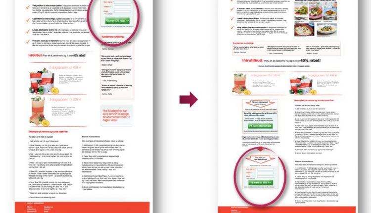
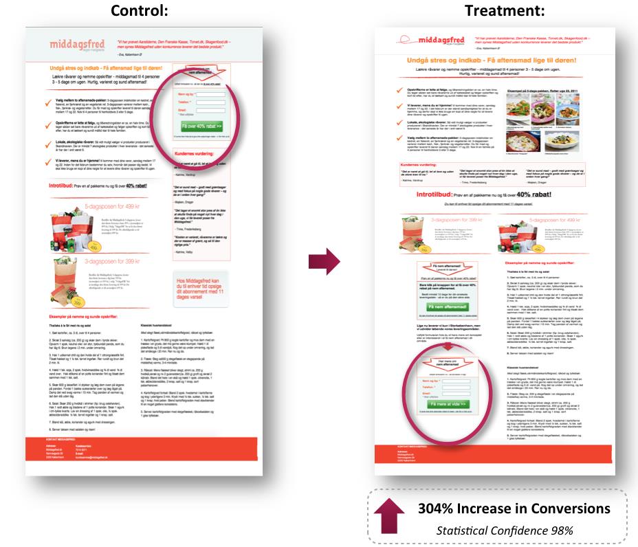
This test pitted a CTA above the fold in the control against below the fold in the treatment:
The results were somewhat counterintuitive with the below-the-fold treatment converting 304% higher than the control at a 98% confidence level.
“There are several other things going on in the treatment. So the whole lift can’t be ascribed entirely to moving the CTA below the fold,” Michael said.
He added, “However, the fact remains that the treatment with the CTA at the bottom of the page, way below the fold, outperformed the control variant with the CTA at the very top of the page – something that simply shouldn’t be possible if you subscribe to the best practice rule that the CTA should always be above the fold in order to convert.”
CTA copy test
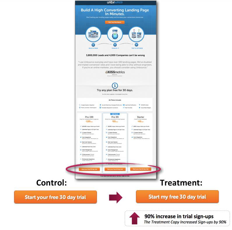
This test is a little cleaner than the previous example from an A/B testing perspective, as it involves only changing one word in the CTA copy. “Start your free trial” in the control becomes “Start my free trial” in the treatment.
As you can see, the treatment changing “your” to “my” resulted in a 90% lift in sign-ups.
“One might be inclined to label this test as a fluke, because it seems so out of proportion that one word could have such a dramatic effect. But I’ve performed the same test on multiple sites, and I’ve consistently seen lifts of 30% to 90% by simply changing the possessive determiner ‘your’ to ‘my’ in the CTA copy,” Michael explained.
He cautioned against applying this technique across the linguistic globe, however.
Michael said, “The funny thing is that I’ve performed similar tests in Danish, and it doesn’t seem to work.”
CTA design test
This final example offers a call-to-action button test that didn’t produce a lift, but did produce a lesson.
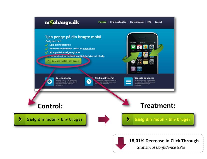
For this test, Michael took another very simple A/B split test approach. The only change between the control and treatment was a design element – the color of the copy in the CTA button. The control was black copy on a green button, and the treatment was yellow copy on a green button.
As you can see, the control outperformed the treatment, with the treatment producing an 18% decrease in clickthrough rate.
“Here, I hypothesized that I could make the button stand out more and increase CTR by changing the font color in a green button from black to yellow,” Michael explained.
He continued, “What a backfire! Changing the font color actually decreased clickthrough by 18%. This simple case study illustrates that even minor tweaks to your button design can have major impact on conversions. Moreover, it emphasizes the importance of testing whether your optimization efforts are in fact optimizing the performance of your website.”
What to test? How to test?
Beyond the tests, Michael explained CTA buttons consist of two overall elements:
- Design – the color, shape and size of the CTA button
- Copy – the text in the button
He said, “In order to optimize for maximum conversions, you need to also understand the interrelationship between these two elements and the roles they play in the conversion sequence.”
Michael added the shape and color of CTA buttons provide a visual cue to emphasize the placement of the button and button design should make the button stand out from the rest of the webpage or email copy.
The button copy comes into play at that “last critical moment” when the prospects have to make up their mind on whether to click, or not. Copy that conveys value and relevance receives more clicks, and copy should focus on what the prospect gets rather than what they have to part with.
Michael concluded his presentation by offering the audience five steps for testing calls-to-action:
- “Diagnose your call-to-action – create a hypothesis about what is wrong.”
- “Use the optimization principles to come up with possible treatments.”
- “Assess whether copy changes, design changes or both will have the greatest impact.”
- “I recommend a simple A/B split test.”
- “The click itself is an important conversion goal – but remember to track the final conversion goal. Sometimes CTR goes up, but sign-ups go down, and vice versa.”
Related Resources:
Optimizing Calls-to-action: 4 questions to ask yourself while writing a CTA
A/B Testing: Split tests are meaningless without the proper sample size
Landing Page Optimization: 3 tools to help you optimize in 2013
30 Ideas in 30 Minutes: Rapid-fire tips and techniques for solving your most challenging problems


so simple yet so effective. Great post !
Yassin
I already implemented this right away, all my optin forms are now personalized… the added word ‘me’ got higher conversions mainly because everyone is most interested in himself 🙂
I like these proven tests! The CTA design test saw a decrease because the text is difficult to read I think. If you have aweber there’s a feature that allows you to split test optin forms, pretty cool.
David,
Great article. Appreciate the share of info for those of us who were unable to attend. Putting the CTA at the bottom of the page and getting those results is against what nearly all of us have ever been taught, but seeing the results has convinced me that it’s definitely something we all need to at least test on our own pages.
Thanks again,
Rick
Thanks for your great post.
By reading just one post here I can learn much more than reading a thick eBook with the same subject.
And I’m surprise with the result of below the fold placement of CTA and opt in. Worth to try!
Emas Batam
This is awesome information. I definitely prescribed to above the fold – will be going through and changing it now. Thanks for the great article!
Great post! Those are some impressive results! I wonder what your thoughts are about placing CTAs both above and below the fold?
As I’ve been saying since advertising first appeared on the internet, IT’S JUST ANOTHER MEDIUM. There are many out there who like to think internet advertising is different, yet these (and other) tests prove it time and time again: Be respectful of the consumer, make it about them, don’t be too selly or too pushy and you’ll have greater success. Changing “your” to “my” simply tells the consumer they’re in control. Putting the CTA below the fold acknowledges that the consumer needs more info before they’re to make a decision; again, respect, honesty. Simply put: Talk with the consumer, not at them. In every medium. Yes, even on the internet.
Love this post, split tests are always the most exciting articles to read. Some interesting results so thanks for sharing!