

If you have hung around this blog long enough, you know that we like to occasionally test and reward our audience’s
 intuition. We do this by asking you to predict the outcome of a recent experiment from our labs. We might say we do it for the sake of science, but personally, I think we just enjoy stirring the pot. We have yet to reveal an experiment that the majority of our audience guessed correctly, yet some followers of this blog seem to have just a little more marketing genius than others.
So here we are again with a new experiment and a new opportunity for you to finally be recognized as the brilliant marketer that you are…. or weren’t last time.
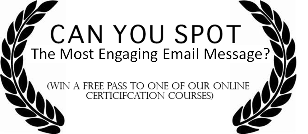
What’s at stake this time?
Well, if you can correctly identify the outcome of the following experiment, we will feature you (or at least your Twitter handle) as a pure marketing tour-de-force on this blog tomorrow.
PLUS – one of the most intuitive responses will be selected to receive a free pass to one of our online certification courses.
Leave a comment below to enter and let the games begin.
Experiment: Background and Design
For this experiment, we were working with a large financial organization offering a quarterly newsletter for business leaders. In this newsletter, they would often feature a free downloadable whitepaper. Overall, this company was striving to build strong relationships with some of their best clients, while providing valuable content that would serve their subscribers.
Our goal in this experiment was to increase the clickthrough rate (opens-to-clicks) of the email without hurting the conversion rate (clicks-to-downloads). So we set up a simple A/B split test that featured the two email versions seen below.
Email Version A (click to enlarge) Email Version B (click to enlarge)


Email Version A featured a detailed overview of the free guide offered for download. It included a headline, intro paragraph, and four key points of value of the whitepaper. The call-to-action stated “Download Guide.” Email Version B featured the title and the first three paragraphs of the actual article and a call-to-action to “Read more/View Full Article.”
Which email do you think is more engaging?
These are two interesting, yet very different strategies for trying to engage subscribers, yet one performed vastly better than the other in both clickthrough and conversion. Which of the two do you think performed better? Which of the two do you think was more engaging? Why?
- Email Version A
- Email Version B
.
UPDATE: The Results
Before posting this update, the comments are currently split at 52% for Email Version A and 48% for Version B. Can you feel the heat? The actual winner of this test was Email Version B and it generated a 28.6% higher clickthrough rate as well as an 84.6% higher conversion rate (as seen in the table below.

What made this test so successful? Here are (from my standpoint) the most intuitive comments from our blog readers:
“Version B – Because all I’m asked to do is continue what I’ve already started…” -@MSDSonline
“Version B tells a story. Doesn’t look like it will sell you something, disarms and invites you to read.” –@bryantjones
“The copy reels you in with a compelling story line but does not provide all the details of the offer, leading to curiosity clicks.” -@dansaun
What do you think? Is this what made Version B more engaging? Either way, make sure you follow these and the other up-and-coming marketing gurus who correctly predicted the outcome of this test:
- @dansaun
- @bryantjones
- @MSDSonline
- @PinsCreative
- @srwilliams65
- @tawatson
- @tatermarketing
Of all the correct answers, Yves of DelaraDance.com was randomly selected to win a free pass to the online certification course of her choosing.
Thanks to everyone who participated, and I’m already looking forward to next time.
I’d say Version A was more successful. The first reason is the presentation of the information in bullet point format. This is easy to read quickly and pull out the key information. The call to action on the button itself is also very clear and direct and the idea of downloading something means I can read it when I’m ready instead of going to read an article right now which might not be convenient. I also see more value to the reader in this versions headline in that it gives them a tangible result that could stem from reading the report. @rtharris23
At first glance, “Email Version A” looks to be the clear winner as it’s easy to consume with the bulleted list and a short paragraph.
But, after giving this some thought, I believe “Email Version B” was the winner and here is why…
1) Unloaded images do not pose a big problem. In “Email Version A” if the bullets are images, they might be less effective unless the “business leaders” have images turned on (personally, I’d use standard HTML here instead). Also, putting the article image to the left might be a problem for this same reason. You’re taking up the most valuable space (top left) with an empty box if they do not have images turned on.
2) It looks and reads like a real email, not a sales pitch which any “business leader” is highly trained to discard immediately.
3) As a business man myself, I can tell you the title about a 250 year business plan is intriguing. The sales pitch on the other is not.
In summary, I don’t want another sales pitch in my inbox. I want to hear a unique story that I might learn something from.
WINNER: Email Version B
@tatermarketing
Version A for sure. The copy in version A is focused on the customer and not the company and the use of bullets makes it easier to read. @ncsuz
Winner version B.
The headline on ‘B’ is more engaging and surprising. Better to grab attention. ‘B’ is a conversation whereas a ‘A’ is a pitch.
The call to action on B is weak, just a ‘read more’ but no suggestion as to what more I will find out. B does have two links to click and the ‘view full article’ sounds easier than ‘download’.
‘A’ does follow the formula approach to what should work. On this one I’m going contra to the typical advice for what works.
Most interested to see how it pans out given the very different approaches taken to the copy.
@tawatson
Version A – clarity of the value proposition, outlines key benefits, better call to action than the other.
@dwhite33
Winner: Version B
Graphic
Doesn’t really seem to matter
Headline
– Trusted, reputable brand captures attention
– “250 Year Business Plan” grabs attention, creates curiosity
– Stands out as different – not like all the other headlines in the inbox
Content Format – Article vs. Bullets
– Article provides the opportunity to make an informed decision to open
– Article appears targeted to the intended audience (intelligent business person)
– Bullets say “I’m selling you something” and “I want your money”
Call to action
– Two calls to action – each appeal to different types of people
– Read more (not selling something, but potential to learn)
– View Full Article button (not “Download” potential virus)
@srwilliams65
@jenny_norton
Winner: Email Version A
As we’ve all heard and learned and hopefully implemented, emails are not the forum for you to spill all the details, emails are to entice someone to click. Email version A does this with the following elements:
– Making it all about the reader by saying “Putting YOUR business plan to work…” while Version B is talking about a 3rd party (Panasonic).
– Enticing with the word “Free”, very non-threatening and does instill any anxiety for the reader.
– Creating bullets for a quick read while version B is overwhelming and copy heavy.
Version A – gives summary/overview of outline allowing me to click through if I want more information.@vjbooks
Emails are a gateway to more information and both creatives use the content in this way, however, I would vote for creative A to have driven more click throughs and conversions overall. My reasons for choosing creative A are as follows:
– Header gets straight to the point and lets the reader know what the email is about – them and their business plan
– 1st paragraph is snappy and to the point and draws the reader in to discover the possibilities in their business plan
– Bullet points gives further clear, short, punchy insights into the main content of the guide
– Copy overall sticks to the key email content rule “make it scanable”
– I would guess that this creative received the greater % of click throughs converting to download the guide, as the call to action is very specific as to what is required from the reader, whereas creative B doesn’t mention the download at all – people love downloads, they mean they don’t necessarily have to read them straight away whereas a click to read more in the article suggests it’s going to be a lot longer!
Improvements that could be made to this creative (!)
– More white space between the heading, 1st paragraph and bullet points
– Ensure the top image is spliced and the copy inserted into the code as copy (this means that even with images blocked, the main point of the header is still conveyed.
– Add a pre-header. This handy, unused line of copy in your coding gives you an extra line to entice the reader to open your email… why wouldn’t you use it?!
– I can’t see an unsubscribe in this email! I would advise adding this to both the top and bottom of your creative – an unsubscribe is much better than a complaint for your deliverability!
Creative A was more engaging in terms of the target audience – business leaders in a financial organisation. It gets straight to the point and tells them exactly what they will get when they click through from the email.
@katebarrett
Version A seems to include a number of essential things to drive engagement
1. An action oriented title that focuses on an end benefit for the customer.
2. Call outs that provide a numbered list (i.e. 6 fundamentals…)and other salient benefits
3. A call to action to download the information, (i.e. something for free)
The heading in version B is interesting, but there is nothing to make potential customers want to read more…
I vote for version A.
@roswilliams
Version A. THe bullets may be images (and there’s a weird spacing issue in the header text), but there’s a clearer purpose to the message, a more direct call to action, and less wordiness.
Version A. THe bullets may be images (and there’s a weird spacing issue in the header text), but there’s a clearer purpose to the message, a more direct call to action, and less wordiness.
Twitter: @ubershibs
though Version A follows best practice rules. I think the Winner is Version B.
Without much thought… at first read… Version B caught my attention and left an impression.
I think the well written story approach is different, not your usual copy, feels more connected and engaging and leads you naturally to view the rest of the article. It’s easier on the eyes and there aren’t competing headlines, bold fonts or bullets. People like stories and not another cold sales pitch. A story is easier to remember and suggests if someone else has tried it and it worked, there sure is some value in this. Strong headline. The tried and tested story relates better with a business person.
I do like the use of two calls to actions – serving different personas but feel they seem redundant and could use some tweaking. “Read more” could maybe “Read more about this in our guide”. “View full article” could stay as is and doesn’t have to be a “download”(which takes up time and space on your HD and sounds like more work for the visitor).
Version B – Because all I’m asked to do is continue what I’ve already started and the article is compelling. Version A in an invitation to do something else, which I may or may not have time for.
@MSDSonline
Version B – if the first three paragraphs engage the reader, he’ll be motivated to continue. Version B is more personal, less “salesy.” Position of headline/graphic is better.
@PinsCreative
Email A – The header seems to focus the eye better on the actual subject of the email and the formatting and lesser amount of text seems is more intriguing and makes you want to click to learn more. Email B, just seems overwhelming!
@eSortedDOTcom
Version B.
Version b jumps in right away with a powerful headline that grabs the attention of any executive.
Winners are always interested in what other winners (especially even greater ones) are doing.
Its irresistible. As long as the body copy is equally engaging and succinct, version b will always get the highest response.
Version B
It tells a story. Doesn’t look like it will sell you something, disarms and invites you to read…
Twitter: bryantjones
I think that Email Version B is more engaging and probably converted at a higher rate than Version A. The position of the headline works better for eye tracking. The copy reels you in with a compelling story line but does not provide all the details of the offer, leading to curiosity clicks. I also think that “View Full Article is a better call to action that “Download Guide”. On many B2B websites, contact details must be provided in order to download something, which might depress response.
@dansaun
I’m gonna go with version A due to the stronger call to action. I don’t care about Panasonic, but I do care about improving my own business.
Twitter: PhotonLight
Email Version A
tagline matches headline.. bullet points
twitter: ninanet
Version B for the specific target audience
stronger relevance + engagement vs. push/outbound tone
Version B because it tells a story. Much more engaging than the bullet points and somewhat dry language of Version A.
I’m going for version A as an email creative – but if the target audience was a blog then I’d choose Version B. Version A is precise, clear with content targeted as beneficial to “you” the reader, making it an attractive invitation to clickthrough as well as a strong call to action. Version B to my mind is a great hook for a blog, a softer sell approach where the story content is as appealing/interesting and important as the clickthrough benefit for the reader. @mariclarek
Version A has a more succint message and the headlines and bullet points grab more attention than long form content of Version B. The action button Download will draw more clicks than Read More I’ll bet too.
@cartmetrix
Version A should be the winner as it ticks every box in what we are led to believe is an ideal email. For example:
The title tell’s me ‘what’s in if for me’, there’s a free give away and the information is succinct and bulleted so I know exactly what I’m getting. Plus tag line/headline, etc.
Therefore, version B (yes version B!) must be the clear winner 🙂
It has the human element that is sometimes so lacking in todays communications.
Email Version B
Because it is specific and seems more creditable.
I missed the contest, but I did (honest I did) just go through it as if it were the real contest and picked the winner.
Here’s why I thought B was better:
* Layout – generic graphic is not engaging enough to warrant that position; better to start with headline and lead into email better
* Panasonic headline was more specific and a welcome surprise since everything before it looked and sounded very generic; the competing A heading maintains that very general tone.
* Story – several people mentioned how B engages with story. Personally feel the writing is stronger.
* Not asking for too much – version A may be asking for the download (and it fails to specify that it is FREE download so it fails to lessen anxiety)too quickly. I don’t think they have established themselves as experts with testimonials or anything else to support their position. It is much more of a commitment to ask for a download than to simply continue reading an article. If the article is well done, it can create it’s own authority after the reader finishes. Version A has only some generic bullet points to rely on. Of course, if there is a powerful logo on the top, that could sway someone to take action quickly.
Thanks for all the good work.
@TomSullivan
Just goes to show you can follow all the email design rules you like but until you actually test it and see the results you wont know!