How much will companies spend on email marketing this year? According to Forrester, that number is well over one billion dollars. And still email designs are being sent out without any clue as to how well they perform. It is not uncommon to see the “most beautiful” email messages that follow all the “best-practice” guidelines and have a committee of “design experts” backing them underperform – as if spending more than a billion dollars wasn’t enough!
So we want to see if you can tell the difference. We ran an experiment with three top-of-the-line agency-designed email messages. We want to know if you can spot the email design that performed best. (A prize for all the winners this time)
Background: This email test ran for Pier 1 Imports, which I will assume most of you know is a large B2C company selling home products. This email in particular was a seasonal promotion going to a segment of their house list. There are three agency-designed email messages (Treatments 1-3) being tested against Pier 1’s baseline version (Control).
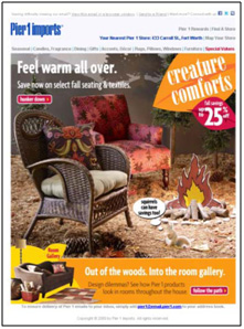
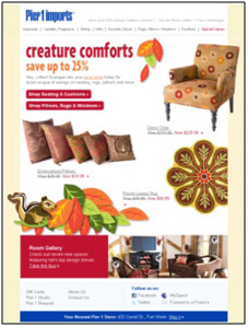
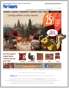
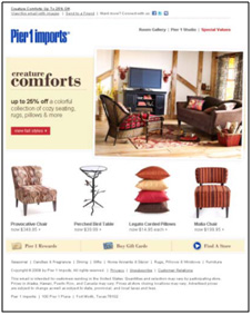
Test Design: This was a simple A/B/C/D multi-factorial test. While we also measured open rate and conversion rate, the objective was to increase the clickthrough rate. Here are the page versions (click to zoom in):
Control Treatment 1
Treatment 2 Treatment 3
Results: So now that you understand the experiment background and have seen the treatments, can you spot which email performed the best? Before we reveal the results, here’s a chance to test your own marketing intuition and be regarded as a world-renowned marketing leader!
1. Which email generated the highest clickthrough?
- Control
- Treatment 1
- Treatment 2
- Treatment 3
UPDATE: Surprise! The Control was the winner. Each of the agency-designed treatments underperformed the original (one of which decreased clickthrough by 52%). Congratulations to Ben, the only correct response we received before we announced the results on yesterday’s web clinic. You can follow Ben on twitter at @findingforrest. Also, subscribe to the MarketingExperiments Journal to be notified when the web clinic replay and research brief are available so you can see the correct answer, the results of the control and treatments, and how these experiments can help you shape your own marketing campaigns.



Cool, competition! 😀
I’m guessing Treatment 3 will do well:
– Lots of whitespace, clean separation of elements
– All other designs our quite crowded, with no clear call to actions
– The mentioning of prices will also help customers to assess whether the products are suited for them.
Interested to know which design performed best!
@patricksteenks
Treatment 1
Treatment 3 :-).
@Xavez
And, sorry: http://twitter.com/xavezbe
Treatment 1 I reckon. The ‘Shop Seating and Cushions’ call to action is much clearer on this than on the others. In fact it would have possibly been better to have said ‘Click here to Shop Seating….’ thus telling the reader exactly what to do.
Treatment 1 – Twitter – PerformanceMC
I love this task! : )
ok, I think the third treatment is the most convincent.
Is clean, show the products very clear, and show and ambience very real and comfortable.
The squirrel is nice but grab to much attention…
The only thing I would add is people enjoying the place.
I’m from Uruguay and and I ‘m learning so much from you.
I think it’s Treatment 2.
Going with Treatment 2.
matt_deboard on Twitter
Treatment 1
@Crystal1407
@iconoinvestor
Treatment #3!
Treatment #2
@flaviograf
I would say #3 because it is easier to read (more white space) and the messaging is more focused. In addition, their calls to action are clear and easily found.
crossflight on Twitter
Treatment 3
Control – @findingforrest
It’d be nice if the images were larger so we could read the CTA button text easier
Treatment 2
@conseil_wa
Treatment 3
Treatment 2 – @bbernrd
Treatment #3. @JerryKFreeman
Treatment #2 because the squirrel asks users to click on a chair.
Treatment #2
@elkebovers
Treatment 3.
treatment 2 because i like the squirrel.
@scpynkeal
My gut tells me it’s #2. @indie_preneur
Treatment 2
@westontt
I saw treatment 3. It has in my mind the clearest call to action and the value prop. is the most obvious
#3
@bobnunn
Treatment 3
Control @zannedu
I would say Treatment 3.
@jfavreau
Control. Product is more clearly visible, color is appealing. Inviting scene invites click-through.
Treatment 1
@Jeroen_Bouserie
Treatment 1 @paolodona
I think option #2 will be the best for CTR because it has two clear calls to action are above the fold (rather than the confusing “Hunker Down” in v1), especially as it pertains to an email preview window. It also lists the 25% discount and has pricing with slash-throughs for each item. Also, it has text links for the global navigation that should help with CTR if these specific products are not of interest to the end user. With regards to the product shots, showing them on a white background is better than showing them out of context around a cartoon campfire (I do like v4 showing them in a real-life scenario the best).
I think “Control”
Yowza, thats a tough pill to swallow for the agencies…interesting to say the least. Great contest tho.
Great stuff. Having run many experiments and posed the question of which one won to experts its no surprise to me that few people got this right. In all honesty I probably wouldn’t either, probably would have gone for #2.
You have to test to know ‘which’. There is no other way.
Now knowing that #1 (control) was the winner the ‘why’ question?
The control
– Doesn’t have prices
– Doesn’t feature particular products directly
– The ‘out of the woods’ orange box is visually strong
I’m sure Eyetracking would should it as hot spot.
This is helping lead customers into the desired action, click to website.
The main objective of #1 is to get people to click to find out more about the products, rather than sell the product already within the email. The other treatments give me more options, more direct product promotion and attempt to get further down the sales cycle in the email itself.
For #1 you have to click to find out more. This could be pushing up the click rate over the others.
It would be interesting to know if the conversion rates followed click rates exactly to support or reject this idea. Could it be control got most clicks but not in relative terms the same increase in conversion?
Keep up the good work.