A few days ago, we asked the MarketingExperiments audience for their best lead generation landing pages. Now it’s up to you. Which of these pages do you think will perform best?
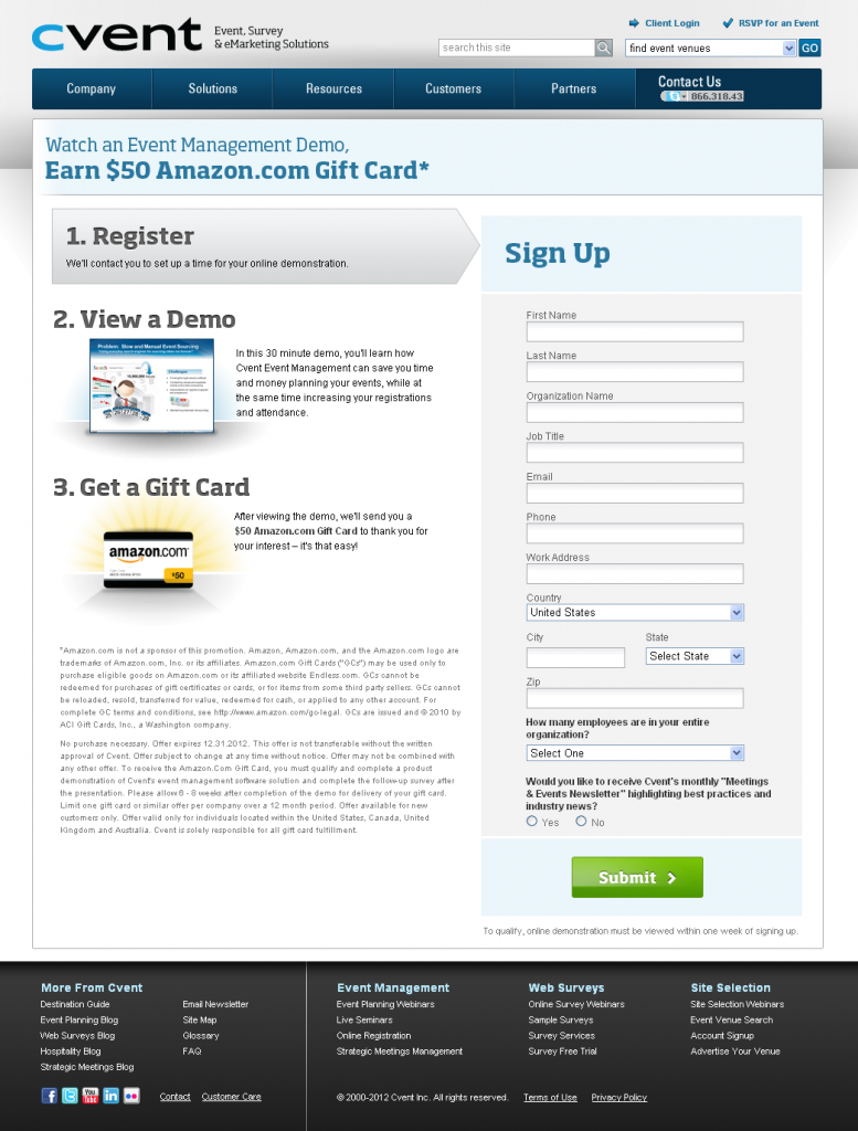
Contender #1: Cvent
The Cvent lead generation landing page was submitted by Sherrie Mersdorf, team lead, marketing operations, Cvent.
“This is our top performer,” Sherrie said. “We are offering a $50 Amazon gift card for seeing a 30-minute demo. People have to talk to the sales team to make sure they’re a qualified lead before they can see the demo and receive the card.”

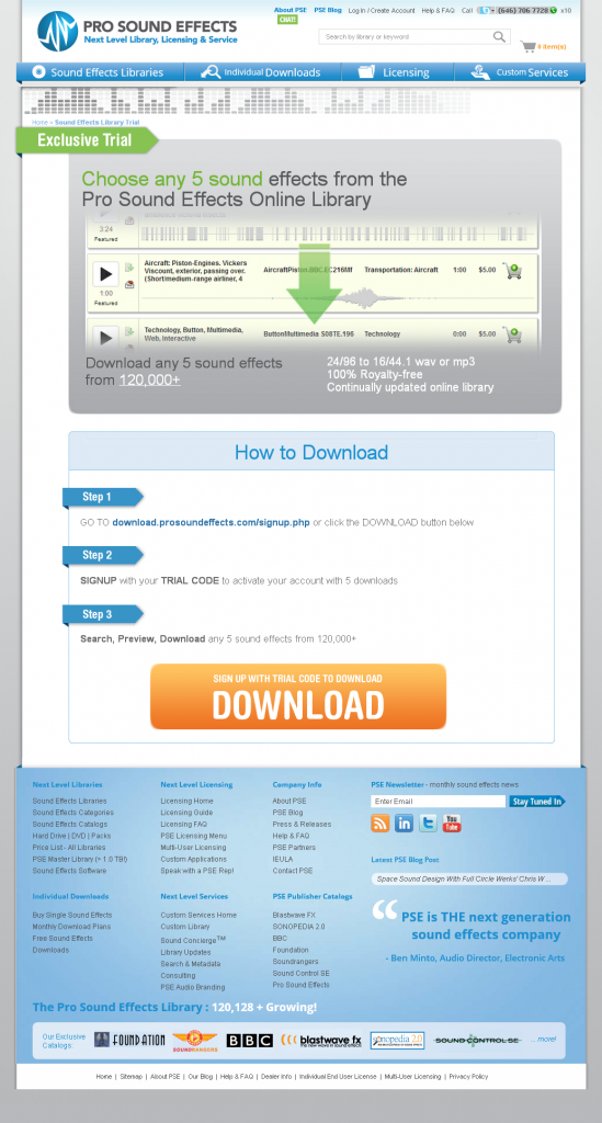
Contender #2: Pro Sound Effects
The Pro Sound Effects lead generation landing page was submitted by Jeremy Siegel, library and licensing specialist, Pro Sound Effects.

You tell us which page you think will perform better
Our MECLABS judges – associate director of optimization and strategy Adam Lapp, senior research manager Tony Doty, and research manager Erin Fagin – narrowed down all the entries to these two finalists. Now they’re looking to the pooled wisdom of the experienced marketers who read the MarketingExperiments blog to decide which of these templates to include as a treatment in an upcoming experiment.
“After reviewing all of the entries, we chose our two finalists based on ease of implementation, as well as the three-step process they both highlight. We thought it would be an interesting test using either the long, vertical landing page with the form at the bottom or the two-column landing page with the form on the right,” Tony said.
“We wouldn’t have the large “Download” button on our treatment landing page; instead it will be replaced with the actual form on the page, but the concept of the three-step process will be consistent between the treatments.”
Next, they’ll be testing the template of the landing page you decide against a hypothesis created by the audience at Optimization Summit 2012 in Denver and the control page supplied by the sponsor of this live test, HubSpot All-in-One Marketing Software.
If the template selected in today’s blog post wins that test, the marketer who submitted it will win a free MarketingExperiments Landing Page Optimization Online Course plus a free copy (both PDF and printed copy) of the MarketingSherpa 2011 Landing Page Optimization Benchmark Report.
So choose wisely, marketers. And stay turned to the MarketingExperiments blog to find out if the lead gen landing page you selected wins the live test.
Voting ends Wednesday, May 30. For more information, read full terms and conditions.
Related Resources
Landing Page Optimization: Test ideas for a B2B lead capture page
Lead Generation Tactics: How testing can help you choose the best tactic for your business
Lead Generation: Testing form field length reduces cost-per-lead by $10.66
MarketingSherpa MarketingExperiments Optimization Summit 2012 in Denver, June 11-14


I’d use the Contender #2: Pro Sound Effects page. I also wouldn’t remove the orange download button. This page has a dynamism that the other page doesn’t have IMHO.
The second will perform better, as all it requires is a click, you don’t have to fill out a long form.
I chose the Pro Sound Effects as I think having to talk to a sales rep will put people off – it definitely would put me off – and the second page looks a lot cleaner.
These are 2 bad landing pages..
Especially the second one :
– why do i have to click on “Donwload” to fill a sign up form ?
– where is my TRIAL CODE ???
I’m pretty sure the first one will perform better :
– instant conversion against form(user unexpected) in step 2 for the second landing page
– looks like a trick to get easy money (“hey i’m smart i will let the video go without watching it and i’ll get easy 50$ ! hehe” )
– clear message, no hidden form, clear ux, you know clearly what you’ll do and what you’ll get
Personally, looking at the two, I think the first works best.
1) It has a more concise and understandable 1,2,3 step by step for cvent.
2) You don’t have to leave the page to complete the lead gen form or wait to get to the bottom of the page to click a misleading download button.
3) What is this trial code? where is it? When do i get it? I click download, but I am not really downloading – there’s a trial code in there somewhere?The first step is to click download, but the 3rd step is when the download happens?
4) The Amazon card is a better incentive, IMO.
Seems like Pro Sound Effects should use the 1,2,3 that Cvent uses to tell a more concise, obvious story on how to get the incentive. Use a smaller version of the top image in step number #3, like cvent did in step #2. Pull the actual lead form onto the landing page, removing a step. They also need to explain the trial code and use proper call to action verbiage in the button explaining that you’re actually signing up.
I like the second one. I think the second would perform the better work.
2nd one is a time saver . Its going to work better for sure . You can opt in with just a click , no need to fill up the entire form in that .
Nice post Daniel,