

When you think of conversion optimization, you likely think of a page with a very clear funnel and conversion objective. For example, selling a product or getting an email address in a lead capture form. But what if your goal is to simply engage more with the visitor?
In today’s blog post, we’ll take a look at a conversion optimization test from a publishing site.
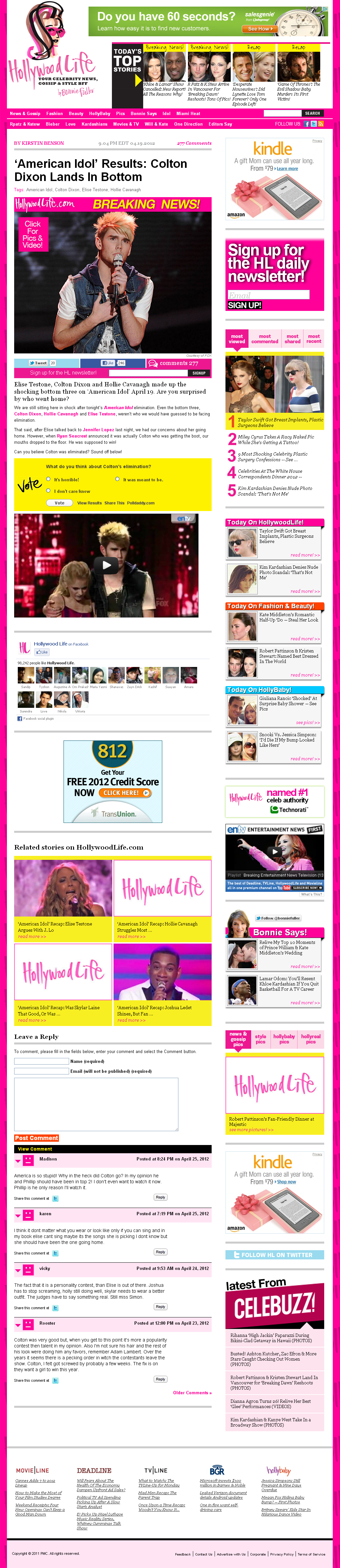
The Challenge
“We noticed a huge increase in traffic since we hired a new SEO. We also noticed that this brought in mostly new visitors who were, by definition, not loyal and bounce rate spikes were correlated with spikes in SEO traffic,” said Ian Larson, Senior Product Manager, PMC.
PMC is an online publisher. The company operates HollywoodLife.com, among other sites. For this site, the goal of a first visit to an article page is for a new user to view more than three pages and stay for more than 90 seconds.
The Control

Ian’s team analyzed the control article pages and identified a few elements that they hypothesized might be contributing to the high bounce rate:
- Information resolution issues
- Too many competing objectives
- Many/most of those objectives were NOT the primary objective of the page (to get the user to click into another article page)
Treatment

So Ian’s team used MECLABS methodologies to design a treatment that:
- Dedicated much more real estate – 40% of the page – to the primary objective (related stories)
- Maximized the information resolution
- Used a vertical F-pattern eye path layout on the left that places the most relevant related articles just at the end of the body copy, where the team thinks the user’s thought sequence primes her for another click
- Added more headline text, article body snippets and comment counts (social validation) within these related articles to give each click a value prop and provide more clarity to the user about where that click takes them
- Removed competing objectives – the loud, distracting clutter. “Obviously each objective has its own internal stakeholder, so some of these remain on Version B,” Ian said. “There is still much room for improvement.”
– Referral Traffic
“We also wanted to drive more P2P referral traffic from Facebook,” Ian added. “We assume Facebook has nearly 100% penetration in our demo.”
To help drive referral traffic, the team added these elements in the treatment:
- Placed bigger social sharing buttons in the middle of the article body and gave them more whitespace. “Again, we were trying to place them in the eye path at the right moment in the user’s thought sequence,” Ian said.
- Implemented Facebook’s Comments Box. “Each comment is also posted to the user’s wall. The average Facebook user has 150 friends, so each comment gives us an opportunity for 150 new referrals,” Ian said.
Results and lessons learned
The treatment generated a 27% lift in page views per visit and a 43% decrease in bounce rate while gaining more referral traffic from Facebook.
“The real win here isn’t the reduced bounce rate. That is nice, but the actual victory is teaching the internal stakeholders that there is a methodology that can produce results and showing them a new approach for building pages based in strategy and studying real-time user data rather than aesthetic design by feel,” Ian said.
“Other marketers can apply conversion optimization methodologies even if their site isn’t an e-commerce site with a strict conversion funnel (user clicked from page A to page B versus user clicked from page A into another page),” Ian added.
“We are going to polish these up a little bit, then start rolling the changes out to our other sites,” Ian concluded.
Related Resources:
Landing Page Design: Eye path vs. Thought sequence
Landing Page Optimization: How to plan a radical redesign so you get a lift AND a learning
I really don’t understand…the second image would outperform the first one? Or what? Because their website is showing version one here that you say is the control. Or the treatment is the page after optimization?
Dan,
Sorry if I wasn’t clear.
Yes, the treatment (the second site layout) outperformed the control (the first site layout).
If you’re going to the website and seeing the control, it may be because they are still testing (I know they’re still testing, just not sure exactly which layouts).
The treatment is the page after optimization, which outperformed the control.
Does that help? Anything else I can clear up?
Thanks.