

Tuesday was day one of Optimization Summit 2012, and I thought it might be interesting to share an impressive case study from the stage here in Denver.
Many #OpSummit tweets have communicated surprise at the idea of moving the call-to-action below the fold and still being able to get results.
So, to help us all understand a little better where the best place for your call-to-action is, Nathaniel Ward, Manager of Online Programs, Heritage, and Tim Kachuriak, Senior Vice President, Innovation and Optimization, Pursuant, shared the following case study yesterday afternoon.
[Editor’s Note: Reader beware, there is some politically sensitive content in the treatments. But, the case study illustrates some transferrable principles you can apply to your own pages.]
The Control
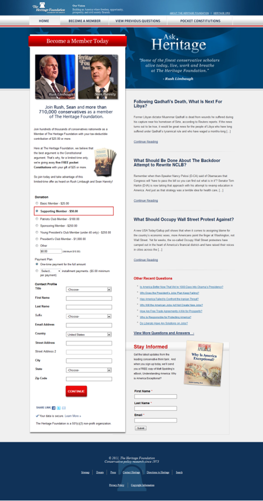
The control page was a typical two-column layout where the call-to-action (CTA) begins above the fold.

The Treatment
The treatment page not only buried the call-to-action below the fold, it also added long-form copy to provide the readers with more value. The result was a, “long, ugly page,” in the words of Tim Kachuriak.
“I didn’t even want to run the page,” Nathaniel mentioned.

The Results
The results from the long-copy, CTA-buried treatment were staggering:
- 74% Increase in Donor Conversion Rate
- 189% Increase in Average Gift
- 274% Increase in Revenue
What you need to understand
Most of this is the result of both providing more value in the copy and pushing the call-to-action below the fold and into the flow of the thought sequence.
“I almost vetoed this page because I didn’t think it would work,” Nathaniel said. “But I decided to give it a shot because I understood that, ultimately, my gut instinct is not the barometer of effectiveness.”
One caveat
During the “30 Ideas in 30 Minutes” session before Tim and Nathaniel presented their findings, Michael Aagaard mentioned he has seen results from both a CTA above-the-fold and a CTA below-the-fold.
“It really has nothing to do with best practices,” Michael told me later. “It has everything to do with providing the CTA in the correct place in the thought sequence.”
Where do you stand on the CTA and fold debate? Let everyone here know at #OpSummit.
Related Resources:
Common Landing Page Mistakes: Too simple of a landing page for a complex sale
Landing Page Design: Eye path vs. Thought sequence
Tricks vs. Testing: The Battle for Internet Supremacy
Online Testing Optimization: Learn from test suggestions for David Weekley Homes
I’m with you guys. It all depends on placing the CTA in the exact stage where people would be most likely to be ready to buy the product/service.
I wrote a guest post on Visual Website Optimizers blog here – http://visualwebsiteoptimizer.com/split-testing-blog/long-form-sales-letters/ – that talks about using the effectiveness of long form salesletters but in a more professional style.
It really all depends on when people are ready to buy, how much information they need to make a decision, where they’re at in the buying process, and many other factors. Good stuff guys 🙂
Jeremy Reeves
http://www.JeremyReeves.com
Who could have imagined, Paul! Just goes to show that our gut feeling as marketers may be frequently wrong. 🙂
I definitely agree that it’s about putting it right where the natural inclination to take action would be. And I also think that depends a lot on your market. This was done with politically active people, who tend to be more intelligent. Thus, they are probably less turned-off by lots of text. If you tried to do this for a target market of people who are trying to find a trade job after getting their GED, you might need to impart that value a lot sooner and have your CTA a lot sooner. A page like this probably wouldn’t work.
I don’t think the winning option was “long and ugly” at all. To me, the initial page was clearly too distracting. Clearly. However — and this is a massive point — they changed almost everything about the second page. So how do we know that a “buried CTA” is truly the reason the second page won out?
We don’t.
I see a few reasons why it can have done better, but that would still only be my own speculation due to the apparent lack of integrity of interpretation of the test results. Pet peeve: seeing people report results and *interpreting* those results in a factual way without having run the test in such a way that it became clear exactly why one thing won out over another.
Sure — they added copy. That almost always works. But they also changed the initial headline (“Join Heritage Today” vs. “Become a Member Today) — and even the colors, for crying out loud. (Red vs. dark blue? That’s a big deal, considering color psychology and its effects on commerce.)
And there’s still more.
So we simply can’t say with any certainty what made this winner effective.
@Harmony M.
You’re right. In the post I stated, “all of this is the result of both providing more value in the copy and pushing the call-to-action below the fold and into the flow of the thought sequence.”
Because there could be other factors at play here, I am changing the wording to “most of this…”
Thanks for holding me accountable.