

Our analyst Adam Lapp looks at the Men’s Wearhouse homepage through the perspective of a first-time visitor and determines several ways to optimize an already strong page.
So, let’s say I need a suit, pronto.
I go to Google, search for “suit” and, not surprisingly, Men’s Wearhouse, the largest men’s dress apparel retailer in the United States, appears first in the natural search results. I know the brand, I can see that they sell “suits,” so I click on this link:
On the page, I immediately see two promotions that compel me to continue:
- Get up to 50% off
- Buy one get one free
These are both great offers and if either one of them is a long-term event, then I would definitely recommend briefly including it in the meta description. For example, if you “always” offer customers buy one, get one, then this definitely needs to be communicated in the ad copy via the meta description. This is a huge incentive to stimulate the prospective customer to click on the link. They’ve probably heard of your brand, they know you sell quality suits–you just need to communicate that one benefit that is going to tip the scale.
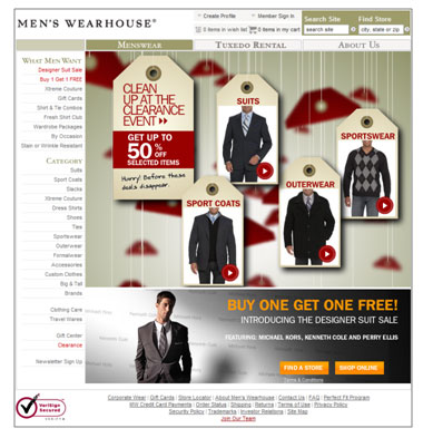
As for the landing page, my first impression is that it is a good page and I see how it would be difficult for a marketing team to know where to begin when designing a test. What do you test first?
The Conversion Sequence
That’s why the MarketingExperiments Conversion Sequence is so helpful. It focuses your energies, forcing you to move methodically through each variable as you analyze a page.
For the remainder of this blog post, I’ll analyze this page by viewing it through some of the variables of the conversion sequence: motivation, value proposition, friction, incentive and anxiety.
Motivation
Your landing page or your homepage must connect to the customer’s demand or need for a product. If they clicked on your ad, something in the ad motivated them to do so. To continue reaching that motivation, the landing page must immediately connect with your natural search ad. The best place to do this is with a headline. Without a headline that connects with the channel, the visitor may initially question if they are in right place to buy a suit.
They may know brick-and-mortar Men’s Wearhouse stores sell suits and they can see pictures of suits on this page, but can you actually buy a suit on this website? Many large retailers have websites that just “show” the products in their catalog but don’t actually “sell” the products. Add to that uncertainty the fact that a suit needs to be tailored. One of the motivation challenges you face is overcoming any visitor’s ingrained belief that suits must be bought in person rather than online (this is also a source of friction).
I recommend testing a simple headline at the top of the page, below the navigation and above the main images, that clarifies what a visitor can do on this website and why they should do it. For example, “Shop Online for Suits, Sport Coats, Sportswear, and Outerwear and Take Advantage of Exclusive Discounts Not Available in Stores.” Create several headlines that connect with your visitors’ motivations and continually test them.
Value Proposition
Your value proposition communicates the unique value you have to offer your ideal prospect.
You need to communicate to the prospective customer that you are indeed the leading men’s dress apparel retailer. But you can’t just say this, you have to prove it. And the best way to do this is to let other people prove it for you. For example, under your logo you may want to test inserting something like “Voted #1 by [well known entity].
You will also want to convey your unmatched quality. If someone clicks on the “About Us” section, they can read detailed information about your “Value Commitment” that includes delivering guaranteed quality merchandise. But you are relying on the visitor to do all the work, to search for this essential part of your value proposition. It’s buried on your site and you make visitors dig for it. I would recommend incorporating it into your homepage where it is plainly visible and easy to understand.
Friction
In order to identify sources of friction, we need to look for any element that may make it more difficult for a visitor to buy a suit or garment. And we cannot just identify sources of friction by looking at the page. We have to analyze how a visitor will experience the page, because friction is psychological, existing in the mind of the visitor.
First, it is not completely obvious that the tags are clickable. When someone lands on the page, they shouldn’t have to think about where to click. It should come naturally and instantly.
Also, the left navigation is somewhat confusing. The links in the top section are unusual ways to navigate through a clothing store:
How many people know what “Xtreme Couture” is or want to join the “Fresh Shirt Club”? My guess is that most visitors will want to immediately navigate by a category such as suits, sport coats, or slacks. Look at your analytics: do most sales come from the categories or from links such as Xtreme Couture? If the latter is the answer, then you are organizing the navigation correctly. If not, I would definitely recommend testing the priority of the two left navigation sections.
I think the biggest source of friction may be located in a visitor’s uncertainty about how they can buy a “tailored” suit from an online store. If you buy a suit from MensWearhouse.com, do you have to take it to your own tailor? Or bring it into a physical Men’s Wearhouse location? I don’t know the answer, but I would recommend being crystal clear about this on the homepage. A simple, easily visible statement explaining the tailoring process after you buy a suit should suffice.
Incentive
An incentive’s function is to stimulate a desired action by your prospect. This page has two great examples:
- Buy one get one free
- Up to 50% off
However the BOGO link in the left navigation is difficult to find right away with a quick scan of the page. It is small and blends in with the content. Sure it is red, but it needs to be emphasized using size and shape in order to stand out. And the other BOGO section is located at the bottom of the page below the fold. Many people many scroll down to this section and see the bright orange font, but many will not.
As for the 50% discount, it is large, in the eye-path, and stands out. But how do you get more people to click on it? You may consider being more specific and quantifying the currently ambiguous “selected items.” For example, “Get up to 50% off over 200 suits, coats, and shirts.”
Anxiety
Anxiety is associated with a “concern” about something and is usually located in the payment process. As this is a home page with no real purchase commitment, the element of anxiety does not pose a major threat to your conversion rate.
But, there are actions you can take on this page that will help to mitigate anxiety that will occur in the future. First you can take information in the “About Us” section, such as your Value Commitment Guarantee, and find ways to communicate it on the homepage. A money-back guarantee can make so much difference if used correctly. When a customer is aware that any purchase is essentially “risk free,” then it makes the final click on the purchase button so much easier.
Also, consider prominently displaying your phone number for reassurance that it is easy to reach you in the event that a visitor has a problem or question. They may not call, but just knowing you are there, ready to help them at any time gives visitors confidence in their buying decision. There is an enormous gap between the ability of an online store to answer a question versus a sales person in a brick-and-mortar store. The level of accessibility an actual sales person offers is just nonexistent online, so anything you can do on your website to close this gap just a little will go a long way.
I hope this quick landing page optimization helps you formulate some great test ideas. Thanks to the folks at MensWearhouse.com for submitting it in our B2C landing page optimization web clinic. Good luck and keep us informed of your results.
Audience: What do you think? Use the comments field to post your suggestions for this landing page, agree/disagree with Adam’s assessment, and let the MensWearhouse.com folks know what you would do.
Three years later, these are STILL HIGHLY RELEVANT. It’s interesting that there seem to be a growing number of similar topics – finally. Just proves how much insight you’ve had all along, Anna.
Loved reading your critique and reasoning behind your recommendations. Like many others, I learn best from real examples. THANK YOU for sharing.