We approached the study of Friction by asking and then answering the following three key questions:
The Questions:
- What is sales process Friction?
- How does Friction in the sales process affect conversion?
And, most importantly . . .
- How can I use my understanding of Friction to maximize the conversion rate of any sales process?
Case Study 1
Test Design
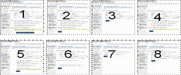
We conducted an experiment for the publisher of a very large national newspaper. The goal was to develop a new order process that would maximize conversion. The original process consisted of 9 distinct steps, each on a separate web page:
Optimized Process:
In an effort to improve conversion, we reduced the number of steps from 9 to 3 and reorganized the form fields to reduce perceived form length to make the pages “feel” shorter and easier:
Results:
We found the following:
| Landing Page | Conversion |
|---|---|
| Long Checkout | 0.26% |
| Short Checkout | 1.04% |
| Increase | 300% |
What you need to understand:By reducing the length of the order process from 9 pages to 3 and reorganizing the form fields, we increased conversion by 300%.
This increase in conversion was influenced by two distinct elements of Friction, which we will discuss later. First, we need to establish a clear definition; then we need to examine how friction affects sales conversion
1. What is sales process friction?
Definition——Friction(Marketing): Psychological resistance to a given element in the sales process.
Friction arises from any element of the sales process that causes aggravation, fatigue, or confusion. Friction does not occur on the page but rather in the mind of the customer as a function, an effect, of something on the page
Unfortunately, if you eliminate all sources of friction, then you eliminate the sale, for we must eventually ask for a credit card number, address, and other information.
Friction in the sales process consists of two components:
- Length
- Difficulty
Length relates to fatigue, irritation, or aggravation caused by forms or processes that ask for more time or information than feels reasonable to the prospect, such as an email newsletter sign-up form that asks for physical address, telephone number, or gender.
Difficulty-related Friction is the result of website elements that cause confusion or require an undue intensity of effort to complete, such as asking for a spouse’s driver’s license number or social security number, requiring that the dimensions of a cabinet be expressed in U.S. Customary units for a European shopper, or asking a customer to make a purchase decision without first providing sufficient information to make an informed choice.
Case Study 2
We worked with a leading publisher of print and online news to increase subscriptions for an electronic version of the paper through optimization of the offer page and subscription process, which included a free trial option. .
Original Offer Box:
The original offer page caused friction because there were 3 competing objectives and 3 evenly weighted options, requiring that the visitor choose among the three without first supplying enough information to make an informed decision.
Optimized Offer Box:
The optimized form requires only one choice, and the call-to-action is simply a “Confirmation,” thereby minimizing difficulty-oriented friction (dT).
Here is the whole page:
| Original | Optimized |
|---|---|
 |
 |
Note the optimized box is framed and highlighted using gradient shading to add weight and draw the visitor’s attention directly to the single call-to-action.
Results:
| Landing Page | Conversion |
|---|---|
| Original | .80% |
| Optimized | 1.32% |
| Increase | 65% |
What you need to understand:By including 1) the offer price on the landing page (which also removed one page in the order process) and 2) minimizing friction by reducing the level of decision making difficulty on the order form, free-trial-signup conversion rose by 65%.
Now we need to answer the question:
2. How does friction in the sales process affect conversion?
MEC Conversion Index:
Wherein:
C = Conversion probability
m = motivation of the user
v = value proposition clarity
i = Incentive to take action
f = Friction elements of process
a = anxiety
Principles
- One of the most effective ways to increase conversion is to decrease friction.
- The objective is to minimize not eliminate friction. If you eliminate all friction you, necessarily, eliminate “the sale.”
- Once friction has been minimized, you seek to overcome the remainder with incentive.
Minimize friction; maximize incentive. As depicted below, you can weigh the two to balance friction against incentive.
Choosing the best incentive is a matter of Perceived Value Differential (PVD)—the difference between the perceived value of the incentive and your cost for the incentive. The greater the perceived value of the incentive and the lower your cost for it, the higher your yield.
Case Study 3
Test Design
We conducted an 18 day experiment for one of the top paid subscription websites in the world.
The goal was to optimize the order process to maximize conversion to subscription.
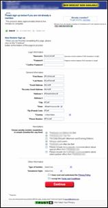
Original Page:
Note: 1) The lengthy form was composed of four different sections(login information, general information, newsletters, and other information).
2) The biggest friction element, credit card information, still lay ahead.
3) Having to check or uncheck options for additional newsletters added difficulty.
Optimized Page:
Note:
- How the headline is clear and benefit-focused.
- That ONLY the email address and name are required for sign-up.
- The much simpler, cleaner page format.
Results
We found the following:
| Landing Page | Conversion |
|---|---|
| Original | 0.60% |
| Optimized | 1.06% |
| Increase | 77% |
What you need to understand: Simply reducing the number of fields required and dramatically reducing the perceived page length through layout increased overall conversion by 77%.
Case Study 4
Test Design
We conducted a 7 day experiment with a company offering a personality assessment in which the visitor received an evaluation of personal communication style.
The goal was to obtain as many assessment completions as possible.
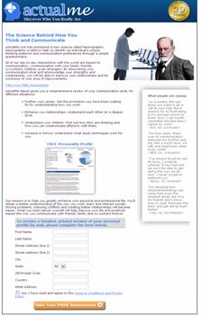
Original Page:
Note:
- Nine information fields were required to obtain a FREE product.
- Both the number of fields (length) and the nature of the fields (difficulty) created friction in the customer’s mind.
- Some customers experienced confusion regarding why a postal address was needed to continue.
Optimized Page:
Note:
- This page is identical to the previous one except for the amount and nature of information required to continue.
- The ONLY information asked for is the email address.
- The postal address isn’t requested until after the assessment.
| Landing Page | Conversion |
|---|---|
| Original | 19.76% |
| Optimized | 24.83% |
| Increase | 26% |
Sales process Friction is psychological resistance to any element of the sales process. Friction can be broken down into 2 components: length and difficulty. Length is related to aggravation or fatigue, while Difficulty is related to confusion or extra effort. But friction is often easy to address and for the effort invested can yield a disproportionally high return.
In answer to our last question, “How can I use my understanding of Friction to maximize the conversion rate of any sales process?” you will find that consistent application of the four principles below will reduce your pages’ tendency to aggravate, confuse, and exhaust your customers and allow the investment you have made in advancing the other elements of web page conversion to take hold and boost your site’s sales performance.
- Ensure that each page in the order process has a single primary objective, and that everything on the page drives toward its call to action. This will eliminate confusion and minimize difficulty-oriented friction.
- Reduce perceived form length to make the pages “feel” shorter.
- Request no more information than is needed at each stage of the buy process.
Use vertical layout and concentrate primary offer content in the main body, using the right or left columns only for offer-support content and navigation to minimize difficulty-oriented friction.


