We examine research findings to discover what factors determine the efficacy of online marketing email copy.
We examine research findings to discover what factors reduce “bounce” rate and keep visitors continuing through the conversion “funnel.”
We looked at what determines whether people who arrive on a business-oriented landing page will move forward on the site or “bounce” to a competitor’s.
The factors and principles indentified are the collective product of research conducted over many months across a broad spectrum of products and industries.
We used recent research to explore the factors that influence what makes business landing pages “sticky” and how to use this information to direct your landing page optimization strategy.
EDITOR’S NOTE: The live clinic where this research was presented included analyses of essential “sticky” principles using sites from participants specifically for the clinic by Dr. McGlaughlin and the Marketing Experiments Team. You can listen to a recording of the clinic by using either of the links below.
Email has become an extremely powerful marketing tool. In fact, U.S. firms spent more than $400 million in 2006.
Our research has identified 6 distinct factors of email marketing campaign effectiveness. Not surprisingly, body copy is among the factors with the greatest impact (highest coefficient).
In the first part of this brief, we focused on writing effective email copy. In part 2 we build upon those principles and show you how to optimize your envelope fields and employ the power of urgency.
Unless we are careful, it is easy to become complacent and inflexible with our current page design or process flow and forget that “marketing is testing.”
With continually increasing competitive and economic pressures, many businesses find allocating time to landing page optimization a challenge. But it is essential that we fight complacency in order to effectively overcome those business challenges.
Because marketing IS testing, companies must have the right tools and processes in place to keep up with changes in their markets, with industry and world events, and with technology-enabled threats from competitors.
Case Study
Test Design
We conducted a 7-day experiment with a company offering an innovative personality assessment in which the visitor receives an assessment of personal communication style. The goal was to obtain as many assessment completions as possible. For this landing page, the objective is a click-through to the assessment start page. The best performing page is the one with the lowest bounce rate.
We split traffic equally between four treatment pages:
- Short copy with email capture
- Long copy with email capture
- Short copy with email and physical address capture
- Long copy with email and physical address capture
Treatment 1: Short copy with email capture

Note the brief introductory paragraph (“ActualMe.com has pioneered . . .”), the “Take your FREE assessment” offer, the quick bulleted points, the “FREE Personality Profile” offer, and the email capture at the bottom as the only fill-in field.
Treatment 2: Long copy with email capture

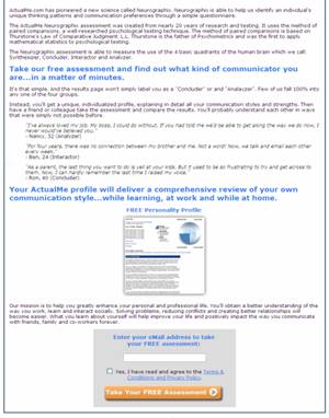
This page contains more than 4 times the amount of text with much more detail. Although we’ve kept the anchor tag (“Take your FREE assessment”), the email capture button is at the very bottom.
Treatment 3: Short copy with physical address capture
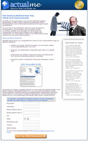
Note that this treatment is exactly the same as Treatment 1 except for the number of fields required to continue.
ActualMe’s goal was to get the visitor to complete an assessment.
Treatment 4 (Long copy with physical address capture) was exactly the same as Treatment 2 except that it required the visitor to fill in more information before proceeding to the assessment.
Notice that in all of these the eye path is vertically aligned, the only thing on the right being supportive and not necessary to complete the process.
Take a few minutes and think about which treatment you feel would get the lowest bounce rate. And while you’re at it, think about the science behind the copy. The tone of voice is almost academic.
The key idea behind the site is that people can improve their communication skills by taking the assessment. We provide testimonials, the “20 Years” seal, and a sample report to bolster credibility, but comparing the click-through between long and short copy is the main thing to key in on.
Results
| TEST 1: Landing Page Optimization | |
|---|---|
| Page | Bounce Rate |
| Treatm’t 1: Short/Email Capt. | 62.5% |
| Treatm’t 2: Long/Email Capt. | 69.9% |
| Treatm’t 3: Short/Phys. Addr. Capt. | 73.5% |
| Treatm’t 4: Long/Phys. Addr. Capt. | 77.8% |
| Treatm’ts 1 and 2 Difference | -6.7% |
| Treatm’ts 1 and 3 Difference | -11.3% |
| Treatm’ts 1 and 4 Difference | -16.2% |
What you need to understand: The landing page treatment with the least friction* (i.e., shortest copy and fewest fields) had a 16.2% lower bounce rate than the page with the greatest friction level, and 6.7% lower than that with the next lowest friction level.
Case Study
What if . . .
Within this particular market segment, the pages with “short copy” outperformed those with “long copy.”
This made us curious about What would happen if we tested even shorter pages?
So we tested the best performing page from the first test against two new landing pages: one with even shorter copy and another with almost no copy at all.
We also tested friction variation by removing the email capture. This also reduced anxiety, as no personal information was requested on the landing page.
Treatment 1: Short copy with email capture

Treatment 5: Shorter copy with no email capture

Treatment 6: Shortest copy with no email capture
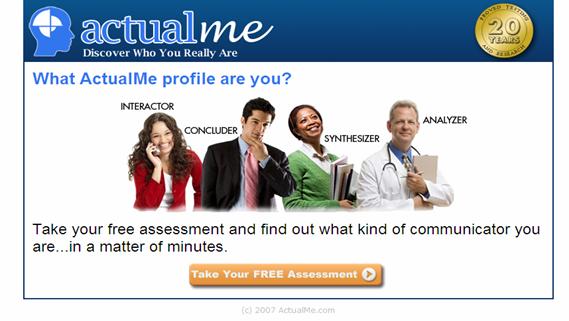
Take your time and think about which would get the lowest bounce rate.
Results
| TEST 2: Landing Page Optimization | |
|---|---|
| Page | Bounce Rate |
| Treatm’t 1: Short/Email Capt. | 66.9% |
| Treatm’t 5: Shorter/Button only | 27.1% |
| Treatm’t 6: Shortest/Button only | 44.8% |
| Treatm’ts 1 and 5 Difference | -59.5% |
| Treatm’ts 1 and 6 Difference | -33.0% |
| Treatm’ts 6 and 5 Difference | 65.3% |
What you need to understand: By reducing the amount of copy and removing the email capture both new pages performed better than the previously best performing page, with the best page yielding more than a 59% lower bounce rate. Note, however, that the shortest version did not perform as well as Treatment 5.
We are searching always for the “Information Divide”—the line that divides too much information from too little for the visitor to stay on the page and continue through the funnel.
Further testing is underway on the hypothesis that this was caused by the unique absence of any text or image references to ActualMe’s use of “The Science Behind . . .” [the test], the elimination of which could reduce credibility and increase anxiety.
Question: Does short copy always outperform long copy?
You will know, if you have been a Marketing Experiments journal reader for long, that the answer is “No.” You have seen many case studies in which long copy far outperformed short copy.
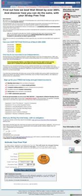
To illustrate this point, let’s take a brief look at one such experiment with an investment newsletter site that shows the relationship between copy length and page performance.
Case Study
Short copy

(intentionally blurred for anonymity)
vs.
Long Copy
| Free Trail Offer Page Test Results | |||
|---|---|---|---|
| Free Trial Offer | # of Visits | # of Orders | Conversion |
| Original page—Short copy | 904 | 12 | 1.33% |
| Optimized page—Long copy | 972 | 22 | 2.26% |
In this case, the long copy version, which included extra anxiety-reducing elements and other features enabled by the long copy format, performed far better, ultimately yielding an 89.4% increase in conversion.
Factors that affect whether short or long copy performs better:
- Cost
- Perceived risk—anxiety
- Level of commitment (high/low; long/short)
- Motivation Type (rational/emotional; analytical/impulse; want/need)
| Long Copy vs. Short Copy Performance—Influence Factors | ||
|---|---|---|
| Attribute | Short Copy Performs Better ActualMe |
Long Copy Performs Better Investment Newsletter |
| Cost | Low or No | High |
| Perceived Risk —› Anxiety | Low or No | High |
| Commitment Level | Low/Short | High/Long |
| Motivation Type | Emotional/Impulse/”Want” | Rational/Analytical/”Need |
Key Point: Whether long copy or short copy is more likely to hold visitors on your site or “bounce” away to a competitor is influenced by these key factors.
Question: What determines which will perform better?
| Long Copy vs. Short Copy Performance—Influence Factors | ||
|---|---|---|
| Attribute | Short Copy Performs Better ActualMe |
Long Copy Performs Better Investment Newsletter |
| Cost | $0 | $95 (after trial) |
| Perceived Risk —› Anxiety | None to Email-Only | Name, Email, CC# & Exp, on page |
| Commitment Level | Low/Short | 1 Year |
| Motivation Type | Emotional/Impulse/”Want” Find out about Me |
Rational/Analytical/”Need Fulfill my need for investment advice |
What you need to understand: The newsletter subscription offer involves a monetary purchase and a one-year commitment, and fulfills a “rational,” practical need. This involves an analytical decision about value vs. cost. On the other hand the ActualMe product offers to fulfill an emotional “want” to discover more about “myself” at no cost, little time investment, and low perceived commitment.
Key Point: The cost and commitment for the investment site is considerable. The prospect perceives more risk. Thus the desire to know more leads to the necessity for longer copy in order to smooth friction and reduce anxiety. (Friction is about annoyance or irritation; anxiety is about worry or fear.)
The more risk you perceive in making a wrong decision, and the longer you will have to live with the consequences of that wrong decision, the more compelled you feel to gather information and make a considered choice. Possible examples include selecting a health insurance plan, attorney, or heart surgeon. Such buying situations lend themselves to long copy offer pages.
On the other hand, low-risk, low-cost decisions—especially ones that address impulse or emotional desires—are well-suited to short copy offer pages. Examples include “learn about me” surveys, such as the ActualMe case study
Landing Page Performance Elements
Through extensive research, Marketing Experiments has identified six essential elements that affect landing page performance:
- Friction—caused by elements of the page that require a prospect to do extra work and increase the likelihood of abandoning the page due to fatigue or irritation.
- Incentives such as bonus gifts or special offers can make the offer feel more worthwhile and encourage the visitor to continue.
- Visitor Motivation Level and Type are factors that influence how many will remain on the site or bounce off. The nature and level of visitor motivation is essential to what landing page attributes will prove to be the “stickiest.” If people really want something, they’ll put up with more friction. We observed this in the short-copy vs. long-copy case study.
- Value Proposition—How quickly, clearly, and effectively the landing page conveys the site’s value affects its ability to move visitors to the next step and not abandon the site.
- Anxiety—All visitors arrive at a site with an initial level of anxiety caused by their perceptions of the relative risks associated with the site, the company, and the product.
- Credibility Indicators—You can improve click-through and conversion by including page elements that convey trustworthiness through credibility indicators such as awards, privacy policies, certifications, testimonials, and longevity statements such as “serving the needs of ___ for more than 15 years.”
We saw that the level of friction caused by copy length and form fields varies depending upon factors such as product cost and commitment levels. These can be offset by adding incentives such as bonus gifts or special offers.
We observed that the amount of initial anxiety from the perceived risk/cost of going forward influenced how much copy, including credibility indicators and explanatory text, was optimal to balance against added friction from copy length. Low perceived risk (anxiety) equals short copy being optimal, while high perceived risk (cost, commitment) correlates with long copy being optimal.
The type of motivation also proved to be a factor.
Rational/analytical/“need”-oriented products consistently correlate with long copy as optimal, while emotional/impulse/”want”-oriented products correlate with short copy being optimal.
Analyzing these factors about your own site and products will help you design landing pages that go beyond simply preventing them from bouncing off the site to instantly engaging your visitors and impelling them forward to your desired action.
Related MarketingExperiments Reports:
- Marketer’s Intuition
- Optimizing Landing Pages
- Optimizing Subscription Pathways
- A/B Split Testing
- Optimizing Site Design
- Conversion Rate Optimization
- Long Copy vs. Short Copy
- Page Weight Tested
- Multivariable Testing
- Offer Pricing Tested
- Order Process Tested
- Essential Metrics for Online Marketers
- Page Weight Tested
- Ideal Subscription Path Tested
As part of our research, we have prepared a review of the best Internet resources on this topic.
Rating System
These sites were rated for usefulness and clarity, but alas, the rating is purely subjective.
* = Decent | ** = Good | *** = Excellent | **** = Indispensable
- How To Measure the Success of Your Web App ****
- Using a Conversion Funnel ****
- Conversion Funnel 2.0 ***
- What Exactly Is a Scenario? ***
- Breaking Down a Conversion Funnel ***
- Save Money with Web Analytics ***
- WebTrends 7 Evaluation Guide ***
- The eCommerce Conversion Funnel ***
- Conversion Funnel Folly ***
- Transactional Website Conversion Explorer ***
- Conversion vs. Persuasion: What’s Your Challenge? ***
- Improve Web Sales Figures Forever and Ever Amen! **
- Removing the Maybe Factor in Your Copy *
- How To Reduce Single Page Accesses
or Bounce Rates on a Content Website * - How Do I Improve My Web Site Conversion Rate? *
- The Long and Short of it is that
These Two Sales Techniques Are the Same * - Increase Conversion Rates by Measuring Bounce Rates *
- Q&A: More Strategies To Improve Your Web Site Conversion Rate *
- Website Optimization, Bounce Rate, and Conversion Rate *
- Paid Search Strategies for High Cost, Slow Conversion Products *
- Excellent Analytics Tip #8: Measure the
Real Conversion Rate & “Opportunity Pie” * - Sticky Pages: Writing Your “Copy.” *
- Tales of Pogo Sticks, Bouncy SERPs, and Sticky Pages *
- Funnel Report: Meaningful Data that’ll Blow Your Mind *
Credits:
Editor(s) — Frank Green
Bob Kemper
Writer(s) — Frank Green
Adam Lapp
Contributor(s) — Ana Gabriela Diaz
Jimmy Ellis
Flint McGlaughlin
Aaron Rosenthal
Nick Usborne
HTML Designer — Cliff Rainer


