We say in our online courses that every element of a Web page must state or support the value proposition. But, what communicates the value of an offer better – a beautiful image or well-crafted copy? Do people tend to respond better to images or do they prefer copy?
All marketers have to face these questions at one time or another in the creative process, and recently, our research analysts had the opportunity to test this particular issue. You might be, as I was, surprised by the results.
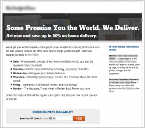
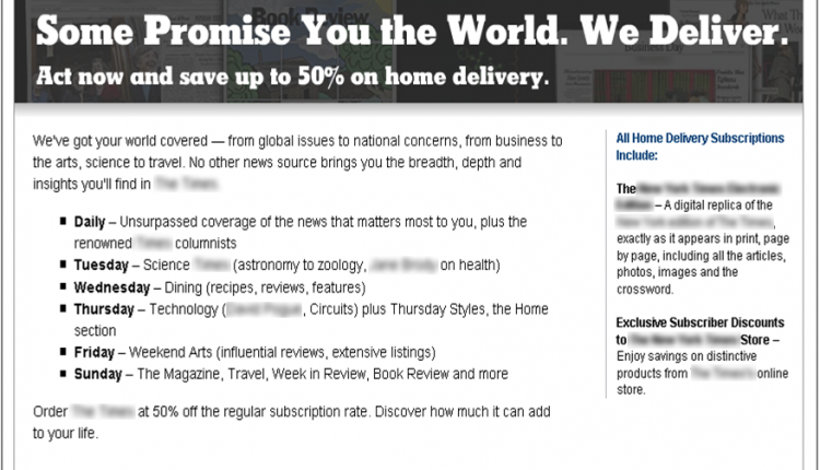
Original page – Copy-rich Version (Click to enlarge)
 We were working with a well-known news publication offering home delivery services via online registrations. Our specific goal of testing was to increase the amount of home delivery subscriptions.
The page we were attempting to optimize was their current best performer for home delivery sign-ups. It had already been through a series of previous tests and had stood out as the winner.
But “adequacy is the enemy of excellence,” as Peter Drucker says, and we wondered if we might improve the page even further. So, working alongside this organization’s marketing team, we began to test radically different page strategies.
One of the things we immediately noticed about this page was that it was copy rich. Most of its value was being communicated through copy. And though the copy wasn’t perfect, it was already decently refined though testing, so instead of attempting to tweak the copy further, we began to wonder about the impact images might have on the communication of the offer’s value.
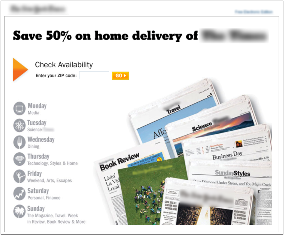
Treatment Page – Image-heavy Version (Click to enlarge)
 In a radical redesign of this page, we removed the majority of the copy and replaced it with imagery.
First, since this was a newspaper home delivery option, we hypothesized that it might be more impactful to just let the newspaper communicate for itself with real images of the printed paper.
We also made sure to use images of each of the different daily featured articles to highlight the diverse content offered by the paper
Iconic images also replaced the standard bullet points next to the daily content feature list, and a gigantic arrow was employed to draw immediate attention to the call-to-action. Overall, this page leans significantly on images to communicate the product value.
The Results
And the winner is…
The image-heavy version outperformed the control in clickthrough by 21% and in overall conversion by 29%. Now, before you start scrapping the copy on your Web pages, there are a couple things that should be noted and learned from this test:
- This product is offering a tangible product that can be held and read in your hands, and therefore images may have brought more reality to the value. In most of our testing, the answer to the question of images vs. copy is dependent on what better communicates the value for a particular offer. In choosing images and copy, we should always be asking ourselves three questions: 1) Can what I am saying with copy be better stated with images? 2) Can what I am saying with images be better stated with copy? 3) How can I bring these two elements together?
- The treatment is a radical redesign. Therefore, though the predominant change was moving from copy to images, there are still other factors that contributed to the success of the treatment. We may hypothesize that images played a significant role in the increase, but the only way to know for sure would be to run secondary tests that focus tighter on the specific variables.
- There is still copy on the treatment communicating crucial information. In fact, if you removed the copy, it would be difficult to discern what the actual offer is. This underscores a second point and that is, the goal is never to pick images over copy or vice-versa. The bottom-line is that an image has unique strengths and copy has unique strengths. The objective on your Web page is striking a balance between the two ensuring that every element of the page is communicating value with the greatest impact.
These three points, as well as more on balancing the use of images and copy online, were specifically covered in our recent Web clinic, “Images vs. Copy: How getting the right balance increased conversion by 29%” Activate your free subscription to be notified when the replay of this Web clinic is available.
Additional Resources
Images vs. Copy: How getting the right balance increased conversion by 29%
Internet Marketing: How your peers balance images and copy
Homepage Design: The five most common pitfalls and how to overcome them


I think the image heavy version will generate more conversions. It looks like the CTA is much clearer and the imagery supports it… could be wrong, but i’m interested to find out
I enjoyed this webclinic immensely, and more similar examples would be interesting. Particularly, cases that test the importance of foundational elements- e.g. a known brand (less information needs to be communicated, favoring images over copy), the psychology of the buyer (most know what a newspaper is and home delivery is and do you want to serve need or surface need?) and the availability of images (i.e. your emphasis that the images represented significant copy in this case and represented the value well).
I particularly liked your summation of evaluating each piece of copy or image by what job it does, and whether the opposite (image instead of copy, copy instead of image) would do the job better.
Maybe try to find a case that falsifies the premise- e.g. everything looks the same, but images hurt.
Reverse case studies would be interesting as well- how much you can undesign a page (i.e. take out the fancy stuff) and keep traffic.
Thanks for the great work.
My vote is for the image heavy version too. With this version it takes a lot less effort to figure out “where am I,” “what am I supposed to do here,” and “why should I do it.” That being said, the fact that the brand name / product is well known may be helping to sway my opinion toward the “image heavy” version. If it were a lesser known brand or product I may want more detail.
Looking forward to hearing more about the results.
Hey Austin,
I would actually say the biggest difference between the two is that the image-focused page has BETTER copy.
Look at the headline of the copy heavy one: “Some Promise You The World. We Deliver,” followed by a sub-head of “Act Now and Save 50% Off on Home Delivery”
The image heavy one says: “Save 50% on Home Delivery Of ____”
So you have on the copy heavy version a generic slogan that could apply to any product in the universe, followed by a smaller call to action and benefit.
If you glanced at the copy-heavy page, you might not even know what was being sold if you only had a second.
To any legitimate copywriter, the the headline on the copy-heavy page is awful for direct response purposes. The subhead might not even get noticed and is not as well worded as the savings headline on the image heavy page.
In order for this to be a fair test, you need to AT LEAST have matching headlines.
I think some more tests would be appropriate.
–Dan
@Dan at Chiromatrix
Dan, you are correct, there are a couple significant changes that were made to the treatment other than adding the images. One as you mention is the more quantitative headline and the other which hasn’t been mentioned is the emphasis and placement of the call-to-action. Both of these factors no doubt had an impact on conversion along with the images, and as mentioned in the post, the question of how much impact each change had will have to be resolved in future testing.
You might also find this recent presentation on the “fairness” or “science” of variable cluster testing of interest. (particularly slides 20-23, 33)
https://www.marketingexperiments.com/images/multifiles/articulate/webclinic-10-20-10/player.html
Either way, I agree, we will need to keep testing our way into more precise conclusions. Thanks for the comment!
I completely agree with Dan on this. While this test is very interesting, there are definitely holes in the testing methodology that leaves much left to debate. Most notably, the fact that the different pages have different headlines. So one might conceivably argue that the headline, “Save 50% on Home Delivery Of ____” might have significantly contributed to the lift on the image heavy version. And why wouldn’t it? There’s more emphasis on the call to action. Furthermore, it’s a pretty general analysis to say that images generate more response.
Also, I would take this further by demonstrating how much more compelling images/graphic treatment could provide lift – while utilizing the exact same copy: generic product images vs. images of people enjoying the product vs. images with people in them communicating the visual concept of saving money, etc, etc.
~ Tony
@TonyKinard
I agree with Dan and Tony. The significant difference in the headline copy makes the conclusion that the “image-heavy” version won due to the different treatment pretty suspect.
A more accurate conclusion would be that more direct-reponse focused copy and graphics worked in combination to boost response over the previous control.
Still … a win’s a win so congrats on that.
-Charmin
@CharminSterb
Hey, I’m on board. We all agree that the we can not decisively say from this test alone which aspect of the treatment contributed most to the conversion, but my question to you is this: Do you believe (as I do) that the images played some role in the increase?
If so, what do you think was done well? Or what could be done better?
This is a great conversation! Thanks for engaging.
@@TonyKinard
Tony, we ran a test on another product offering of this company using images of people enjoying the paper as you are suggesting. You might find that study interesting. Here is the link:
https://www.marketingexperiments.com/images/multifiles/articulate/webclinic-04-28-10/player.html
Thanks again for your feedback.
Austin,
I really appreciate how open you guys are to comments, including challenges on methodology.
If there’s another tweak I can recommend for an “images vs. long copy” experiment, it would be to have the copy-heavy version contain some of the images of the image-heavy version, only smaller, of course. And giving the image-heavy version a condensed form of the text from the copy-heavy version would also be good.
Just like a biological experiment, we want to isolate the X-factor involved as much as possible.
How about copy versus images in e-mail marketing?
My own tests show that they are on par, but I’m very curious about other results
I venture to say that key audience also makes a difference… e.g., in this eblast, if the audience is private, home email addresses where the recipients are at their large-screened home computer and can enjoy the graphics-rich communication– that contributed to its success rate, but if your audience were traveling salespeople, the PDA experience might be a pain in the tookus, and hurt click through.
What I find interesting about this is that the design of the second page (treatment) is SO MUCH better than the first. The first page is black and white and all of the graphic treatment of type is very straight-laced. The second image has visual excitement, color, good use of negative space and draws you in. My hypothesis is that it is the improvement in the design and the fact that it invites you to explore what is being said that is the key difference. Robert Friedman, FEARLESS BRANDING
I think this all comes down to what Gene Schwartz called your prospects ‘state of awareness’.
The people that got through to this landing page to begin with already know the product and already know what they get out of it.
The only thing they need to know is what the offer is – and a reminder of what they’ll get for their money.
The copy failed because it wasn’t targeted to the reader in this way.
I think a copy version could still outpull the ad with the images – EASILY… But this copy would need an almost complete ‘you-driven’ overhaul…
According to today’s belief a web page designed with good crafted images will have more page views than that of page full of content. Image heavy version will draw good response as compare to copy-rich version.