Affiliate marketers have it tough these days. So many affiliates are attracted by the promise of building a business without having to involve themselves in the details of actually filling orders. With a marketplace so saturated, it’s difficult to get any kind of ROI out of affiliate campaigns.
So, how can affiliate marketers increase their ROI?
The same way a merchant would increase its ROI: by providing enough perceived value to guide the prospects to, and through, the offer.
Of course, increasing ROI is always easier said than done. And because that’s part of the job of our research analysts, Adam Lapp, Associate Director of Optimization teaches an optimization training class every Thursday here at MECLABS. In it, Chris Rochester, one of our research analysts, developed a treatment homepage for affiliate website Safari.com as a thought exercise.

–
Now, before I go any further and show you Chris’ treatment, it needs a heavy disclaimer. Because Safari.com was submitted by one of our Web clinic audience members, we didn’t have any actual metrics for the site. In other words, Chris may not have made the suggestions he did in the treatment had he seen the real data behind the site.
Fortunately, our Associate Director of Optimization, Adam Lapp, developed some example metrics Chris could work from. So here’s some imaginary background for you…
(Imaginary) Background
Safari.com is an affiliate website generating leads for ziarasafaris.com
- We don’t sell vacations, but instead get paid for each lead we generate for Ziara Safaris
- We get paid more for leads that turn into sales
- We sell ads on our website, which accounts for 10% of our revenue
If you want the full set of metrics Adam developed, you can download the PowerPoint detailing them.
Treatment
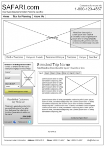
Using the imaginary metrics, Chris was able to create this treatment wireframe:

Chris’ wireframe is what we call a “radical redesign” of the homepage. While it may not look too different, the strategy for the page has completely changed.
Change #1: Give the people what they want
The first thing Chris did was make the page focus on the images.
“According to the data that we had, people liked browsing images,” Chris said. Essentially, by focusing on the images, the treatment should be able to give the visitor what they want up front to begin the process of delivering value.
Please note, we are not suggesting that images are the answer. This is, after all, a vacation site. For many vacation sites, images are crucial. After all, people often need to envision the relaxing/exciting vacation possibilities before they click.
If you sell, say, generic widgets, images may be less important to your visitors, but they are likely looking for something else. This leads us to our first principle. …
Transferable Principle:
- Look at your data and figure out what your visitors are trying to do. If you simply give them what they want up front, you can start to guide their thought sequence through the value to your offer.
Change #2: Repurpose content for an incentive
Once the visitor has looked at the pictures or reads the generic widget specifications he or she needs, they need more value to stay on the page. Chris provided that with a downloadable PDF safari planning guide. The PDF guide would simply be repurposed content from the blog in the form of a PDF to help visitors plan their safari.
Transferable Principle:
- If you have an affiliate site (or any other site), one of the best ways to provide value to your merchant (or regular customers) and site visitors is with content. It not only draws the visitor in, but also generates higher quality leads/prospects for your merchant. In this case, Chris completely changed the strategy of the site with lead generating content.
Change #3: Provide more information
This change really goes back to “giving the people what they want.” After visitors were done looking at pictures and downloaded the guide, Chris wanted to meet them with more information on the individual safaris offered. He did that with a bold headline and a tabbed safari explorer.
Transferable Principle:
- Once your prospect is ready, continue to provide value all the way through the site. Helpful and valuable content is one of the best ways to do that.
Change #4: Reduce anxiety
Because the site is an affiliate site, it needs to convey its l legitimacy. To accomplish that, Chris did two things.
First, he added a phone number so visitors could call a representative if they had questions. Phone numbers also relieve anxiety for visitors that don’t call because they know that someone’s there if they will need them.
Second, he included testimonials directly under the lead generation form. This was designed to help relieve anxiety at the precise point where it most occurs on the page.
Transferable Principle:
- Affiliate sites by nature create a lot of anxiety for visitors. You can over-correct for anxiety with specificity, proximity and intensity.
Change #5: Remove distractions
According to Adam’s imaginary metrics, ad space accounted for about 10% of the revenue for the site. Of course, with a properly optimized page, ads can hurt the bottom line more than help. Many times, the revenue you can generate from removing the distraction of ads on your site is much higher than the revenue the ads generate themselves.
To counteract this without hurting the ad revenue too much, Chris decided to move the ad space to the bottom of the page where it was out of the main eye-path of the visitor.
Transferable Principle:
- Distractions like ad links or multiple calls-to-action on a page can often hurt the overall potential revenue of the page, even if they are generating a small amount of revenue themselves. Always test whether removing them will help or hurt the bottom line.
Live Optimization in the Comments
To thank Safari.com for submitting their page for review, I’d love to help them out by giving them access to some of the smartest marketers on the planet … y’all (we’re in North Florida, the southern-most part of the state). So now that you’ve seen what a researcher from our lab would do, tell us how you would optimize Safari.com’s homepage in the comments. You might even write a post about it and link to it in the comments. Whatever you decide, give them some tips for getting more revenue out of their site.
Related Resources:
New Commissions, Landing Page Tests Power Affiliate Success: 5 Steps to Triple Sales
Affiliate Marketing – Web clinic replay
Affiliate marketing clinic study guide: 12 resources to get you going


Check out the MarketingExperiments LinkedIn Group discussion on this post for some great optimization tips from group members John Hyde and Martin Wiedenhoff: http://linkd.in/safaricomments
Useful pieces of information ,thanks for putting it together.