

Can we separate the form of the writing from its content? — Errol Morris
Is it ever possible to understand the meaning of a work of art as separate from the way in which we receive it? — Lynne Conner

Source: The Pentagram Papers, 44th Edition
In the spring of 1980, Academy Award-winning documentarian Errol Morris (“The Thin Blue Line,” “The Fog of War”) first encountered philosopher Saul Kripke’s seminal book, Naming and Necessity. After reading the book, Morris became fascinated with the theory that words and our interpretation of them are singular manifestations of all of the individual characteristics (seen and unseen) that comprise them.
More specifically, Morris was consumed with the idea that typeface itself might have an innate power to influence our fundamental perception of truth.
“Yes, we read the word ‘horse,’” Morris wrote, ”but we also see the letters, the typefaces, the shape of the word on the page. Is this not part of the meaning? Do we more readily accept (as true) sentences written in one typeface rather than another?”
As Morris continued work on his acclaimed films over the coming decades, this idea continued to haunt him.
Morris collected anecdotal stories dealing with the power of typeface. This included the story of Phil Renaud, a Canadian university student and blogger. While in school, Renaud blogged:
I’m nearing the end of my sixth semester of university, and things are going pretty well: I’m clearing a decent grade point average, enjoying my major, and just having wrapped up my semester’s ‘essay alley,’ wherein all my courses require a term paper or two, and getting my results back telling me that I’m doing much better than usual.
At first, I’m just relieved to be doing so well. Still, ever the skeptic, I start to wonder: what exactly am I doing differently now to be getting all these A-range paper grades all of the sudden?
I haven’t drastically changed the amount of effort I’m putting into my writing. I’m probably even spending less time with them now than I did earlier in my studies, and while I guess you could argue that I’m probably just being a great example of practice making perfect, I’ve got my doubts; I even used to take courses concentrating on writing better essays, and in the time surrounding that, my grades were pretty low.
Then it hits me: the only thing I’ve really changed since I’ve been getting these grades is … my essay font.
Renaud wrote 52 essays in total. 11 were set in Times New Roman, 18 in Trebuchet MS and the remaining 23 were written in Georgia. The Times New Roman papers earned an average grade of A-, but the Trebuchet papers resulted in a B-.
The Georgia essays? A solid A.
“Maybe fonts speak a lot louder than we think they do,” Renaud wrote.
In 2013, Errol Morris finally got the opportunity to test this theory in one of the more remarkable — yet under-reported — social experiments in recent years.
Morris, who had been blogging for The New York Times for five years, penned an article titled, “Are You an Optimist or a Pessimist?” Within the article, Morris discussed a giant asteroid that had recently made a close pass to the earth and detailed NASA’s public assurances that world citizens were never in danger of a collision.
Morris concluded the article with the below quote from internationally acclaimed mathematician David Deutsch:
“If a one-kilometer asteroid had approached the Earth on a collision course at any time in human history before the early twenty-first century, it would have killed at least a substantial proportion of all humans. In that respect, as in many others, we live in an era of unprecedented safety: the twenty-first century is the first ever moment when we have known how to defend ourselves from such impacts, which occur once every 250,000 years or so.”
Immediately after the quote, Morris included a survey, ostensibly to determine whether readers were optimists or pessimists by nature:

In reality, Morris never intended to gauge the optimism of his readers. Instead, the article served a different purpose.
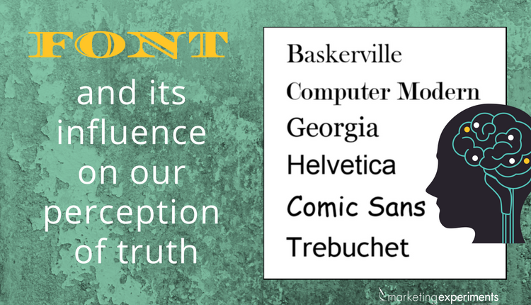
When presenting the final quote from David Deutsch, Morris — with the surprising cooperation of the Times — randomly segmented the readership into six equal groups. For each group, Morris used a different typeface for the quote — Baskerville, Computer Modern, Georgia, Helvetica, Comic Sans and Trebuchet.

With the help of the survey, Morris hoped to test his theory that different fonts subconsciously influence our perception of truth.
45,000 readers responded to the poll — a large enough sample size to validate statistical differences. What Morris found was astonishing. Baskerville, a 250-year-old serif font, had a statistically significant positive impact on reader’s willingness to trust David Deutsch’s quote.
David Dunning, Professor of Psychology, Cornell, was shocked by the results, which validated with a p-value of only .0083.
“I’m surprised that the damn thing worked at all,” Dunning told the Times. “You are conducting an experiment in an uncontrolled environment. Who knows what’s going on at the other end of a computer screen? Their kids could be screaming in the background for all we know. It could be two a.m. It could be two p.m. They’ve had their coffee. They haven’t had their coffee … The font is on their desktops. There is just a ton of stuff out there that could obscure any results whatsoever … But it is clear in the data that Baskerville is different from the other fonts in terms of the response it is soliciting. Now, it may seem small but it is impressive.”
In a follow-up article, Morris came clean to his readers about the experiment:
Here is my confession. My quiz wasn’t really a test of the optimism or pessimism of the reader. There was a hidden agenda. It was a test of the effect of typefaces on truth. Or to be precise, the effect on credulity …
I do not mean to dismiss the possibility of global catastrophe from asteroids or global warming or a host of other possible calamities — bio-engineered viruses spreading out of control, Malthusian nightmares of overpopulation choking off life on the planet, etc. I wouldn’t want to dismiss even the most outrageous of millenarian fantasies, including Mayan predictions of the end of the world.
But for the moment, I was interested in something somewhat less apocalyptic.
We all know that we are influenced in many, many ways — many of which we remain blissfully unaware of. Could typefaces be one of them? Could the mere selection of a typeface influence us to believe one thing rather than another? Could typefaces work some unseen magic? Or malefaction?
Don’t get me wrong. The underlying truth of the sentence “Gold has an atomic number of 79” is not dependent on the typeface in which it is written. The sentence is true regardless of whether it is displayed in Helvetica, Georgia or even the much-maligned Comic Sans. But are we more inclined to believe that gold has an atomic number of 79 if we read it in Georgia, the typeface of The New York Times online, rather than in Helvetica?
In addition to Morris’ work, there are numerous other studies that have found font to directly influence behavior.
For example, The Atlantic reported on a University of Michigan study where two groups of students were presented with identical instructions for an exercise routine. The only difference between the two sets of instructions was the font.
Students who received instructions in Arial font believed that the routine would be quicker and easier to keep up with than students who received the instructions in a more difficult font (Brush). As a result, students in the first group reported a significantly higher willingness to follow through with the routine and make it part of their daily lives.
To test the results, the experiment was repeated with instructions for a complex recipe. Again, students who received the instructions in Arial were more willing to follow through and cook the recipe at home.
Harvard Medical School, the University of Manchester and Leeds Beckett University have all found there to be a direct correlation between font use for medicinal instructions and labeling and patient understanding of the drug and willingness to use it. The Center for Disease Control, U.S. National Library of Medicine and the Centers for Medicare and Medicaid Services all produce guides on font use, with each group urging the use of simple, medium-sized, serif fonts.
Whether it be because certain fonts like Baskerville simply “disappear” into the subconscious of the reader more easily than other fonts or because they have some deeper mystical power, as Morris implies, we cannot argue that fonts matter.
Similarly, just as using the right typeface can bolster reader perception of our credibility, using the wrong font can be disastrous to perception, even if you are the most accomplished organization in the world.
For example, in 2012, scientists at CERN finally found experimental existence of the Higgs Boson — the mythical “God Particle.” This single particle, which science had been searching for since 1960, is what gives everything in the universe mass. Without Higgs Boson, particles would have no weight, gravity would have no effect and the universe as we know it simply could not exist.
It was astounding, then, when CERN — which houses multiple Nobel Prize winners — chose to announce the most important breakthrough in physics since Einstein’s theory of general relativity in the much-maligned Comic Sans font.
Viewers found CERN’s presentation so aesthetically offensive that the font choice became as big of a story as the discovery itself.

The reaction to CERN’s typeface was so strong that particle physicists who should have been enjoying their historic achievement spent the day defending the choice of font.

Now that we know that typefaces influence perception, what can we actually do with this information?
As marketers, we need to be acutely and constantly aware of the typefaces that we are using, and the influence that they have on readers’ perceptions of our individual truths.
Should we abandon all of our favorite or brand-specific fonts and worship before the holy altar of Baskerville? Of course not. Before settling on a typeface for our marketing materials, we should examine our customer theory and carefully consider what we know about our audience.
Are they scholarly? Stylish? Elderly?
Affluent? Skeptical? Children?
Choosing fonts appropriate to our unique audiences, and A/B testing these fonts when possible, can bolster readers’ perceptions of the credulity of our messaging.
There is no one-size fits all typeface, but luckily, there are numerous resources available to help us choose a font.
If ever in doubt, neutral fonts can be used. Helvetica, for example, was designed to be neutral. As explored in the stunning 2007 documentary of the same name, this typeface was created to hold no intrinsic meaning outside of the words.
When optimizing our pages, the typeface can often get overlooked in favor of more obvious elements, such as page layout, call-to-action, imagery, etc. As the Baskerville Experiment proves, however, in today’s hyper-competitive market, we can no longer afford to leave any page element untested.
Note: Prior to desktop publishing, the term “typeface” denoted the actual collection of characters (e.g. Times New Roman), while the term “font” denoted the full application of said characters (e.g. Times New Roman, 10 point, italics). In recent decades, the meaning of the two terms has converged. Thus, the terms typeface and font have been used interchangeably within this article.
You can follow Ken Bowen, Manager of Editorial Content, MECLABS Institute, on Twitter at @KenBowenJax.
You might also like
A/B Testing: What choices does your content really influence?
Value Proposition: NFL’s Jaguars increase revenue with customer-centric marketing
Value Prop: How Radio Shack lost its way by losing sight of its ideal customer