

There’s been plenty of gloom, doom, and handwringing over this year’s holiday shopping season.
While your best bet is to keep projections grounded, not all hope is lost. Even in a tight economy, the Web has several advantages for shoppers, and ecommerce sites that capitalize on these will see more opportunities.
Optimizing a few key areas of your site and channels will help you increase traffic, make browsing and buying easier, and win more new and repeat customers – even beyond the holidays.
The MarketingExperiments research team has compiled this ecommerce holiday “playbook” with 13 specific practices to help you maximize your ROI in this difficult holiday season.
Ecommerce Forecast: The Downturn is Not Exactly New
This season, predictions range from mildly hopeful to dire warnings of a downward spiral. A new Forrester report suggests online retail sales will rise by 12% over last year, but notes that this is the slowest ecommerce growth rate to date. And when Directmag.com polled marketers for predictions for their company’s holiday sales, 72% of respondents said either, “down from ‘07” or “I’m too scared to think about it.”
In truth, high unemployment, market instability and plummeting consumer confidence have had their cumulative effect. B–to–C marketers have been seeing lower sales and higher customer acquisition costs for months now.
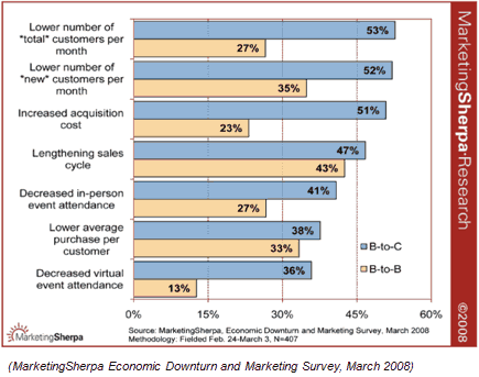
In the best circumstance, B–to–C merchants had the foresight to prepare for the downturn. In this best case scenario, optimization can spring from a strong base of previously established successful practices. In the worst circumstance, B–to–C retailers may view optimization as a risk, but there’s still time to implement productive changes in their pages or sites.
Ecommerce Forecast: The Silver Lining
Some analysts predict ecommerce is in a unique position of strength for this upcoming holiday season. In this slide from our web clinic, we took note of a survey acknowledging ecommerce’s 2008 advantage over brick–and–mortar stores.
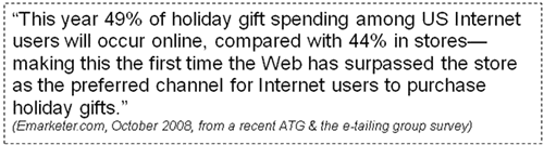
Factors such as high gas prices and free shipping will likely create new opportunities for ecommerce sites to increase sales. Bargain hunting and comparison shopping are sure to increase, and both are easier to do online than in stores.
While this is encouraging news, seasoned marketers realize that competition for consumers in the ecommerce world is wide–ranging and intense. To be part of this positive trend, optimization becomes even more of a necessity.
Optimizing Under Pressure
Faced with conflicting information about the state of ecommerce in a recession, ecommerce retailers must decide how to capitalize on a shifting sales cycle.
Deciding where to begin holiday optimization almost seems like the debate about the chicken and the egg. Which should marketers focus on first, driving traffic or refining landing pages?
Before focusing on driving traffic, marketers need to consider whether or not their landing pages are ready for visitors.
Ecommerce Playbook – Part I
It doesn’t matter how many prospects visit your pages if confusing layout or multiple calls–to–action drive them away almost as soon as they land.
Optimize your ecommerce landing pages for maximum yield–per–visit (YPV) before optimizing your traffic drivers.
Yield–per–visit represents the desired interaction: a sale, a referral, a phone call or a subscription. If you opt for radical redesign, your efforts may outweigh your yield–per–visit and be time and cost prohibitive.
Focus your optimization on quick, minor changes that will have the biggest potential impact.
Put Landing Pages First
Let’s see how one ecommerce site recently applied these efforts:

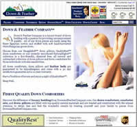
David Smith attended our Landing Page Optimization Workshop in June. He learned the MarketingExperiments Conversion Sequence principles in depth and worked with our analysts on ways to optimize this site.
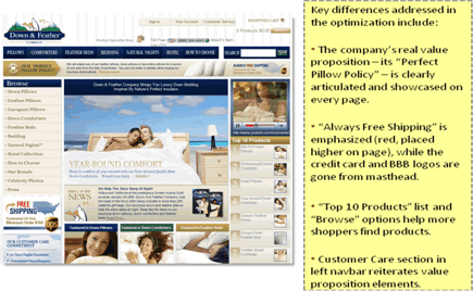
Key differences addressed in the optimization include:
- The company’s real value proposition—its “Perfect Pillow Policy”—is clearly articulated and showcased on every page
- “Always Free Shipping” is emphasized (red, placed higher on page), while the credit card and BBB logos are gone from the masthead
- “Top 10 Products” list and “Browse” options help more shoppers find products
- Customer Care section in left navbar reiterates value proposition elements
Results: The redesign emphasized the value proposition, made it easier to shop, and increased conversion rate by %145.
Areas To Address
While David’s redesign is more intensive than most marketers have time for in the weeks left before Cyber Monday, the principles that guided his optimization apply to all ecommerce sites.
Focus optimization on these high–impact areas:
- Homepages
- Category Pages
- Offer/product–specific pages
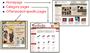
And within those areas, focus on specific page elements for quick changes designed for high impact on holiday visitors to your site:
- Copy
- Headlines and Subheads
- Body Copy
- Calls to Action
- Testimonials
- Graphics
- Product photos
- Buttons, calls to action
- Credibility indicators (badges, awards, security symbols)
- Forms
- Email opt–ins
- Order forms
However, for changed copy, graphics, and forms to have strategic effect, more than surface change is required. Change is useless unless it more clearly reveals the essential qualities that make your company valuable to your ideal prospect.
Set Your Site Apart
Our 13–step playbook lays the groundwork for site redesign that responds to marketers’ immediate holiday needs but also opens avenues for further revision in 2009, as time and opportunity permit.
Step 1: Emphasize Your Value Proposition
A strong, credible value proposition should be the guiding principle of any site or page redesign. Without a value proposition behind your thinking, a redesign risks being unfocused or reactionary.
Your value proposition—the primary reason a prospect should buy from you—is not fixed. Rather, it is a statement that evolves in response to customer needs (whether they perceive them as needs or have needs that are as yet unrealized). As your value proposition evolves, your pages must change to accurately reflect your refined value proposition.
To emphasize your value proposition, you must:
- Place it in a primary position on both your home and landing pages
- Support it with sub–value propositions
- Reinforce it through graphics and design
Let’s review some examples of strong and weak value propositions.
Example:
|
Value proposition that David Smith originally submitted: “We don’t harm the birds to acquire the down and we allow our customers to have their pillow firmness adjusted for one year from the date of purchase for FREE. No one else in the industry provides such service. Pillows are very personal and difficult enough to select at a big box retailer much less over the Internet sight unseen. Quite simply the finest down bedding in the world” The strongest value proposition (the Perfect Pillow Policy) was buried in the paragraph – and it was invisible on the site. |
 |
Example:
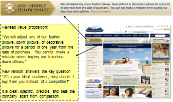
In the revised version of his site, his “Perfect Pillow Policy” holds a prominent place on every page. It clearly differentiates the company from competitors.
Example: What’s Not a Value Proposition?
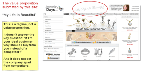
“My Life is Beautiful” does not address consumer concerns. A value proposition is not a slogan, a tagline, or a brag sheet of your company’s facilities or accomplishments. Those statements speak about you, not what you can do for your customer.
Instead, a value proposition speaks to how your company or product can improve the customer’s world. Any facet of your site that does not communicate your value proposition with that perspective is wasted.
Step 2: Intensify the Clarity of Your Site
Throughout the holiday season, marketers will intensify their persuasive pitches. The way to make your site stand out? Focus on Clarity over Persuasion.
Where persuasion pushes sales, a focus on clarity helps browsing customers orient themselves to your site and the opportunities you offer them. Clarity answers the three primary questions of your audience:
- Where am I?
- What can I do here?
- Why should I purchase from you?
In a January 2007 MarketingSherpa survey, customers expressed their appreciation for clarity in their ecommerce options:
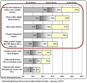
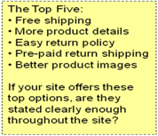
If your site offers these top five consumer preferences, make sure that they’re clearly expressed.
Step 3: Reduce Inhibitors to Conversion
Even the most clearly designed sites face obstacles to conversion. The two primary obstacles are friction and anxiety.
- Friction: psychological resistance to a given element in the buying process
- Anxiety: often stimulated by legitimate concerns but disproportionate to the actual risk, it is more lethal to the sale than Friction.
Minimizing conversion obstacles effectively requires insight into the customer’s experience with ecommerce sites:
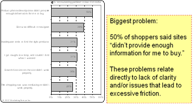
(MarketingSherpa Ecommerce Benchmark Guide, 2008)
In essence, your site will benefit from any steps you take to make browsing and buying easier.
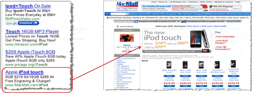
Category and Product pages are key areas for optimization. Left to themselves, they can quickly become crowded with too many thumbnail pictures and too little information to encourage the casual browser to move on to the next step in the buy process.
Example of Category Page Optimization:
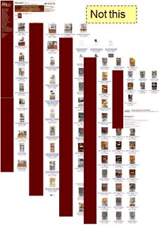
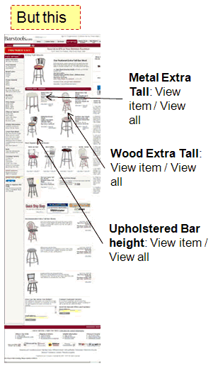
In the optimized version of this category page, there are a smaller number of products per page and brief descriptions. Each product offers a link to similar products, allowing the prospective buyer to quickly locate desired choices.
Three Wise Principles of Holiday Optimization:
- Emphasize your value proposition
- Intensify the clarity of your site
- Reduce inhibitors to conversion
In our web clinic, our sciences team reviewed the following attendee–submitted landing pages through the lens of these three principles.
Example: Teavana (Homepage)
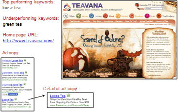
Aaron Rosenthal: They are doing a good job of matching of the expectations of a user who is searching for the keyword “loose tea”. However it still doesn’t tell me anything compelling they would make me click on this ad versus any one of the other ads, at least in the headline. For your PPC ad, consider what is your most compelling piece? It might be free shipping. So test some variations of loose tea and using the free shipping offer in the headline to see if you can get a little bit of an improvement there.
Also, there is no call to action on this particular page. You have names of teas down at the bottom of your image but I don’t realize that I am supposed to click on those. Nothing about them looks clickable. They are not underlined links. It’s not a button. People may not be able to figure out what to do when they’re on your site.
Dr. Flint McGlaughlin: This looks to me like a magazine ad. It is flat. It’s one–dimensional. The graphic is too large. It doesn’t connect with me in a conversation. There is no personalization.
They need a slogan in Teavana or a description that helps them know where they are at real clearly. Next we need a headline and it doesn’t need to say scared of Oolong or whatever that is, I can hardly read it, which is another problem, and it’s the wrong kind of font. It needs to be a headline that engages them into the site with an implication about your value proposition. The headline needs to lead to a paragraph of text that explains who your store is, what they can do at this store and probably have a few text links in the paragraph to actual products. Underneath that they actually need to see your main products. In this case, let’s see loose tea right away, so they can visually identify where they are at and so they can quickly make a decision to purchase, if they already know that’s what they want.
Always give the main message in the middle of the page. Never use your columns to do the main work. Columns should only support the message in the middle of the page.
Example: Timberghost Shop (Homepage)
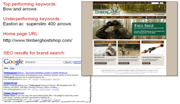
Aaron Rosenthal: The first thing I notice is you aren’t submitting an actual meta description of what the site is so Google is scrolling the information, the copyright and the address information at the bottom of the page and using that within your description. I would actually look at tailoring Meta descriptions or adding them because when I went to the source I didn’t see that you had them.
When I arrived at your page you are almost talking to me too fast. You haven’t built any trust with me yet, unless I am already familiar with who TimberGhost is and what you can offer me. Everything on your home page here is talking about sales. Even your buttons are talking about signup today and buy now. You speak to me all in headlines and special alerts and buttons. But you still haven’t told me why I should shop with you, why I should trust you –– not just with my money but my time.
Jimmy Ellis: I see a Fall Sale to save big on all the branded gear you need, but you are not connecting with the actual brands. List the brands. You are not telling how much can I save. And the specials alert doesn’t tell you why they are special. Is there special savings, is there limited supply, or they are exclusive offers that are only carried at timberghostshop.com? Would I be the first to receive special limited time offers on products from your online stores? But that still does not communicate why I should actually want limited time offers and why. You know if I am into fishing and not hunting and archery and optics, I don’t want all the other stuff. I just want specials on fishing. So make it more specific and make it more valuable for the user.
Ecommerce Playbook – Part II
Once your pages are optimized, drive qualified traffic to those pages with the highest yield–per–visit. To drive qualified traffic, apply the same practice of clarity to your traffic channels that you applied to your landing pages.
For best results with this optimization, focus on channels and elements in the most strategic order:
Channels to prioritize:
- PPC
- SEO
Each of these channels has unique elements to be shaped by optimization. Remember that it’s possible to lose people when you use traffic channels as if they were the primary selling vehicle. A marketers’ goal should be to capitalize on traffic and magnify the response rate.
The goal of email and PPC is not to sell but to intrigue your audience to click through to your site. Don’t try to sell too much in an email or it will be avoided, rather than read.
Email Elements:
- Sender (“From”)
- Subject Line
- Copy
- Headlines and subheads
- Body copy and offers
- Calls to action (links)
- Graphics
- Product photos
- Buttons, calls to action
- Credibility indicators (awards, security symbols)
A suggestion for marketers this season is to review the last five emails or the emails they plan to send out this holiday season. Lay them out where you can see them clearly and ask yourself the goal of the email: a click or a sale.
PPC Elements:
- Keywords
- Negative keywords
- Copy
- Headlines
- Ad copy
- URLs
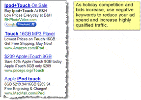
As experienced marketers know, the key to PPC campaigns is driving qualified traffic. With this in mind, marketers should diversify their PPC campaigns to attract buyers at different stages of the buy process.
- Product–centric buyers are usually in the early stages of the buy process and are more interested in gathering information and comparison shopping.
- Company–centric buyers have decided on a product and are now focused on choosing a vendor. Their interests lie in service, reputation, and warranty.
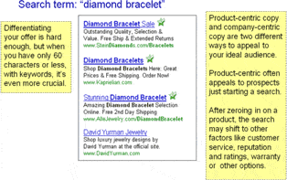
Targeting PPC ads toward both markets allows you the chance to capture qualified leads at any stage in their buying process.
Use SEO and PPC together to complement each other and fill in gaps in essential search results.
SEO Elements:
- Meta descriptions
- Keywords
- Copy:
- Page titles
- Headlines and Subheads
- Text Formatting
- URLs
The primary challenge for organic search during the holidays is differentiating your headlines from other offers while still offering the common holiday benefits (such as free shipping) that savvy consumers have come to expect.
Example for SEO:
Search Terms: “Men’s Shoes”
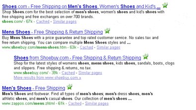
The choice: to blend in with a similar offer or find a way to stand out from the crowd.
Whichever channel you focus on, remember that traffic should offer consumers more choices than to buy or not to buy. That kind of marketing only connects with customers. In a recession, it’s just as important to connect with visitors.
This year the number of people browsing online will probably be consistent with previous years. However, while visitors this year are looking, they simply will not buy as much. But, if you’re not offering a compelling reason for visitors to return to your site, if you’re not capturing emails that will become the backbone of post–holiday lists, you’re leaving money on the table this season.
Three More Wise Principles: Using Clarity to Optimize Traffic Channels
While email, PPC and SEO have unique elements, optimizing these channels should be guided by three universal principles:
1. Focus on Relevance: Ensure that all messaging is consistent between your channels and your landing pages
The congruent copy reinforces shopper expectations from PPC ad to landing page.
2. Emphasize Urgency: The holiday season creates its own sense of urgency, but your channels and pages need to capitalize on it.

Make sure that your sites remind shoppers of inventory status, sales promotions, and shipping deadlines.
3. Highlight Exclusivity: Like your value proposition, your edge will come from showing what you can offer that others can’t match.
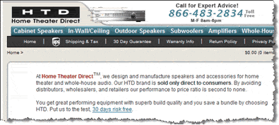
HTD sells directly and exclusively to customers, giving them an edge on beating their competitors’ prices.
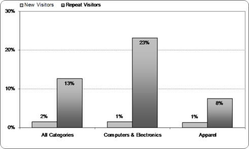
No matter how much traffic, or qualified traffic, your drive to your site, unique visitors will not be your primary source for sales. For ecommerce sites, most sales occur with repeat visitors.
Don’t Ignore Future Sales Potential
Compare the conversion rate of new visitors with returning visitors:
You must connect with visitors, not just customers, to pave the way for future marketing and sales opportunities. Consider all the ways for your site to encourage repeat visits:
- Email sign–ups/email capture
- Basket recovery
- Follow–up emails
- Autoresponders
- Notification of shipping deadlines and special offers
- Gift cards
- Post–holiday sales
According to Frank Malsbenden, VP of Shoeline.com, poor customer service immediately and powerfully negates any perceived advantage that comes from shopping via e–commerce. To encourage long–term relationships with customers, make every customer service touch an opportunity for a personal connection.
Live Optimization of Attendee–Submitted Examples:
Example One:
Product–Specific Landing Page: GK Elite Sportswear, submitted by Andrew Foss
Landing page URL:
http://www.gk–elitesportswear.com/Leotards.html
Top performing keywords: gymnastics leotards
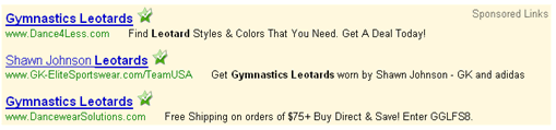
Under performing keywords: leotards, gymnastics
Jimmy Ellis: The top ad works better because it’s much more specific than gymnastic leotards, it’s talking about this special Shawn Johnson one from this year’s Olympics. The URL says slash team USA, it’s much more specific, and so what happens is that these ads qualify the user or the customer much better than the generic ads.
The second ad reads gymnastics leotards, your under performing keywords. Many retailers do something like this. What happens is that then there is overwhelming amount of information, and they don’t know how to make a buying decision.
So you have the headline that directly connects with the user, next you need to help them figure how to shop in this site, right now it’s just the shop now link. Within these 49 new leotards, okay, what’s the cheapest, what’s the most popular, what’s the best, are there different styles or types? Help me make a buying decision by listing the information that will help me find what I’m looking for besides having to scroll through 49 different versions of leotards.
Aaron Rosenthal: Some valuable information, applicable to all e–commerce sites, is you need to help the customer make a buying decision. Companies are expecting the customer to do too much thinking. Don’t leave all the thought process in the customer’s hands. You have already worked very hard to get them to your landing page, once they are there, help guide them through the process.
Dr. Flint McGlaughlin: I can’t make out the value proposition for the company at all. It might be the prices but I can’t tell unless I have been to other sites that these were good prices, and I don’t trust the word “as low as $29.95” because what that means to the average person here is that you may have some lousy product for $29.95, but then you are going to get me with the real prices when I get in there. Now, you are not that way and I don’t mean to be hard to the person that submitted this, but I’m telling you the postmodern consumer is skeptical. If you can fix it in time for Christmas, you could double your results off of this page, and I find that to be exciting.
Example Two:
Homepage: Wall Décor and Home Accents, site submitted by Chris Tomov
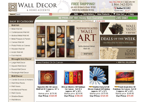
Home page URL:http://www.walldecorandhomeaccents.com/
Top performing keywords: metal wall art
Under performing keywords: modern wall art
Ad copy:
Aaron Rosenthal: You are not giving me any compelling reason to click on your ad versus any one of your competitor’s ads. There’s some more compelling stuff in your body copy but you are not targeting it in your title or in your headline. So test using those 20 to 40% off phrases, test using the free shipping phrases. You might be able to get some higher clickthrough rate. Same thing for your URL, displaying URL on your PPC ads is a great way to bump up the click rate on your ad, whether using a sub–domain or file folder of your display URL you can usually find slight increasing by testing some different variations there. What this company is not doing is they are not targeting any specific language within their URL that helps convey that this is what I am looking for.
Dr. Flint McGlaughlin: First, all you are dealing with here as a design page is boxes and graphics. People don’t buy from web pages, people buy from people and all I have got is boxes and graphics, and I want to help you get past that. You’ve got to start thinking differently because this is not a display show and this is not a magazine ad. It’s a dialogue between a sales representative of your company and the person who is visiting your site. You are just hitting me with images and then stopping me with bars across the page.
Second, you would want to add clarity, where am I, what can I do here. Well I know where I am at, I have some idea what I can do here, I don’t know the best way to shop and no one has talked to me, no one has met me. There is still friction on this page and that is because my eyes go all over the page, there is no eye path. You have an enormous graphic in the upper left, so you have both position and you have size, drawing my attention to that thing that says sophisticated wall art. But I can tell you right now that if your audience comes here and that’s not the kind of art they particularly like –– and you know how people are about taste. You’re already getting people to click away because you lead as if you were certain that’s the one image that’s going to motivate them and it might not be the one.
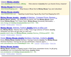
Example Three:
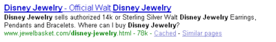
Category Page: Jewel Basket, submitted by Zvi Dubin
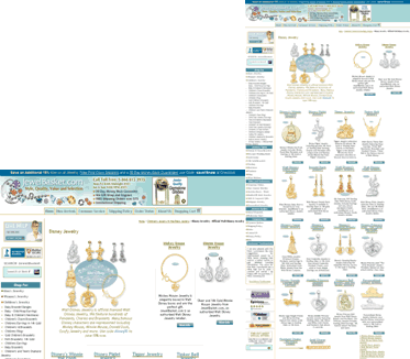
Landing page URL: http://www.jewelbasket.com/disney–jewelry.html
Top keywords: Mickey Mouse jewelry
Under performing keywords: Disney jewelry
Ad copy:
Category Page:
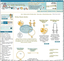
Landing page URL:http://www.jewelbasket.com/mickey–mouse–jewelry.html
Ad copy:
Jimmy Ellis: There is no value proposition in the headline. If you have Disney Jewelry, why should I buy it from you?
Pieces are getting lost in that header because it looks like a banner, within an image, in black text and blue background, it’s hard to read. I’m trying to read it right now, because it’s really small so it’s 30 day money back guarantee, we can gift wrap and engrave free shipping on orders over $75, international shipping.
That might help me a little bit in terms of why I should buy from your store compared to any other Disney Jewelry store, because there are lots and lots of them. They actually have a 30–day money back guarantee and they can get free shipping over 75 bucks. Possibly the gift wrap and engraving especially when the holidays we might want to emphasize that, because lots of people like to give personalized gifts.
Aaron Rosenthal: There is something I think we as retailers don’t do and that is differentiate between a site value proposition and a product value proposition. Much of the information that’s at the top of the page that Jimmy pointed to, the 30 day money back guarantee, the wrap and engrave, the free shipping over $75. That’s a site value proposition and that’s why you should shop with this particular site, but there is also why you should buy this particular product. I need to know why I should buy this specific Disney Jewelry or if it’s a page like we see in the next slide on Mickey Mouse Jewelry; I need know why I should buy this particular piece of Mickey Mouse jewelry. That it’s a very important part of the landing page process and it’s how you should be guiding customers into the buying process.
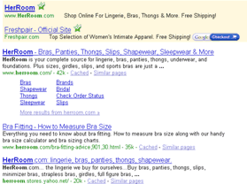
Example Four:
Homepage: Her Room, submitted by Joanna Culbertson
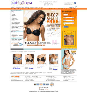
Home page URL: http://www.herroom.com/
Top performing keywords: Her Room
Under performing keywords: Lingerie
PPC and SEO results:
Aaron Rosenthal: People are familiar with your site if they’re coming through that specific keyword. Something you may consider since there are other competitors bidding on your keyword is incorporating your keyword into your URL. In the title of your ad and also in the body of your ad, try “official her room,” or “her room,” even using that domain name “herroom.com” and reiterating that you are the actual site, the official site that you are looking for. I think you might find that you can get a little bit higher click rate to help differentiate yourself from your competitors who are also bidding on the name of your site.
And I would certainly test sending them to a landing page focused on a two–column design. You have got two different types of sale working on this page, the buy–two–get–one–free promotion and also the bra finder. Almost too much going on, where I don’t know the best way to find my product. I would look at a strategy to actually integrate those two offers. Find the perfect bra for you or find two of the perfect bras for you and get one free. And then go through a four–step or three–step process to find that bra for you with your bra finder.
Jimmy Ellis: Lingerie is the under performing keyword because it’s so generic it’s like looking for Microsoft Outlook 2003 and you typed the search term “software” in Google. If you carry Outlook 2003, you are not going to sell many of them. Using the keyword “software”, you are going to get so many people looking for other types of software that you are just not going to get very relevant clicks. But it might be better if you did something like bra lingerie, underwear lingerie and you qualified that with two or three or four keyword terms.
Playbook Recap: 13 ways to maximize revenue, beat the downturn
- Optimize landing pages before optimizing traffic drivers.
- Focus on quick, minor changes with the biggest potential impact.
- Short of a full redesign, work on optimizing your prime movers.
- Emphasize your value proposition.
- Intensify the clarity of your site (Clarity trumps persuasion).
- Reduce inhibitors to conversion.
- Drive qualified traffic to the pages with the highest yield per visit.
- Apply the same clarity to your traffic channels as your landing pages.
- Use relevance and consistent messaging between channels and pages.
- Capitalize on urgency with your channels and pages.
- Play up exclusivity and what you can offer that others can’t match.
- Connect with visitors, not just customers, to seed future sales.
- Make every customer service touch a personal connection.
Related Marketing Experiments Reports
- Optimizing Ecommerce Websites
- Powerful Value Propositions
- Optimizing Headlines, Part I
- Optimizing Headlines and Subject Lines, Part II
- Optimizing PPC Ads, Part I
- Optimizing PPC Ads, Part II
As part of our research, we have prepared a review of the best Internet
resources on this topic. Rating System
These sites were rated for usefulness and clarity, but alas, the rating
is purely subjective.
* = Decent | ** = Good | *** = Excellent | **** = Indispensable
- Holiday 2008 Consumer Trend Round–Up ****
- Conversion Proof Your Site for the Holiday ****
- Free Shipping: Holiday Hit or Headache? ****
- The Retail Email Blog ***
- Ecommerce Site Owners Guide to Holiday Sales ***
- Stride Rite: A Study in Holiday E–mail Marketing ***
- Pinching Pennies Online for the Holidays **
- Tweaking Your Holiday ecommerce Strategy **
- As the economy sinks, will the sleigh rise? (Internet retailer survey) **
- 81% of shoppers are more likely to buy online with easy returns, study says **
- Yes, You Can Make More Money Next Week – Here’s How **
- Is Your E–Commerce Strategy an Asset or a Liability? **
- Bottom Line Ecommerce Advice for the Holiday Season *
Credits:
Managing Editor — Hunter Boyle
Writer — Anna Jacobson
Contributor(s) — Flint McGlaughlin
Aaron Rosenthal
Jimmy Ellis
Bob Kemper
Production — Mel Harris
Austin
McCraw
Cliff
Rainer
Amanda Melhoff