In the invitation for the October 10, 2007 MarketingExperiments live Webinar, participants were offered the opportunity to submit their own Landing Pages for real-time assessment by the MarketingExperiments optimization team.
This brief completes the review of Landing Pages selected for that analysis.
Dr. Flint McGlaughlin and optimization specialists Jimmy Ellis and Aaron Rosenthal analyzed each page, identifying areas where applying research best practices and key concepts of Landing Page Optimization could result in significant improvements in page performance for these Websites.
We asked those who submitted their sites to describe, in one or two sentences, their primary Value Proposition: Why should a customer buy from them rather than from their competitors?
We also asked them to describe the Value Proposition of the specific offer on the page they submitted, and what optimization steps they have already taken, if any.
This brief illustrates the foundational concepts and principles of Landing Page Optimization as applied by the MarketingExperiments specialists in their analysis and recommendations for the participants’ Websites.
The assessments were based on the MarketingExperiments Conversion Index:
Each variable in the Conversion Index represents a key factor affecting the probability that a customer arriving on the Landing Page will take the desired action; that is, the probability of “Conversion.” Essentially, the formula is saying that the probability of Conversion is a function of the Motivation of the prospective customer (m), the degree of clarity with which the page expresses the Value Proposition (v), the net impact of the Incentive for the prospect to continue (i), less the Friction elements of the sale process (f), and the degree of Anxiety (a) that the page creates in the mind of the prospect. The coefficients represent the relative “volatility,” or degree of impact that the relative efficacy of each factor has on Conversion probability.
Landing Page 8
http://www.cappex.com/page/account/chancesCreateStudent.jsp
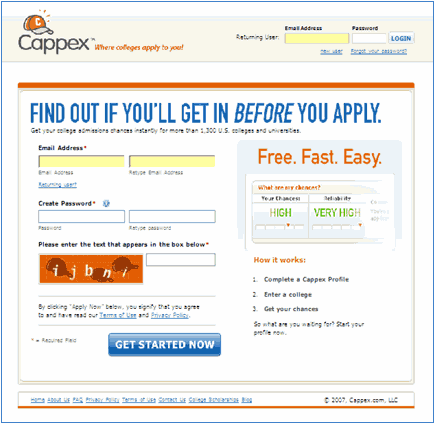
Business Value Proposition submitted: Cappex.com is a free service that helps connect students with colleges and universities. Students can visit the Web site and see which colleges want them before they apply.
Specific Page Value Proposition submitted: The unique tool instantly lets students know their chances of getting accepted to more than 2,000 colleges and universities BEFORE they apply. The free tool helps guide students by giving them a better understanding of how well they fit a particular college’s historical admissions profile.

Landing Page Submitted
Analysis (Jimmy Ellis)
- Headline draws attention, but after reading it you still do not know what the site is about: Find out if you’ll get in before you apply for what?”
- The left hand form immediately asks you for personal information, creating Anxiety because it’s still not clear exactly what is being offered.
- The sub-headline is great, but it’s so small it gets overlooked. It quantifies the value of the service, is specific about what the service does (college admissions chances) gives you a time frame (instantly) and is simply more clear. I recommend testing the sub-headline as the main headline.
- The fact that it is a “Free” service also needs to be tested in the headline. Presently the customer only sees “Free” if they decide to look at the right side of the page before they leave.
- Visitors need to know they are on the right site, they need to have a reason to use the service, and then they need to get the Call to Action. If you do anything out of order it creates confusion and Anxiety.
Analysis (Flint McGlaughlin):
- The business Value Proposition submitted is a description of the business, not a Value Proposition. Your Value Proposition is the single reason why I should buy from you rather than one of your competitors.
Your headline comes closer to being a Value Proposition. - The word college appears by Cappex, but it’s affected by “banner blindness”: It is the wrong color on that background. It is too small and it is above the line where people pay attention.
- As a visitor, I need to know who you are. Meet me, greet me, tell me where I am. Tell me what you will do for me and help me get through the process. You can do it in a paragraph. There is not enough clarity. This is actually an example of site flow disruption.
Landing Page 9
http://www.securehorizonsbyunited.com
Business Value Proposition submitted: Secure Horizons by United Healthcare is a leading provider of Medicare Supplemental Health Insurance for America’s seniors. It is one of the most trusted healthcare and health insurance organizations in the U.S. and offers superior customer service.
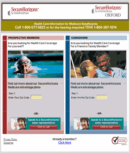
Specific page Value Proposition submitted: The page is intended to segment traffic by either Caregiver of a senior or a senior looking for insurance themselves. The multi-page application process asks for demographic information for lead generation and to send information. A phone number is also provided.

Landing Page Submitted
Optimization Steps Already Taken: This is a new program. No changes or optimization has been done to improve results/conversion.
Additional Information offered: Looking for suggestions on how to improve this marketing page and user experience based on Caregiver/Senior target variable and information capture.
Analysis (Jimmy Ellis)
- I do not know who Secure Horizons is or why I should use them.
- A “Side by side” evenly weighted layout means customer has to process the entire page to make a decision.
- You could simplify the entire page by making one form with a radio or checkbox. For example: “I’m looking for health care coverage for myself” and “I’m looking for health care coverage for a friend or family member.” One form, no confusion.
- There is no headline on the page.
- There is no information that lets the prospective customer know you are a reputable company.
- The zip code functionality without the button is interesting but needs to be tested.
- There is no information on the page that leads me to believe your service could possibly help me. I would wipe this whole page clean and start from scratch with one specific set of traffic from prospective members.
Analysis (Flint McGlaughlin)
- “Leading” is one of the worst words to put in a Value Proposition. It is meaningless. Who says you are leading? Why should a visitor believe you? Use third party credibility factors to make qualitative statements.
- If you want to communicate to a visitor you need to talk to them in their language. When you use terms like “prospective member” or “caregiver,” visitors have to guess your meaning. Meet visitors like a person and tell them where to go and tell them why they should click. You can do this in three paragraphs of well positioned text. Persuasion is trumped by clarity. You cannot persuade visitors yet because they are not even clear who you are and what you want them to do.
- Use different colors.
- Analysis (Aaron Rosenthal)
- You have two Calls to Action. Break this into two separate forms. Side by side evenly weighted layouts means you are asking the customer to make the decision and you are going to lose conversion.
Summary of Landing Page Optimization Concepts
- Conversion Index. Use the MarketingExperiments Conversion Index to structure your thinking and approach to evaluating and optimizing your Landing Pages.
- Value Proposition. Begin by ensuring you can clearly and succinctly state the Value Propositions of both your business and the specific primary offer of the landing page that you are optimizing. To make sure, you should print out both and keep them in front of you while you are looking at the page.
- Competition. Look at and consider competitors’ Landing Pages. You cannot effectively evaluate your offer without the context of the others that your customers will compare it against in making their purchase decisions.
- Metrics. Use your Web data to guide your evaluation of your Landing Page for each of the conversion elements. For example, where customers are clicking on the page and where they are abandoning the sale process should be strong indications of where the sources of Friction and Anxiety are concentrated.
- Test. No optimization analysis is complete until you have turned theory and speculation into demonstrated performance. Take the principles and processes learned and demonstrated here, design test “treatment” pages and test them to Discover What Really Works® for your business.
Related Marketing Experiment Reports:
- Landing Page Optimization: How Businesses Achieve Breakthrough Conversion by Synchronizing Value Proposition and Page Design
- Optimizing Site Design
- Optimizing Free Trial Offers: Can Copy and Design Changes Alone Significantly Lift the Performance of Free Trial Offer Pages?
- Online Competitive Analysis Tested
- Landing Page Confusion: How Does Having More Than One Objective to a Page Affect its Performance?
- Site design tested: Reducing Customer Anxiety
As part of our research, we have prepared a review of the best Internet resources on this topic.
Rating System
These sites were rated for usefulness and clarity, but alas, the rating is purely subjective.
* = Decent | ** = Good | *** = Excellent | **** = Indispensable
- Landing Page Optimization Webinar (Omniture/MarketingExperiments) ****
- Online Value Proposition ***
- How Do You Develop a Unique Value Proposition? ***
- Free Google (beta) Website Optimizer Tool ***
- 10 Landing Page Optimization Tactics **
Credits:
Editor(s) — Frank Green
Bob Kemper
Writer(s) — Jimmy Ellis
Peg Davis
Bob Kemper
Contributor(s) — Jimmy Ellis
Aaron Rosenthal
Flint McGlaughlin
Bob Kemper
HTML Designer — Cliff Rainer
Email Designer — Holly Hicks


