

One of the easiest things to do to get a lift on a lead generation offer is to reduce the number of form fields. We hear it all the time because it works. The problem is, it only works so well and then you start seeing diminishing returns. Plus there’s always the issue of the quality of leads you’re getting from your form. The less fields you have, the lower quality your leads are.
So how do you get a lift on a lead gen page without reducing the number of fields? Well, there are a couple of things you should understand before I get into that…
First of all, there is always a perceived cost in entering your information into a form.
And second, to counteract that perceived cost, you must provide more perceived (and hopefully true) value to tip the psychological balance in your favor in the mind of your visitor.
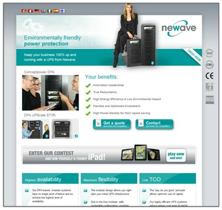
To explain what I mean by tipping that balance, I’m going to walk you through a page that was submitted by one of our Web clinic attendees last year. The clinic itself touched on this same issue of perceived cost vs. perceived value. In it, MarketingExperiments’ Associate Director of Optimization, Adam Lapp, and Managing Director, Flint McGlaughlin, reviewed the following page from Newavenergy.com:

In the clinic Adam and Flint pointed out several things that could be optimized on the page. For the sake of this post, however, I’ve condensed what they said into seven ways to reduce the perceived cost of a lead generation offer:
1. Eliminate multiple calls to action
The first thing we notice when we come to the page is that there are multiple calls to action. Multiple calls to action create confusion and mitigate conversion. As Adam Lapp puts it, “Why would I want to contact you rather than get a quote? I have no idea how much the product costs, so it makes the most sense to get a quote.”
Eliminating that extra call to action is a great way to lower the perceived cost of the form because it focuses the visitor on one simple action rather than two. One almost always costs less than two.
Transferable Principle: Unless you’re dealing with something like a home page, having a single, clear call to action lowers the perceived cost of filling out the form.
2. Clarify the value proposition for the form
Another problem Adam points out is the lack of a value proposition for the offer itself. Of course, this will obviously contribute to the perceived value of the form, but coming up with a value proposition for a lead offer is always easier said than done. According to Adam, a couple of ways it could be done on this page would be to state some specifics for what the visitor will get from filling out the form:
- Is it speaking to someone in person?
- Is it a call back within 24 hours?
Transferable Principle: A clear value proposition for the lead gen offer is the greatest contributor to the perceived value of the offer. To do this for your own forms, ask yourself the value proposition question we tout so often around here but relate it specifically to the lead gen offer. So the question would look like this: “If I am your ideal lead, why would I fill out this form for you rather than your competitors?”
Answer that question and make it clear on the offer page to increase the perceived value.
3. Avoid unrelated images.
One of the things adding to the perceived cost of the page is the presence of unrelated images. Because of these images, the visitor has to use, in Adam’s words, “unnecessary effort” to interpret the meaning behind the images. Because of that effort, the perceived cost inevitably gets bigger in the visitor’s mind.
Transferable Principle: Your images must instantly communicate the value of the lead offer. They should also drive the visitor into the form. If they don’t do that, take them off the page.
4. Enter into a conversation with the visitor
One of the biggest problems with this page, according to Flint, is that it’s not communicating with the visitor when they get to the page. First of all, there’s a weak headline that doesn’t explain much of anything, then it leads straight into some bullets. As Flint states, “You’re talking to me in bullets. You don’t talk to real people in bullets. You need a paragraph of text here that tells me what I can do here and why I would want to do it.”
Transferable Principle: Potential leads coming to a landing page need to know three things (as Flint started to mention above):
- Where am I?
- What can I do here?
- Why should I do it?
A paragraph of text coupled with a strong headline helps to orient the visitor and give them an idea of where they are and what they can do on the page, while hinting at why they should do it. Start the conversation by clearly stating at least those first two in the first paragraph and your visitor will be more likely to see the value in what you have to offer as they continue down into the copy on their way to the form.
5. Include strong, tangible benefits
The benefits listed here should answer the third question above: “Why should I do it?” But here, they don’t really say anything. They certainly aren’t helping the perceived value of the page in any way. In fact, they’re probably adding to the perceived cost by losing credibility with the visitor. As Flint states:
“What does innovation leadership mean? These are not benefits. I need something more specific and more tangible. Tell me something I understand. It has to be instantly understandable and instantly credible.”
Transferable Principle: Benefits must be instantly understandable and instantly credible. You must be completely clear about what the visitor will get in exchange for filling out the form. Obviously this will boost the perceived value of taking action in the visitor’s mind.
6. Add value to the button
Simply put, “Get a quote” means “get a salesperson to call me.”
Transferable Principle: Again, the value must be clearly stated all the way through the decision process in the visitor’s mind. Even the button must convey value to tip that scale in the opposite direction of perceived cost.
7. Clean up the eyepath
Right after the form, there is a big bar right in the way of the eyepath that simultaneously has nothing to do with the offer. Its location, its weight, and its offer are all negative and all contribute to the perceived cost of the page while adding nothing to the value.
That said, one of the things Flint mentioned in the clinic was that the offer itself could be used as an incentive to fill out the form. In that case, it would certainly add to the perceived value and could be very effective in getting a lift.
In addition to the iPad bar, the page has three evenly weighted columns. Those are essentially equivalent to three people talking at the same time about different things. Again by creating confusion and noise on the page, the page is bumping up the perceived cost of completing the form.
Transferable Principle: Lead gen landing pages should be connected to the thought sequence of the visitor. They should quickly drive the visitor into the form with a clear eye-path that presents information in the right order.
What all of this means for your lead gen offers
For every lead gen landing page on your site, you need to communicate more value than what the visitor sees as the cost of filling out your form. Reducing the number of form fields can only do so much. The huge lead gen lifts that we see here at MarketingExperiments are usually because we focused on value, not only because we reduced fields.
[Note: This is one of series of blog posts about website optimization. Because I’m relatively new here at MarketingExperiments, Daniel Burstein thought it would be a good idea for me to go back and take a look at the live optimization sessions of our Web clinics and report back on what you can learn from optimization tips our research analysts provided about your peer’s landing pages and homepages.]
Related Resources:
Copywriting on Tight Deadlines: How ordinary marketers are achieving 200% gains with a step-by-step framework (our upcoming FREE web clinic)
MarketingSherpa B2B Summit coming to Boston and San Francisco
How to Build a Quality List and Make Data Drive Leads
Lead Generation: Testing form field length reduces cost-per-lead by $10.66
Nice post. This idea of perceived value versus cost/effort is key to mastering conversion rates right across the marketing process. I call it the Effort/Value Principle.
Hi Paul,
Thanks for the value you share here. Your tips are very simple and easy to implement. Also I suggest providing Thank You pages for our customers. I believe we can still find a lot of online relationship-building opportunities using it.
Best,
Nadine
Paul – Nice job on your article, pointing out specific things we can do to get more leads by simplifying the page. I agree with Flint on the benefits stated on this page; they don’t say a whole lot.
The one surprise for me was the “eyepath.” I had always thought those columns at the bottom were a nice way of cleanly formatting and even segmenting information, but now I see that it does tend to confuse the visitor.
Look forward to your future posts.
@Maria Peagler
Thanks for the kind words Maria. Glad you got something out of it 🙂