

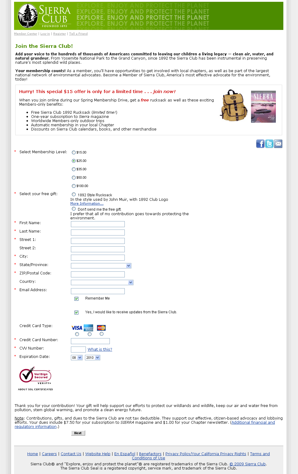
Landing Page Optimization: Clean air or a free backpack? (Which is the bigger incentive for Sierra Club members?)
B2C ecommerce is probably the road most traveled in landing page optimization. With shopping cart processes becoming increasingly standardized, e-tailers have learned on their own and from each other, creating better and better shopping experiences. Top names like Amazon.com and Ebay certainly waste no time in their testing and optimization work (or so I hear).
However, in B2C, there is a special segment of sites that sell — nothing. That is, they sell an idea, a feeling, an emotion. These are typically charitable or other non-profit organizations that solicit donations for a cause.
Selling air
When you sell a physical product, the value is largely encapsulated in the features and benefits that the product will deliver. Before I get death threats from branding experts, I certainly do acknowledge that there is more to the product than its physical and functional attributes — but it’s sure easier to explain on a webpage what an air conditioner will do for you, as opposed to what the Clean Air Act will.
When non-profits ask for a contribution, being able to delineate correctly the value exchange in the mind of the website visitor will make a huge difference in their ability to attract donors. In this post, I am looking at how Sierra Club approaches this issue.
At first glance, the page that our friends at Sierra Club initially provided for our Live Optimization Web clinic looks fairly plain — much like many other donation pages I have seen in the past. Here is some quick math: in the space between the header and the footer, (to be gracious) about 10% of the content is dedicated to what Sierra Club does, 20% to the gift incentive that the donor will receive, and the balance to the payment information form.
This layout is typical, and contains an inherent contradiction: the minimal information about the organization and a single-page long payment form would be ideal for highly-motivated visitors, who are ready to donate; in contrast, heavy emphasis on the incentive suggests that visitors to this page are yet to make their decision.
Incentive overkill
I am going to make an explicit assumption that people that want to help the Sierra Club are not doing it because of the free backpack. (What on earth is a rucksack?!) People who are shopping for backpacks probably want to see several different styles, different brands, and few will buy without having touched one (e.g., in a store).
They don’t go to Sierra Club for their backpack (or even rucksack) shopping. It’s a nice gift, but in the framework of value exchange occurring on this page, it is incorrectly positioned as the most prominent part of the offer. It is the single most distinguishable image on the page. The “loudest” message on this page is: free backpack.
However, I am not saying to kill the incentive! Since this item is probably not available in stores, it might be a great way to show off being a donor. As such, this may truly be the right incentive — one that directly connects with the same motivation as the core offer: people that would be willing to support Sierra Club financially may also want to help support its brand and thus influence others to provide financial support.
Value Exchange, Part 1: What will I get?
Sierra Club offers something very special to its donors. It’s the satisfaction of knowing that their hard-earned cash is going to help plant more trees, clean up an oil spill, protect wild places and so on.
Importantly, Sierra Club does this on a lean operational budget — a hot button topic, especially for large, experienced donors. There is an attempt to communicate the immense number of things that Sierra Club does in two sentences of the intro paragraph. However, this is simply not clear enough to lead to an exchange.
The objective in conveying value is to paint a complete picture in the mind of the visitor of the value to be received — in this case, experienced as a thought and/or a feeling. As I stated above, without a physical product, this is challenging (hence the crutch of using a physical incentive), but not impossible.
Ironically, the clearest expression of value is stated at the very bottom of the page (I noticed it only after examining the page in fine detail), after the visitor, presumably, has filled out the form — in other words, it doesn’t help to get the visitor to that point: “Your gift will help support our efforts to protect our wildlands and wildlife, keep our air and water free from pollution, stem global warming, and promote a clean energy future.”
This page needs to tell the visitor succinctly, but clearly all the things that Sierra Club does, and how well it does it. More importantly, this page needs to relate what Sierra Club does with the donations being requested below. A headline like “Last year, 2,394 donors just like you contributed over $350,000 that was used to [fill in the blank]” can get that conversation started.
Making a reference to “other people just like you” has been shown to be effective not only in online offers —Robert Cialdini conducted an experiment on reuse of towels in hotels. In his experiment, referencing “other visitors that stay in room 125” (I’m paraphrasing) in the card that asks to consider reusing towels — as opposed to leaving them on the floor to be replaced — to save water and energy, dramatically reduced the hotel’s laundry bill.
Value Exchange, Part 2: What do I give in exchange?
The form itself is simple enough, but there is room to make it appear even simpler. The pre-selected radio button is already a plus. In past experiments, we have seen that suggesting a choice is more likely to prompt action — even if the visitor ends up choosing a different option.
The “Don’t send me the free gift” option is just a little confusing the way it’s laid out. This is not a critical issue, but making it clear that text belongs to an item by indenting it can go a long way to making this long form easier to read.
More importantly, even within the form, we must never forget that a value exchange is in progress. If we are asking for a physical address, it’s an opportunity to remind the visitor about the value he/she will get by entering the information.
Both the gift and the magazine need an address, so a value-focused subhead like “Where do we send your gift and magazine subscription” both make the form more relevant and reinforce value to be received. Likewise, organizing all the fields into sub-sections will make the form look less lengthy and more manageable, reducing psychological friction that online forms necessarily create.
The form button is an often overlooked opportunity to reinforce value. Simply “next” communicates little. It implies a negative: that the work of donating is not finished — there’s more to do. Instead, it needs to communicate something positive, related directly to what we are asking the visitor to do (click).
Thus, “Start My Sierra Club Membership” can make a succinct value statement (since “Use my membership dues to protect our wildlands and wildlife, keep our air and water free from pollution, stem global warming, and promote a clean energy future” just can’t fit on a button).
Finally, in asking for value (form completion), we can make the process to feel like less value is being surrendered by increasing the credibility of the request. In the case of Sierra Club, adding testimonials from fellow donors can create a clear connection in the mind of the visitor between the request and the ultimate outcome: between the payment and what the contribution does for the person contributing.
Going back to Cialdini’s research, this is similar to the “social proof” mechanism that he had uncovered. Enforcing the social aspect, letting the donors upload their photos, or better yet, the photos of natural wonders they’re hoping to protect (or both!) may on the one hand reinforce the value being implied in the offer, and on the other hand provide invaluable material that can be used by Sierra Club to demonstrate social proof.
Other innovative ways of saying “other people like you are doing it” is to let visitors sign in with their Facebook® credentials. Building a simple Facebook application that would post something like “Jane Smith is now a member of the Sierra Club” with a link to a special landing page would let Sierra Club leverage the network effect with no additional marketing efforts. Likewise, implementing the “Like” button should be effortless.
More test ideas
Here are a few other tests that Sierra Club may want to try:
- Depending on traffic quality, perhaps try test a two-step process — The first page could focus entirely on communicating the value of being a member/supporting Sierra Club. Since there is a dollar cost, mention something like “for as little as $15 your first year” to minimize price anxiety. The second page could focus on the incentive and payment page.
- Obviously, test different membership levels (probably already did that) — Both with one- and two-step processes. In the two-step process, it may be easier to list higher membership levels.
- Video testimonials — Expressing an idea or a feeling is certainly easier through video than through text.
Related Resources
Live Optimization: What we’ve learned from the last 200 experiments distilled into three principles
Web Page Optimization: Consider this post the help desk for free trial landing pages
Web Page Optimization: In search of a value proposition as fast and reliable as Verizon FiOS
They need to brainstorm some messages and then test, test, test them.
I would try the message: “protecting America’s wilderness areas past, present and future”.
A big photo of 3 generations of Americans hiking in Yosemite – maybe one reading the Sierra magazine. And a nice headline to say the same message with words.
Other messages to test could be:
Do YOUR part
Less than you thought to preserve our wilderness
Membership is $15 – your children’s future is priceless
Specific details of just what the $15 will do
Right now the message seems to be “free retro rucksack”
@John Hyde :: York, England
These are brilliant test ideas, thank you for offering them! I like the last one (Specific details of just what the $15 will do), because it creates the most immediate connection between what the page is asking the visitor to do and the value that the company provides/creates in return.