

Landing Page Optimization: How an engaging headline and revamped layout led to a 26% conversion rate gain
While we endure a winter that harkens back to our parents’ most impassioned tales of school commutes (“It actually snowed for six minutes in Jacksonville.” – D. Burstein, 2011) you’d think that a website offering discounted Florida vacations wouldn’t struggle with conversion rates. When you factor in that the website in question is based in the not-quite-sun-soaked United Kingdom, you’d probably think a text-only, free blog page would be more than enough to sell sunny getaways.
Of course, I’m exaggerating (though, as a MECLABS employee, I’m also intrigued by these testing possibilities). Still, as the following experiment shows, even a highly targeted Web page, offering deals exclusive to local residents, can benefit from seemingly minor alterations.
Background
This experiment involves a United Kingdom-based online ticket broker offering residents a series of exclusive vacation packages for Florida theme parks, tours and attractions. The page tested here is for the Universal Studios theme park in Orlando.
The goal of the test was to see:
1) Which Universal Studios page leads to more booked vacations?
2) Which Universal Studios page leads to a larger order size?
3) Which Universal Studios page leads to greater clickthroughs/engagement?
The test involved adding strong headline copy – which reinforces the idea that Universal Studios theme park is a highly-rated choice among the site’s customers (complete with a real-time, five-star rating widget). Additionally, the team made notable design changes, such as adding a photo viewer image gallery and giving more prominent placement to the site’s customer reviews.
In doing this experiment, the team measured both clickthrough and conversion rates for the control and optimized pages.
—-
Control: A text-heavy design

The original page was a text-heavy design with only moderate photo/image use – a somewhat small, static box to the right of the dense copy. The photo box was not active, and only featured stock graphics and logos used within the theme park. At no point did users see the type of engaging images that would help them picture what this vacation would be like.
Without an intriguing headline to capture visitor interest, viewers were forced to search for vacation package details in the five to six paragraphs of body copy. Though there was ample use of bold text, without prominent images to break up the copy into more easily scanned sections, it was difficult to browse the page for important information.
Additionally, this layout immediately presented users with two links – one external – before they could begin to read the information below. Likewise, user reviews and comments were located at the bottom of the page, well below the fold and beneath another series of links that encouraged users to leave the page.
The page design also placed heavy emphasis on the shopping cart box, which sat alone in the right hand column, atop an abundance of unused white space.
—-
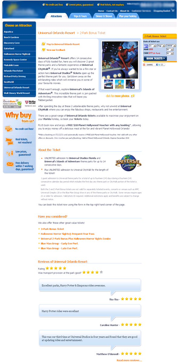
Treatment: Sell the sizzle

As the old saying goes, you don’t sell the steak, you sell the sizzle.
The optimized page immediately enticed readers with its action-oriented headline, “Enjoy 14 Days of Unlimited Access to both Universal Studios® and Universal Islands of Adventure®.” The headline is accompanied by a real-time, five-star rating widget, which gives the viewer an immediate testimonial for the product offered on the page.
The image box was redesigned to cover the entire width of the center column, and was updated to a more active rotating photo viewer, with images that change by a user’s mouse-over movements. Additional static images are placed below the photo viewer, further breaking up the extensive amount of text.
The shopping cart still sits atop the right-hand column, but customer testimonials were moved into the formerly white space, employing an appealing “voice balloon” graphic treatment. These testimonials are now easily seen while scanning the page, further reinforcing the package value.
The images are now more representative of the customer experience, showing actual photos of the theme parks, as well as images of visitors enjoying themselves at various park attractions.
—-
Results
The optimized page outperformed the original by 24% during the initial test period. After the page was switched over completely from the original, the conversion rate remained at a 26% gain above what was observed in the preliminary control test.
We can assume by this series of tests that the additions of stronger, more active images, an intriguing headline, and overall improved page flow not only contributed to customers reaching the checkout page more often, but converting, as well.
And when you step back for a moment and think about these results, they make sense. Try to get into the minds of a potential vacation purchases. Their motivation likely hinges largely on having an enjoyable time with their family. Yet the Control page did very little to help them picture what that vacation would be like.
It’s winter. You’re in the UK. It’s cold. Sure, Spiderman is cool, but what’s in it for me.
Adding visuals of families enjoying their vacation likely helped potential customers envision exactly what they were purchasing, and tapped into their motivations.
—-
Related Resources
Sign up for the MarketingExperiments newsletter
Internet Marketing: Optimizing form fields to maximize conversions
Landing Page Optimization: Identifying friction to increase conversion and win a Nobel Prize
Landing Page Testing: Designing and prioritizing experiments
Online Marketing Research: The MarketingExperiments Quarterly Research Journal, Q3 2010
—-