Every month the MarketingExperiments team hosts a Web clinic designed around a specific topic to help marketers create stronger campaigns. January’s “Boosting Your Only Factor” clinic discussed the relationship between appeal and exclusivity, and how it’s not enough to have just one — you have to have both. In order to have an “only factor,” there has to be an overlap between the appeal and exclusivity of your product or service. Basically, not only does your offer have to attract the interest of prospective consumers but you also have to give them a reason why they can only get this product/service from you.
Using the principles touched on in the Web clinic, optimization specialists from MECLABS Institute, MarketingExperiments’ parent company, analyzed audience-submitted landing pages in a 60-minute Live Optimization Webinar to help fellow marketers create stronger campaigns.
Takeaway #1: Put yourself in your customer’s shoes
When looking at a landing page or campaign, it is imperative to “put ourselves in the shoes of the customer,” Austin McCraw, Senior Director of Content Production, MECLABS Institute, said.
Sometimes when marketers design content, we try to communicate as much value as we can, as quickly as we can. This is especially true on landing pages, where marketers are trying to grab the attention of consumers who have immediate Web access to your competitors all around the world.
Therefore, when examining your campaigns from the consumer’s perspective, make sure that your value proposition is clearly stated. Austin noted during the live opt that many of the submitted landing pages had “buried” their value propositions, making them difficult to quickly discern.
It is also important to keep in mind that, from this customer-centric viewpoint, even if your company has “high appeal [but] no exclusivity,” you don’t have an “only factor.” It is only when these two elements are both present on your pages that you can expect to attract the customers you want.
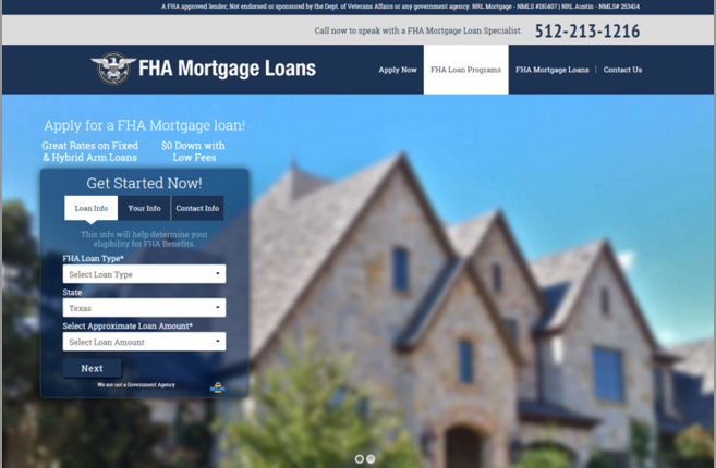
However, be cognizant of not creating unintentional exclusivity. One company offering FHA mortgages featured a luxurious, large home on the landing pages. Because FHA mortgages are typically for first-time homeowners, consumers looking for this particular service may be intimidated by the imagery on the site and leave the page.
Finally, in regards to the “only factor,” Ben Filip, Research Manager of Data Sciences, said that there not only has to be appeal and exclusivity surrounding the product, but the company as well. Don’t make your customers guess what your company does.
Takeaway #2: Create clarity and credibility
While appeal and exclusivity are imperative for creating your brand’s “only factor,” clarity and credibility help to support these elements, Austin said. Having strong credibility is necessary, and ties into putting yourself in your customer’s shoes. Consumers are more likely to do business with you when they are able to believe you. They also need to be able to understand you. “When you have no clarity, you can’t have appeal,” Austin said.
For one of the landing pages, John Durrett, Research Manager, said, “I’m not clear on what the company does. Is that an assumption they want me to make?”
Customers don’t want to come to your landing pages to guess what product or service you can provide them. Instead, ensure that your “only factor” is supported by clear and credible claims.
However, be prepared to back up your credibility. John suggested that you provide evidence on your pages to tell your audience what exactly qualifies you to be an expert. “Bring in the brand name, provide evidentials,” he said. These support materials strengthen the claims on your page.
In an effort to provide your customers with clarity, “never hide the most essential part of your value proposition in secondary material” like a video, Austin said.
Takeaway #3: Have a strong headline that effectively incorporates all of these ideas
When looking at the submitted pages, a consistent pattern for the MECLABS panel was a lack of clear headlines.
“A hundred other [companies could do what you are claiming to] … what makes you different?” Erin Fagin, Senior Manager of Research and Strategy, asked the audience.
Having a clear headline ties into having clarity on your site. The easier your page is to read, the better that is for your customers.
Avoid creating customer anxiety by helping them understand how exactly you can help them, Austin said.
Many of the pages optimized during the live webinar were long pages that required a fair amount of scrolling, all while not having a clear headline at the top of the page. “Don’t wait too long to get to the value,” Ben said.
Also make sure that your headline doesn’t convey an unintentional message. On one of the pages with two exclamation points, “I feel like I’m being yelled at with the headline,” Erin said.
In addition to being clear, make sure that your headline sets the correct tone on your page.
Finally, make sure that you are not using your headlines as placeholders for just the “what” — include the “why,” Austin said.
Register to attend our next live optimization webinar on Thursday, March 24.
You might also like
MarketingSherpa Summit 2016 — At the Bellagio in Las Vegas, February 22-24
Value Proposition Development online course [From the MECLABS Institute, parent research company of MarketingExperiments]
Customer Value: The 4 essential levels of value propositions


