It was time to get radical at Senior Optimization Manager, Adam Lapp’s optimization class, and once again I was there to document it all for your reading pleasure. Because I care, naturally.
Since my last post, the student body has grown, and we now have five new research analysts eager to learn. Due to our uneven number, Adam decided to pit all of the analysts against each other for his optimization competition, instead of taking the usual team approach. This time around, their challenge was to create the most effective radical redesign for the Arbor Day Foundation homepage (which was submitted for live optimization during our Homepage Web clinic).
But before I show you the original page, I’d like to add that this lesson not only sharpened our optimization skills, but also proved that great minds don’t always think alike. And, believe it or not that can be a really good thing.
Diagnosing the homepage
Now, let’s get to down the “nitty gritty”…here’s the audience submission:
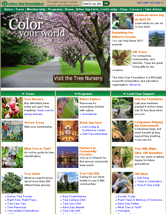
Before being given the task to create radical wireframes for the original homepage, Adam and the class discussed the page’s main issues. Here is their analysis the key problems visitors might face:
- The logo is too small. It gets lost in the page and also doesn’t help the visitor know exactly where they are
- There’s not a clear focus on the page
o It has a confusing top navigation
o It has three equally weighted columns (Trees, Programs, Lend Your Support)
o It also has confusing objectives (Where do I click, what can I do on this page?)
1. What is the difference between a membership, a donation and buying a tree?
- Unclear call-to-action
o The first and largest call-to-action a visitor sees is “Visit the tree nursery”
o Makes the visitor ask, “What is a tree nursery? Is this a place to buy trees or a clever metaphor for a type of product or page?”
o Visitors have unclear expectations of what the next page will be and are a little lost at this point.
Radical Solutions
After pointing out these issues, the analysts had to figure out how to tie in all these objectives together into one goal. And when it was time to present their radical wireframes, each analyst came up with a completely different design and goal in mind (remember the original page had several objectives).
Each submitted wireframe focused on one of the following goals:
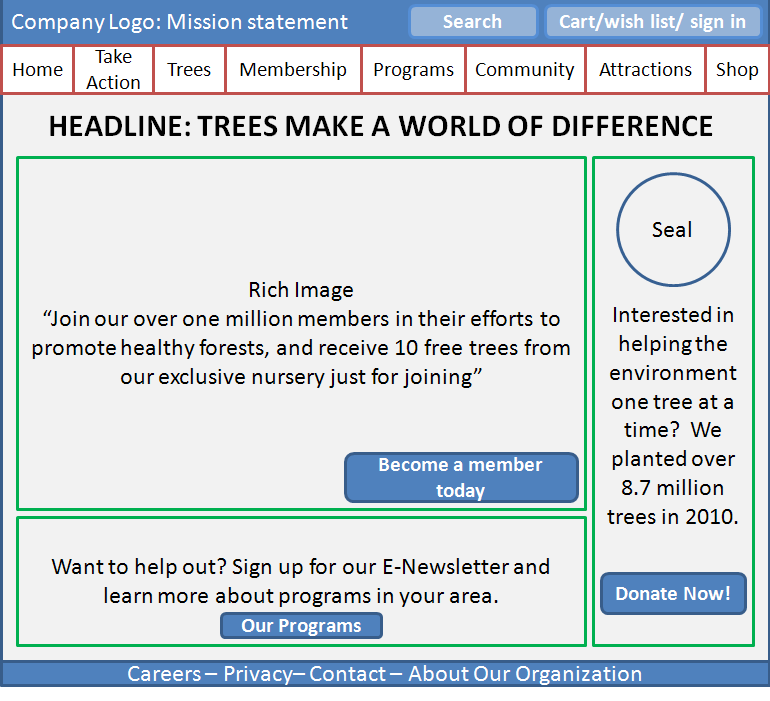
-Directly pushing a membership
- The headline is action oriented, specific and includes a membership incentive
- It drives the visitor’s attention to a primary call-to-action (become a member)
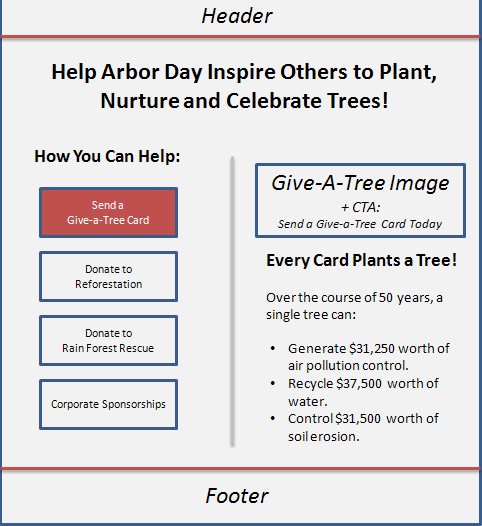
-Getting visitors to donate and help the Arbor Day Foundation’s mission
- Headline immediately says where you are
- The options on left let visitors know what to do on the page (donate/help)
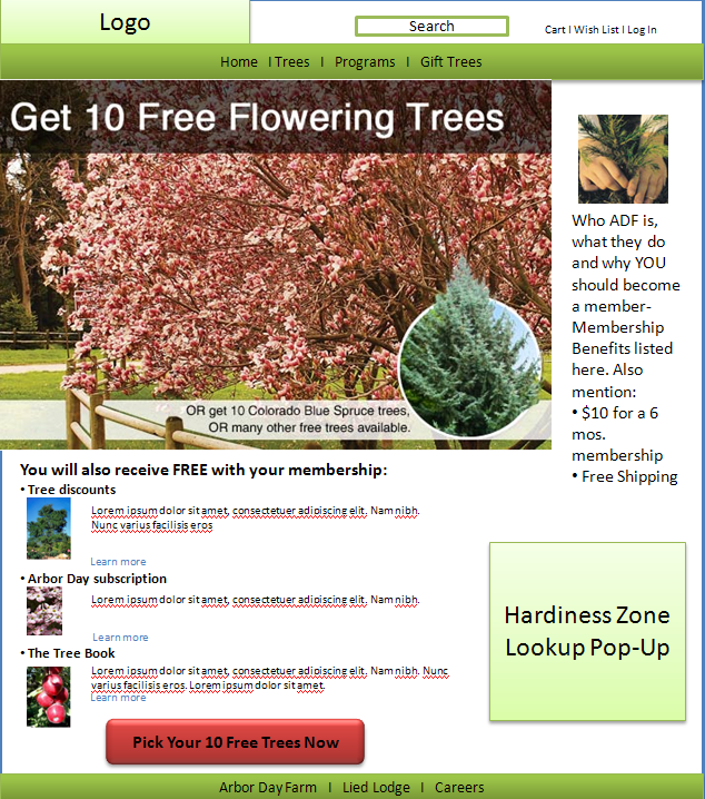
– Giving the gift of a tree or allowing visitors to pick 10 trees for themselves now
- Page objective is simplified and the incentive of 10 free gifts with donation is emphasized
- De-emphasized supporting column with core information about the foundation
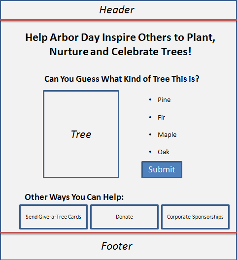
-Engaging visitors with an interactive game
- Headline tells visitors exactly where they are
- Focuses on letting visitors interact and become familiar with the product through question game
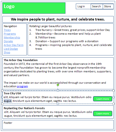
-Pushing all objectives in a new navigation-focused design
- Visitor can quickly choose a path from the easy to see, simple, and short left navigation on the top portion.
- Has a rotating banner will draw the eye path to the four most important objectives, then presents four core values in a controllable (and testable) sequence
Five heads are better than one
These five separate takes on one Web page got us thinking about the brainstorming process and how important it is for marketers to create a blissful marriage between individual ideas and teamwork.
In a marketing team, not everyone is going to think the same way, but this doesn’t mean that these differing thoughts can’t turn into a great collaborative effort.
This reminds me of the weekly peer review meetings we have at out lab, where the research team gets together and reviews Web pages as a team. Usually, one person starts off the conversation and then another person bounces off an idea about that topic, sometimes agreeing or challenging the previous comment. The idea here is to brainstorm in the correct way, by being open to different ideas and avoiding groupthink. Of course, not every idea is a good idea, which is why you have to test.
This is exactly what happened during Adam’s class. Each analyst initially came in with a different idea for the homepage and after everyone’s thoughts were put on the table, each individual thought grew into one improved and cohesive approach to developing treatments.
“If one person in charge of this page only relied on their own ideas, we may not [be] able to achieve the highest level of success,” Adam said. Of course, this hypothetical collaborative effort would have to be tested to make sure it’s actually effective.
“There’s no such thing as expert marketers, only expert testers,” Adam said. “AND the best way to get diverse test ideas is to leverage other people with other ideas.”
Lesson learned
In the end, even though it started as a free-for-all competition, with the right guidance and frame of mind, it turned out to be a great team effort.
Now that we’ve learned that lesson, I would love to start a collaborative effort with the audience, and ask you to share your ideas to optimize this homepage. Feel free to use the comments section to get this brainstorming session rolling.
Related Resources
Homepage Optimization: Radical redesign ideas for multivariable testing
Homepage Optimization: Creating the best design to quickly meet multiple visitors’ needs
Informed Dissent: The best marketing campaigns come from the best ideas
Landing Page Optimization: What cyclical products can learn from CBS Sports


OMG! What did Flint have to say about the ‘submit’ text used in the button on the “Engaging visitors with an interactive game” wireframe?
Hi Trent. Thank you for your comment. Dr. Flint McGlaughlin actually did not take part in the optimization class this time (Though he did participate on my last post, Homepage Optimization: Radical redesign ideas for multivariable testing). As you see, these are wireframes with potential design ideas by members of our research team. They are submitted before the class and further optimized collectively. The redesign wireframes for class, in most cases, are rough drafts that through some brainstorming can transform into an improved design test idea. While, the text “submit” is not the best wording for a call-to-action, the overall redesign was pretty interesting. Thanks again for your comment and keen observation.
hi there. how are you? i kinda need your help. i have done my M.Com from Pune University and i am planning to do my phd in international marketing. i need you to help me out to find a suitable topic in this field.
regards,
kaveh
knicjoo@yahoo.com
Hi Kaveh!
That’s a major decision, and a very difficult one to make at that. I would say, based on my experience, testing and optimization seem to be great opportunities and fields to explore. We have an upcoming Optimization Summit in June, where we address the importance of testing and optimizing in online marketing. You can check it out more about it here: http://www.marketingsherpa.com/optimization/
We also have more blog posts addressing the fields of testing and optimization throughout our blog that you can check out as well.
Good luck on your decision, and I hope this was helpful!