Marketing talking heads love to spout out call-to-action best practices:
- Keep it easy to find
- Put it above the fold
- Make it a big button
But all of these “rules” miss a fundamental shift in the way we need to be thinking about CTAs. There’s something wrong with the word “call-to-action” that focuses us (as marketers) on ourselves and not on the needs of our customers.
This manner of thinking treats the audience as if they’re a mass of mindless peons, just waiting for us to command them what to do next.
Simply put, I think a call-to-action should be an act of customer service.
Why?
It’s not because of some abstract ethical construct I made up. It’s because it works. It increases marketing performance.
Here are five call-to-action examples that worked because they were helpful and focused on serving the customer:
Call-to-Action Example #1
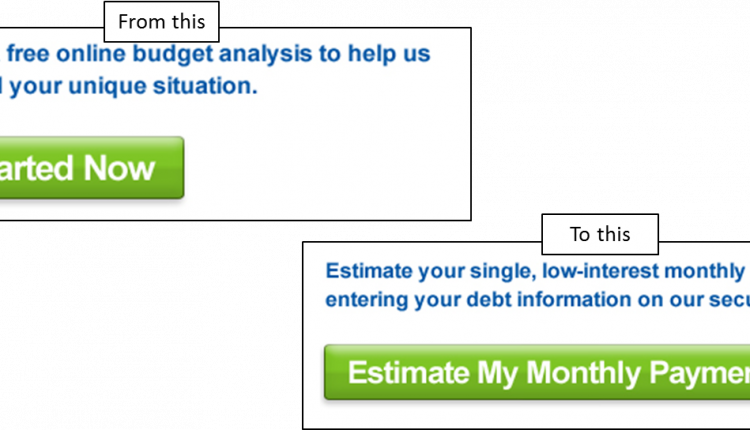
125% Increase: Don’t state a command; help foster a conclusion in the customer’s mind
Call-to-Action Example #2
120% Increase: Don’t make customers request more information; help them understand next steps*
*Note also the change in the visual nature of the CTA. It was moved into a tab in the main content. Again this emphasizes that the essence of “the ask” is to provide information, not “call to action.”
Call-to-Action Example #3
2,793% Increase: Don’t just show a button; provide an on or off switch
Call-to-Action Example #4
263% Increase: Don’t make customers fill out a quote form; give them an instant quote tool
Call-to-Action Example #5
74% Increase: Don’t just show customers links; give them a configurator to select what they want
Effective calls-to-action are not focused on calling people to action.
And they are certainly not effective due to a set of best-practices.
Effective calls-to-action are effective because a marketer somewhere put some creative thinking into solving the problem of how to best serve a set of customers. Until we can put our creative energy behind that objective, our CTAs will always underperform.
You might also like…
Why Subtle Changes in Button Copy Can Significantly Influence Clicks [More from the blogs]
5 Traits the Best Calls-to-action All Share in Common [More from the blogs]
CTA Optimization: Button copy test increases click rate 95% [More from the blogs]
A/B Testing: Optimizing calls-to-action for maximum conversions [MarketingSherpa video archive]


Great post Paul, I agree with you that CTAs need to be customer focused. Nobody likes dictators, do they now? 🙂
I’m curious, what would you recommend for a quote request form if it’s not possible to have an instant quote generated?
Hi Viktor,
Generally, you want to think about what would delight your customer. Is there some way you can reposition the quote form into something like a “tool” to make your buying experience better? Or maybe a way to get a free consultation for a customized solution? If you have a particular quote form in mind, we might be able to do a brainstorming session in the comments…
In the meantime, here’s a few resources that might help you think through it:
Hey Paul, thanks for resources. Nothing specific at this point. I’ve worked in the past with clients that didn’t really have a budget to develop instant quote form due to complex process that it takes to generate one… usually with a huge selection of products… think local print shops.
Also, some businesses might not like to do instant quote since it doesn’t take in account the actual customer using the form since it doesn’t really allow for price segmentation. If Disney requests a quote and a local coffee shop requests a quote, they would pay the same thing with instant quote form… but with a personalized quote you have the power segment your pricing and charge customers what they are willing to pay – which changes from customer to customer depending on their size. This is more geared towards B2B, in B2C market that’s where instant quote form might make more sense. Now this could be an interesting case study… instant quote forms – B2B vs B2C.
Thanks.
Glad I could help 🙂
Agree on the instant quote form case study. Thanks for the tip!
Hi Paul,
example 3 is all the more interesting or the exceptional gain it achieved. However, I don’t know what I am looking at.
What is an ‘on/off switch’? I’ve not come across this before.
What is it doing in this instance.
How would the visitor know what to do? Without prior knowledge or relevant copy it’s more likely to create anxiety about what’s behind this instruction.
Regards,
terry
Hi Terry,
If you look at the screenshots closely, you can see that in the control there is a button that says “create email alert.” In the treatment, instead of a direct call-to-action, there is simply an option to turn email alerts on or off. You’re asking the right questions, however, in this case the results show that this particular set of visitors DID know what to do.
Hope that helps…reply if it doesn’t.
-Paul
Hi Paul, Thank you for sharing your research findings. With these examples and your explanation, I feel much more clear about how to come up with an effective call to action. Like the commenter above, Viktor Nagornyy, my business serves differentiated customer needs, which can make it hard to make instant quote. It’s good to hear I’m not alone in that consideration, and I will think up a way to make it work with my customers. Thank you so much for the inspiration and clarity! Camilla
Camilla,
Thank you for the comment. Glad I could help in some small way. 🙂