The MECLABS Conversion Heuristic is what we use when optimizing our Research Partners’ websites – and now for me as a research analyst, it’s become second nature to optimize every website I encounter.
I say this because truthfully, it’s one thing to simply memorize and understand a formula. But when you’re able to conceptualize and apply it, you own it.
For instance, I was recently window shopping on one of my favorite sites, HauteLook, a members-only ecommerce website that offers limited-time sales of leading brands in fashion, home décor, skincare, and occasionally, luxurious vacations.
I’ve shopped there countless times before, but this time my HauteLook experience was different, thanks to seeing the site from the perspective of an analyst.
Lightboxes are not a warm welcome
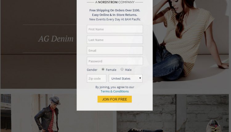
When you get to the HauteLook homepage, you are immediately greeted by a mandatory registration squeeze before you can arrive to the “members only” section, where the sale events are displayed.
Right away, this form causes new users anxiety and potential frustration.
(Editor’s Note: MarketingExperiments defines friction as a psychological resistance to a given element in the sales or sign-up process. Anxiety is a psychological concern stimulated by a given element in the sales or sign-up process.)
Here’s one problem with front-end registration: The visitor is not able to see what the website offers that might match their motivation to visit the site.
In short, what is the squeeze costing you in sales?
By not allowing a visitor to see what your website offers prior to asking them to join might cause them to exit prematurely because they don’t want to go through the trouble of signing up.
This leads me to my main point:
Ultimately, one word got me through the gate of anxiety the first time I was here – Nordstrom.
Use parent brands for surrogate credibility
In my example, you’ll see copy that identifies HauteLook as a Nordstrom company, which immediately alleviated my concerns and was the first thing to convince me to move forward with the registration.
Using an established brand as a third-party credibility indicator is a great way to help reduce customer anxiety.
Kudos to HauteLook for using an established and well-known brand to relieve anxiety and help increase the sign-up rate while also aiding visitors in making more informed decisions.
Test your way into delivering a better customer experience
Being able to see websites from a customer’s perspective paired with the knowledge I’ve acquired at MECLABS has made me realize how friction and anxiety can play into a user’s decisions – including my own.
If you’re interested in learning more about how you can optimize your customer experience, feel free to check out some of the resources below.
You may also like
Ecommerce: 3 landing page elements to help increase product emphasis [More from the blogs]
Online Testing: 3 resources to inspire your ecommerce optimization [More from the blogs]
E-commerce: 5-question checklist for eliminating products [More from the blogs]


