Engaging in conversion optimization requires making a modification of some sort to improve conversion. But, what if there are steps in your customers’ buying journey that you can’t control?
For example, we often hear from marketers that they don’t really have the time or resources to change their shopping cart in significant ways to improve conversion. Or, if you’re in affiliate marketing, channel marketing, or simply have a go-to-market partner, you might control the beginning of the funnel but have no control over the final conversion. Perhaps you sell a product through third-party stores and distributors and have no control over that process.
I was recently in this boat myself. Not only am I a student in the University of Florida/MECLABS Institute Communicating Value and Web Conversion graduate certificate program, but I’ve been working on marketing it before the April 1st application deadline as well.
The Optimization Process
The first thing I did with the team was map out the customer journey — starting with not knowing anything about the program all the way to enrolling as a student in the program.
Now, here was the great irony. Session 2 of the MMC5436 Messaging Methodologies and the Practice of Conversion Optimization course in the program walks through the optimization process and the first, second and third steps you should take. The very first step is reducing friction and anxiety.
However, when we looked at the step in the customer buying journey with the most friction and anxiety, there was nothing we could do to reduce those elements because that step was the University of Florida application.
When friction is a good thing
The UF application necessarily has friction and anxiety, of course. After all, this isn’t a simple online training purchase; this is a real university application. It should have friction and anxiety. When you increase friction you increase quality as well. And when you have a complex process, it can induce anxiety. Unlike an online product purchase, where I assume the acceptance rate is 100% (as long as the credit card goes through), the University of Florida rejects more “customers” than it invites in, with an acceptance rate of only 46%.
When a process created for one purpose is used for another
However, our students wouldn’t be undergrads or MBA students trying to attain a complex and long degree. Since our program is a graduate certificate (essentially, an accelerated credential that only requires four master’s-level courses), we wouldn’t be using UF’s application to weed out students. Applicants only need a 3.0 undergraduate GPA and don’t have to take the GRE or GMAT, so no weeding out of students is necessary.
But, they would still be UF students, so we would still have to use the standard application. And, our audience would be working professionals in advertising, marketing and general business — so they are accustomed to a seamless customer experience.
Customer-First Marketing: Empowering customers to interact with your brand in the way that works best for them
In the previous semesters of this program, both UF and MECLABS offered, essentially, a concierge team to add the human touch to the application process to overcome this friction and anxiety.
This works well, but we wanted to add an ecommerce option for anyone who wanted to become a student without feeling like they were becoming a “lead” — these people were marketers after all.
For applicants who wanted the human touch, great. We still offer it.
But we didn’t want to force a complex “sale” for those who weren’t interested in being contacted; we wanted to empower them to apply on their own if they chose to do so.
We changed a few other things about the landing page as well to put the customer first and allow them to interact with us in the way they chose, not the way we forced them to. Originally there was an information packet behind a gate — a common and sensible practice to build a list for nurturing. We improved the packet and made it readily available for download. If you just want the information and don’t want emails from us, we don’t want your email address.
We also changed the opt-in form at the bottom of the page to be about content instead of as a squeeze page for general program information. Because if people do want to regularly receive emails from us with content inspired by the program, we want to give them that option as well.
Back to creating an ecommerce-type experience for visitors who want to apply on their own. Marketers usually think of removing elements of a process (form fields, steps, etc.) to reduce friction, but we couldn’t remove anything — everything on the application was required by the university. And we couldn’t change any wording to reduce anxiety because the application was hosted by the university. We had only one option left.
Adding copy and design to reduce friction and anxiety
We had to figure out a way to get more control over the final step of the funnel — the application —without actually getting control over it or changing anything about it. We couldn’t create our own version asking for the necessary information and sending it to UF through an API due to the university’s security requirements.
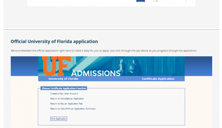
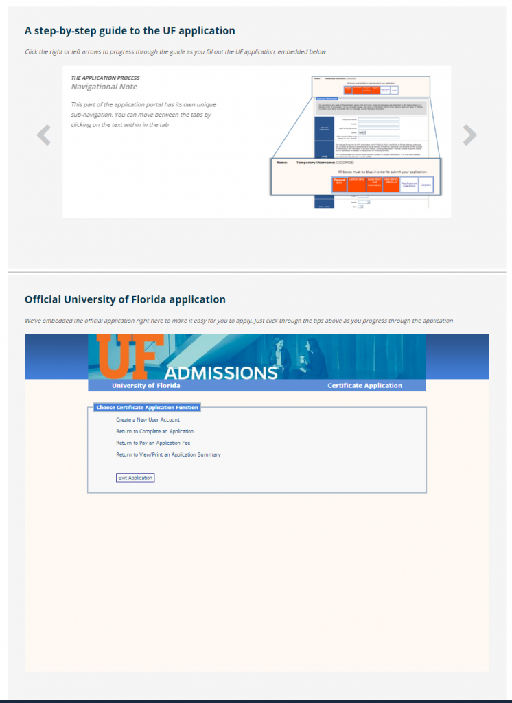
We ended up creating an Apply landing page that pulls the UF application into our landing page using an iframe.
Since the application is in an iframe, the information applicants enter into it goes directly to UF and is hosted on their server. However, by embedding the iframe on our landing page, we’ve been able to add copy and design that hopefully helps to reduce friction and anxiety in the process without the applicants ever needing to contact us.
At the top of the page, we include general copy to let potential students know what they need to apply.
And our application developer Christine Risberg created a Javascript slider that walks the user step-by-step through the UF application. This is directly above the application iframe, and the applicant just needs to click forward on the slider each time he or she progresses in the application.
Unlike most of our case studies and experiments, this is something we’re literally working on right now, so I don’t have specific results yet. But feel free to take a look at the application page and the entire landing page, and let me know what you think.
Could an approach like this work for a sales process you don’t have total control over? If you can’t remove or change elements from a conversion process you don’t control (whether your own shopping cart or through an affiliate process, etc.), are there ways you can add copy and design to help reduce the friction and anxiety in the process? Could you also use an iframe? Or perhaps you have a better approach?
Remember, there’s more to reducing friction than removing things. When that option is off the table, see if there’s anything you can add. When using copy and design to reduce friction, sometimes more is less.
You can follow Daniel Burstein, Senior Director of Editorial Content, MECLABS Institute, on Twitter @DanielBurstein.
You might also like:
Learn more about friction, anxiety and the MECLABS Conversion Sequence heuristic here
The Difference Between Marketing and Advertising (and Why It Matters)


