If you’re engaged in landing page optimization, step back from the analytics for a moment and ask yourself a bigger question — why do we have a landing page in the first place?
Sure, you’re selling stuff. Getting leads. Achieving a conversion. Blah blah blah. Yes, that is all true.
But, all of those objectives have a fundamental similarity.
The objective of a landing page is to help a customer make a decision
And yes, that objective usually skews towards the get them to buy/donate to/download something. But by taking a customer-first marketing approach to your landing page, you can see them with a new perspective — not merely what you’re trying to get other people to do, but how can you help them through this decision.
One excellent place you can get this information is from customer service. What do customers have questions about? What concerns them? What confuses them? Should your landing page be able to answer these questions? If so, why is there a gap?
Hearing from customers in their own words
If you work for a very small company or you’re a solopreneur, you may be close enough to the customer to naturally get this information.
But if you work for a company of any size, you likely aren’t seeing this information every day. Can you work with customer service call centers and email and chat support to log both recurring topics that customers ask about as well as examples of these customer concerns, questions and frustrations in their own words? And can you get regular access to them?
The bigger the company, the more complex this is. But I don’t want you to feel it’s impossible. So, here’s an example from perhaps the largest, most complex customer service feedback to any organization in the world.
During his presidency, former President Obama received about 10,000 letters and messages every day. And he personally read ten of them each day. The complex and well-thought-out system to go from 10,000 to ten and make sure the most powerful person in the free world heard directly from his customers in their own voice is the subject of this fascinating article from The New York Times Magazine about the Office of Presidential Correspondence.
An example based on my own failings
The reason hearing from customers about their questions and concerns is important is because every marketer has a blind spot — self-interest.
To wit, I’ve been working on the marketing for the University of Florida/MECLABS Institute Communicating Value and Web Conversion graduate certificate program.
I’m also a student in the program, so I should be able to empathize with prospective students. And hopefully I am. But once I’ve taken on the role of marketer, that subtle, unintentional shift happens, and I start to look at metrics and think of the landing page as a means to an end I’m trying to reach. As much as I try to see through the eyes of the customer, this self-interest somewhat obscures my vision.
So, when our education team shared a customer service email that asked a few key questions, it helped me see — through that prospective student’s eyes — the gaps we had on our landing page. You can see the current landing page here, and below are some examples of changes we made based on that customer service email.
How much does this cost?
Price is a huge concern for customers for every possible product I can think of. Even if it’s free and doesn’t have a monetary cost, what does the customer need to do to get it?
Many ecommerce landing pages do a great job of displaying the price. But for a more complex purchase, like our graduate certificate program, the cost can get buried.
Now, I’m not saying you should lead with cost. You want to communicate value before cost, especially if you want to win on value proposition and not price.
However, there will be a logical moment when a customer has heard enough about the value and wants to know what it is going to take to go forward with the conversion action.
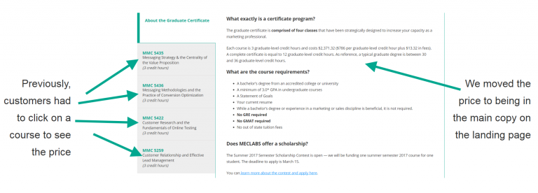
For our graduate certificate program landing page, we thought a sensible place for the cost of a course was in each course’s description (similar to a product description on an ecommerce page). However, when a customer asked how much the program costs, we realized that many customers may not wade that deeply into the page before wanting to know the cost, so we made the cost accessible on the landing page without a click.
Again, you don’t need to lead with cost. You should lead with value. The image below might be misleading because the cost is actually about two scrolls down the landing page, not at the very top. You can see the page here. But by that point, we figured enough value had been delivered that visitors will start wanting to know the cost.
When does the customer get value?
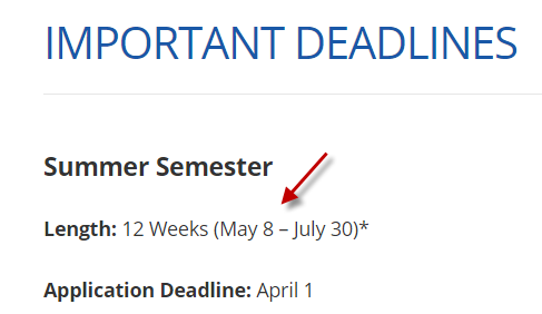
We were so focused on the date that was important to us, our conversion objective — in this case the summer semester application deadline of April 1st — that we overlooked a crucially important date for the customer.
“When does the summer semester start?” — someone asked in a customer service email.
So, we added in the dates when the summer semester classes will actually take place.
This is another example that tends to be better on ecommerce pages — when the product will ship, how long it take to get to me — than on a bigger or complex purchase.
For example, if I’m buying siding or new windows for my house, when will the install actually be complete? That may be equally as vital to a customer as when a discount is ending.
What is going on in the customer’s life and how does it affect purchase of your product?
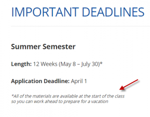
One anxiety that potential students might have about taking classes in summer semester is if they would still be able to take a summer vacation. We were asked, “Are all of the materials available at the start of the class so I can work ahead for a vacation?”
So, we updated the landing page with that information.
Note how similar the copy is to the actual voice of the customer. Building rapports and addressing concerns it not about using fancy language (this is especially important in the health care industry); it’s about talking to them about their concerns in their words.
Customers may have concerns about taking a conversion action that has more to do with their personal lives than your product, so you would never think to add that to your landing page. As in the example above, our landing page is about a graduate certificate program, not a vacation package, so why would we think to talk about summer vacations?
Because that is what the customer is thinking about. That is her priority, and it can lead to anxiety.
These concerns can take many forms, from health (“Is the lox you’re selling made from farm-raised or wild caught salmon?”) to ethical (“How does your mutual fund company vote on shareholder climate change proposals”) to safety (“Is your school located in a safe area?”) to fear (“Will this medical procedure hurt?”) to ego (“Will my friends think badly of me if I buy a giant SUV?”).
If and when you have real value there (obviously don’t just make something up to placate customers), how can your landing page address these concerns to help your customer?
In our case, the courses are on-demand so students can naturally work at their own pace to allow them to enjoy a vacation or fulfill any other work or life obligations or plans they have while still meeting the course deadlines. We just didn’t talk about it in that specific language on the landing page before.
You might also like:
Download the free Quick Guide to Conversion Rate Optimization
Landing Page Optimization: 6 common traits of a template that works
Industrial Digital Marketing: How being clear can maximize catalog orders and distributor sales


