One of the most common questions we receive at MarketingExperiments about optimization is, “What is it that actually makes a call-to-action effective?”
In truth, there are a lot of factors to consider, so in this post, we’ll take a look at five traits the best CTAs all seem to share in common based on our testing research.
Trait #1. Alignment
According to Jon Powell, Senior Executive Content Writer, MECLABS, alignment is when “a call-to-action needs to be aligned to a specific customer need or desire. And what I mean by that is, do they like the color blue or do they like the color red?”
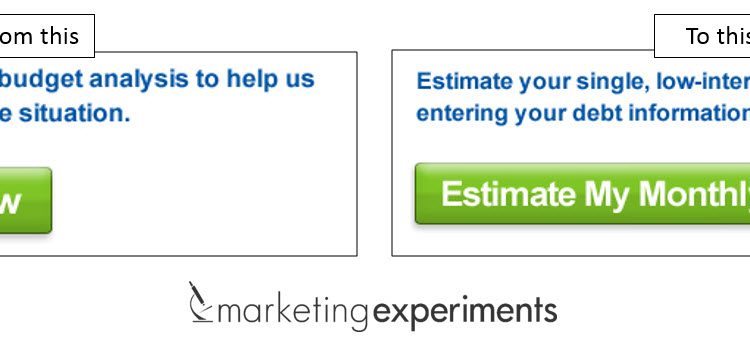
In the example above, the original CTA assumed customers will find value in understanding their problem. However, the treatment call-to-action tested to discover if customers find more value in a proposed solution.
In this case, the treatment increased clicks 7% and conversion 125%.
Trait #2. Timing
Great CTAs are delivered in a conversation with customers at just the right time. In the experiment above, you can see where the CTA was located in the control and treatment, which indicates how timing plays into effective CTAs.
The control page presented arriving customers with a CTA almost immediately.
In the treatment, the CTA was moved to a time-delayed pop-under. The problem for these customers was they missed the opportunity to convert interest into action, which explained why the treatment decreased conversion 29%.
Trait #3. Absorption
Effective CTAs are easy for the customer to absorb as they are scanning the page. They are highly intuitive for customers to understand and engage with.
Here’s what absorption looks like in a real-world CTA test.
In the control, the MECLABS research team hypothesized the primary CTA for creating an email alert was difficult to clearly see in the design that used the small bell icon to imply notification functionality.
The treatment design was adjusted to ensure customers would see the opportunity to create a free alert, resulting in a 2,793% increase in email alerts created.
Trait #4. Negation
Excellent CTAs are crafted to present themselves as the only meaningful choice for your ideal customer.
Here, we can see in the control above that to the customer, the only immediate, discernable difference between the three options is the name and price.
So in the treatment, the copy was rewritten and presented to provide an immediate distinction between products, helping customers identify their ideal path to purchase. The treatment resulted in a 63% increase in revenue per visit.
Trait #5. Redundancy
Effective CTAs should ideally help re-emphasize the value of taking a desired action. This is where supporting content can really pay off.
In this example, the control version of the “add to cart” pop-up summarized the action with essential product information.
The treatment, however, re-emphasized a money-back guarantee presented earlier in the process, which led to a 37% increase in conversion.
Effective CTAs drive conversation with customers
The best CTAs do far more than simply asking customers to “submit,” “proceed” or “checkout.”
The CTA is not limited to just a button or copy; it encompasses every element on a page that transfers customer conversation into customer action.
To learn more about effective CTAs, watch the on-demand Web clinic replay of “The Most Effective Calls-to-action.”
You may also like
Copywriting: Call-to-action testing and optimization [More from the blogs]
A/B Testing: 3 resources for copywriting and call-to-action optimization [More from the blogs]
Optimizing Calls-to-action: 4 questions to ask yourself while writing a CTA [More from the blogs]


Thanks John for the great post!
We are going to improve our online shop based on your tips. Sometimes some enhancements are very small, but they hit it!
cheers
Firmenadressen kaufen
Vielen Dank!
Keep us posted on your testing results. 🙂
-best,
John Tackett
Great post John. “Excellent CTAs are crafted to present themselves as the only meaningful choice for your ideal customer.” particularly struck a chord with me – you are totally correct, it needs to be the only logical choice!
Hi Kostas,
Thank you for the kinds words. I’m glad you enjoyed the post.
-best,
John Tackett
Some excellent actionable examples. Easy to forget just how much difference to conversions swapping a couple of words can actually make. Thanks for the info, John.
Your Welcome Dave!
Glad we could help.
-best,
John Tackett
This tips are super and will be valid as long as shops run independent. As Facebook now launched its plattform i am just thinking if within a platform in longterm there willl also be such rules…. anyway very nice article.