At the West Coast leg of the MarketingSherpa B2B Summit 2011 in San Francisco this week the first case study of the day featured IBM’s homepage redesign and the overall approach IBM uses in its redesign process. Joan Renner, Content Manager, Corporate Marketing Digital Initiatives, IBM, presented on how Big Blue engages in site redesign.
But they don’t stop at the landing page. They go the next step into the funnel and test landing pages, as well.
–
Landing page testing
Joan says, “Having great landing pages is very high value to the company and these tests wouldn’t be difficult to perform.” These two attributes made landing page testing a high priority in their testing backlog, which is their list of tests they’d like to run, ranked on three factors to determine priority:
- Internal visibility
- Difficulty
- Value
And she added, “We’re putting into our organization the ability for any division to come forward and ask for help.”
In this case a test was created to improve the landing page for the IBM X-Force Internet security and threat report landing page and led to a dramatic improvement in the page’s performance.
–
The objective
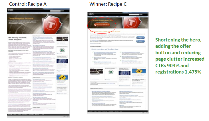
The objective was to test the layout of content and the addition of call-to-action button to increase the clickthrough rate to a report download and links to products and services.
The test ran for six weeks featuring a control and two treatments and involved 100% of visitors to the X-Force landing page.
–
The key difference between the control and treatment is a shortened hero image at the top of the page, the addition of a call-to-action button for the report download and a dramatic reduction in page clutter.
–
Results:
Overall results of the tested changes was a 904% increase in clickthrough rate, and a 1,475% increase in registrations, both at 99% confidence.
This test provided IBM with learnings to take forward to future tests:
- Reduced body copy and simplified content improved results
- Clear and concise calls-to-action are more effective
- Offers should be organized, prioritized and reduced
- Keep the key message above the fold
- Make hero images clickable
- The improved page layout made the most dramatic contribution to uplift
This test also created ideas for future tests at IBM:
- Test the registration form to reduce drop off
- Test headlines, text link targets, button colors and button calls-to-action in a multivariate test to identify element contribution
IBM’s learnings may (or may not) work for your landing pages. There’s only one way to tell … let’s get testing.
–
Related Resources:
How to Plan Landing Page Tests: 6 Steps to Guide Your Process
Website Redesign: Wondering what to test? Just ask your customers
Landing Page Optimization: 2 charts describing the best page elements to test and how to test them
Homepage Optimization: No single metric will do


I feel like this should have been beyond obvious… I’ve advocated this to numerous people for years now. Even stranger is that it seems to have been an industry trend for the last couple years. Why is IBM just now looking into it?
Actually Joshua, I was quite surprised by at least one aspect of this test. We’ve run many tests that have shown a call to action that high on the page does not perform well. Here’s one example — Debunking the “above the fold” myth
Wow, the results (904% increase in click-through; 1,475% increase in registrations) are pretty dramatic!
Question: how does the landing page redesign increase click-through? Seems like influencing click-through is up-stream of the landing page (i.e., a redesign of the ppc ad or email, etc., would increase click-throughs to the landing page, and then landing page optimization increases conversion rate). Unless it is increasing traffic by virtue of better SEO.
I can suggest a couple of things to test that would probably improve the landing page even more:
1. Reduce the amount of copy/images/clutter on the page even more dramatically. Even the optimized page is very dense and I can’t imagine all this content is needed to convince a person to download a free report. It would be great if the blogmaster could attach larger images of the pages, even the zoomed-in version attached is too small to see any of the copy/graphics to get a real idea of what’s going on here. But the content of the landing page should be single-mindedly focused on getting people to download the report (thus creating a lead). This looks more like a microsite (with many links and CTAs) than a landing page.
2. Eliminate the top navigation from the landing page, and all other hyperlinks except the “download” button. Any links that can take people away from the page should be eliminated. Eliminating top navigation is something many webmasters will view as heresy. But direct response marketers know that the only click-able item on a landing page should be the “download” button. Your landing page should function like a cattle chute, giving your page visitors only one navigation option.
Check out this SlideShare showing landing page optimization best practices, showing side-by-side comparisons of an original page vs. the optimized page: http://bit.ly/hebeisen-landpg-s
Sounds like this was an ABC test so it’s difficult to know which changes should get credit for the improvement. You don’t know if one of the changes was responsible for all the improvement or none of the improvement or actually decreased the total possible improvement. Why didn’t they opt for multi-variate testing so they could see which individual changes actually make a difference and by how much?
These are great results.
Bob H., in the article is says CTR is “to a report download and links to products and services.” It sounds like CRT is click on the Call-to-Action on the page. I assume the registration is on the next page.
Like Bob, I’m curious to know if they tested any version with even less information on the page. It appears that cutting even more information might further improve the CTR.