Optimizing your landing pages for multiple buyer personas becomes a difficult undertaking when conversion optimization principles often call for a focus on a single customer type.
So, how do you optimize for customers with a variety of needs and interests?
In a recent Web clinic, Jon Powell, Senior Manager of Research and Strategy, MECLABS, addressed that question by presenting three key design changes that impact conversion on pages that serve diverse customer groups.
According to Jon, to clarify the offer for multiple personas, he recommended a focus on these three types of page template adjustments:
- Number conversion paths
- Availability of subheadlines and headers for instructional guidance
- The sequence of content
“If you have the ability and power to make changes to your pages, then there are three types of page template adjustments that we’ve discovered that can really make a difference,” Jon explained.
Design Change #1. Number of conversion paths
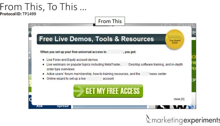
In the control pop-up, the MECLABS research team hypothesized that using a single conversion path for the different customer types was not optimal.
In the treatment, the team increased the number of options to three and took the same value copy in the control and distributed it across those paths to appeal to the different customer types.
The team also utilized the header as an instructional headline that attempted to appeal to all three customer paths. The overall redesign resulted in a 25% increase in clickthrough rate.
Design Change #2. Availability of subheadlines and headers for instructional guidance
In this experiment, Jon explained the MECLABS research team also hypothesized the number of conversion paths was not ideal based on the commonalities among the different customer types.
In the treatment, the team decreased the number of conversion paths and added a subheadline to help explain the process and support the value copy.
The design changes in the experiment resulted in a 32.4% increase in conversion.
Design Change #3. Sequence of content
For this experiment, Jon explained the MECLABS research team hypothesized that the content’s initial positioning was impacting engagement.
For the treatment, the team moved the content higher up on the page, added a subheadline to help explain the process and support the value copy, and made changes to the color design.
The changes in the experiment netted the team a 181% increase in clickthrough.
What you need to know
Testing these changes can help you discover the optimal number of paths, the ideal subheadline and best arrangement for your content.
But, what they also do for your marketing efforts is give them clarity, or as Jon explained, “The marketer’s goal is not simplicity; the marketer’s goal is clarity.”
By keeping landing page messaging, design and layout simple, it makes it easy for that visitor to understand what action you want them to take on the page.
To learn more about how category pages impact the sales funnel, you can watch the free on-demand MarketingExperiments Web clinic replay of “Optimizing for Multiple Personas.”
Related Resources:
Online Testing: How a pop-up chat test increased conversion 120%
Landing Page Optimization: 6 common traits of a template that works
Landing Page Optimization: Color emphasis change increases clickthrough 81%


