“The first step in exceeding your customer’s expectations is to know those expectations.”
-Roy H. Williams, Author and Marketing Consultant, Wizard of Ads trilogy
One way to know your customers’ expectations is to set them yourself. Recently, as we’ve been looking for speakers and case studies for Lead Gen Summit 2013, I’ve come across a few different lead generation pages that failed to meet the very expectations set by prior stages in the funnel.
For that reason, I thought it would be helpful to review six steps you can use to set expectations for your customers. But first, let’s look at a three-part process an insurance website requires to receive a quote on home insurance, and how it incorrectly sets customers’ expectations.
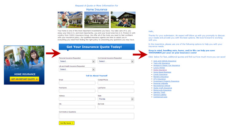
On the homepage, visitors see three main objectives: auto insurance, home insurance and business insurance. Each call-to-action promises an instant quote, and that message sets a certain expectation in the minds of customers.
Clicking on that button with that expectation, and prior experiences, I expected to fill out information about the home, myself and my desired coverage. I also expected to either receive the quote on a follow-up page or to receive it in an email immediately after I submitted the form.
Anything other than those two options and the process would come up short of my expectations. What else would you expect with a word like “instant” in the call-to-action?
The second step in the quote process includes a simple form, from which I immediately deduce a quote will not be coming from – despite the CTA’s promise. There is not enough information gathered to calculate even a basic quote.
Frustrated by the misleading CTAs, I went back to Google and continued my search on another website. But, to show you the full process, I returned to the form to see what hid on the other side. And, no surprise here, it wasn’t a quote. In fact, the subsequent page tells me a representative will contact me, which is the first time I’ve learned of the required contact to receive my quote. I wanted an instant quote, not a sales pitch.
The company sets customers’ expectations on the homepage and reaffirms them with “Get My Quote” after the form. However, customers find themselves without a quote and are left with anxiety over a looming phone call they didn’t want or expect.
Now that you’ve seen a subpar example of setting expectations, I’ll use that example to illustrate a better way to meet customer expectations, using these six steps:
Step #1. Know the expectation you want to set
You can’t properly set expectations if you don’t know what you want them to be. Like Stephen R. Covey’s second habit, you must begin with the end in mind. What will visitors gain from filling out your lead gen form? When will they receive that benefit? How will they receive it? Through email, phone call, mail or something else?
For example, if you want to provide leads with a free special report, you need to determine when and how they’ll receive it. Will they receive a hard copy in the mail in two weeks? How about in an email within 24 hours? Or, can they instantly download a PDF version?
When, what, where, why and how. These are factors potential leads will weigh to determine if the cost of their personal information is worth the value you are offering in exchange.
Once you know what your customers will experience through your lead gen funnel, then you can begin to set expectations based on that experience.
Step #2. Establish expectations using calls-to-action early in the funnel
You want to use any calls-to-action early in the customer decision-making process page to begin setting expectations. That could include a button on the homepage like the above example, a PPC ad, an email hyperlink, a Twitter post, and the list could on and on. You want to have continuity between all parts of your conversion process, so each part the customer interacts with should promote the value of converting.
Look at the example homepage. The yellow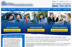 call-to-action (CTA) buttons provide direct value, which is a good practice to follow. Many consumers looking for a quote to compare to others don’t want to wait, and they’ll find high value in an instant quote.
This would have been a great way to show the value of the click and the value of the rest of the quote process if the website carried through with the promise.
However, because the quote is anything but instant, customers now have incorrect and misleading expectations.
The button could leave out the word “instant” and still follow through. This leaves out the required phone call to receive the quote, which could cause some visitors to feel misled.
You want to use as much real value as you can to entice the click. So, if the company wanted to accurately set up customers’ expectation and earn the click, it might use call-to-action copy such as “Request a Quote” or “Learn How to Get a Quote.”
Step #3. Be clear in your headlines
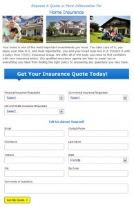 Looking at the landing page to the left, where do your eyes immediately go? Mine go the attention-grabbing blue bar. The bold color and large text start visitors’ eye-path almost halfway down the page.
I see “Get Your Insurance Quote Today!” before anything else … including the real headline that says I’m only using this form to request a quote.
More emphasis should be placed on the top headline, as it gives the best indication of what value this form has. After all, if I submit this quote at 11:00 p.m., am I really going to receive the quote today? Or what about anytime on Sunday? Will a representative contact me then?
You don’t want to try to persuade visitors with fancy words or false promises. Instead, you want to be as clear as possible, and the headline is the first place on the actual landing page where you can do that.
As Flint McGlaughlin, Managing Director, MECLABS, says, “Clarity trumps persuasion.”
Step #4. Provide deeper details with copy prior to form
The paragraph hints at the value of the form: Qualified insurance agents can assist you with anything you need. However, it could better voice why visitors should fill out the form, as well as what they should expect afterwards.
If they’ve already done any insurance shopping, visitors can conclude a quote will not result from the displayed form fields. So, you need to mitigate the anxiety potential customers will feel at handing over personal information with not much hope of getting what they want.
Again, clarity will win. Explain exactly what benefits they’ll gain from filling out your form. Will they receive a free report? A personalized email newsletter? A sales pitch? Plus, make sure visitors know how they will be receiving those benefits. A subsequent webpage? An email? A phone call?
Step #5. Cement expectations with the landing page’s call-to-action
The call-to-action under your form is the last place you can set your customers’ expectations before they submit their information. Like Step #1, you want to make sure value is implied in your call-to-action copy.
Call-to-action copy for forms like “Submit,” “Click Here” and “Register” don’t imply any value. All the customer knows is their form will go to some unknown place and some unknown thing will happen at some unknown time. Basically, the customer is left not knowing a whole lot with CTAs like that.
Here are some examples of how to infuse value into common, generic CTAs:
Get Free Access instead of Register
Get Your Free Consultation instead of Submit
Request More Information instead of Click Here
With value in your CTA, the focus is no longer on the act of clicking the button, but on the value or benefit they will receive from clicking the button.
But remember, you want to accurately set the expectation. In the case of the example, the form’s CTA should have said, “Request My Quote,” as I wasn’t actually getting the quote by clicking the button.
Step #6. Meet expectations
The last step is pretty simple: Meet the expectations that you have already set. Failing to meet expectations can confuse customers or even anger them, leaving such a bad taste in their mouth they don’t bother to open your email or return your voicemail.
However, if you followed steps #1 through #5, then this step should be a breeze. That’s the beauty of beginning with a certain objective in mind: You paved yourself an easy path to follow.
Let’s look one last time at our insurance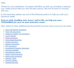 company example. If they had used this thank-you page as a starting point, then the other steps – the homepage CTA, the landing page headline, the copy and the form CTA – should have all accurately set expectations that would have been met on this page. From this page, I have a much clearer expectation of what is to come. However, it’s come much too late in the process. Many potential customers may have never clicked that “Get My Quote” button because of the inconsistency and misleading elements they had already encountered.
Related Resources:
Lead Gen Summit 2013 in San Francisco – Call for speakers
Form Field Optimization: 3 optimization opportunities from a real-world form field page
Lead Gen Form Optimization: Why a lower conversion rate can be a good thing
Lead Generation Test: How adding urgency increased conversion rate by 6%



Great tips on the importance of congruence, Selena. Love the Roy Williams quote, too. It’s so easy to get lost in the process and forget the importance of keeping the customer’s experience and thought patterns and expectations in mind. Thanks for breaking these steps down so clearly. Makes a lot of sense
Great post, Selena. Love your story about the instant quote. I can think of one more step. Don’t bamboozle customers. You might not gain their trust.
Great article. I think it is important to let customers know what to expect (reduce click fear) and let them know its not an instant quote website. Majority of insurance websites out there are lead generations websites that sell the customer’s information to 20 agents. The websites falsely lead the customer to believe they will fill out a few pages and receive an instant indication. Instead they get “someone will contact you”. This creates anger with the customer because they feel they have been duped and then they start to receive phone calls from agents who purchased the information. The relationship really begins on the road of mistrust.
I tried to reduce “click fear” on my insurance agency website with 6 bullet points “What is going to happen when I click “Request a Quote”. I also changed my button from “Get Quote” to “Request a Quote”.
Its all an ongoing experiment