We examine research findings to discover which ads perform better, those that “stand out” from host site content or those that “blend in”.
EDITOR’S NOTE: This Research Brief was also presented as a live Web clinic. You can download the full clinic recording at:
How Matching Ad Design to Context Improved Conversion by 127%
Content (contextual) advertising has become a staple of paid search advertising. In fact, in 2006 marketers spent an estimated $2.5B on content ads.
But what do we know about how to create the best ads?
In this brief we will share our findings and help you make the most of your contextual advertising efforts.
Advertising that blended in and looked like a “native” site content performed significantly better than ads that stood out from the rest of the page.
We conducted three tests with ads that stood out from surrounding content against those that blended in.
Test #1 (WebProNews)
On two separate occasions we ran an ad that stood out from the host page:
Here is the ad:

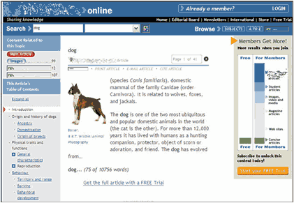
Here is the context:

Here are the results:
| Test #1 Ad Performance | |
|---|---|
| Ad | Click Through Rate |
| Send 1 | 0.34% |
| Send 2 | 0.24% |
What you need to understand: On both sends, this ad yielded unremarkable clickthrough rates and only one conversion
Test #2 (Emarketer)
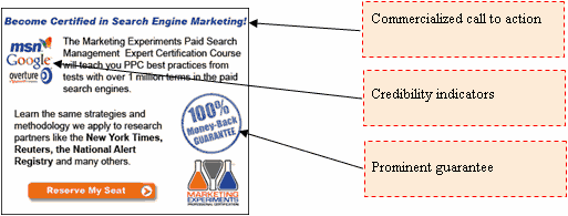
We ran three ads on this site. The first stood out from the content in both size and content type:
Here is the first ad:

The text stood out from the host page in size and color scheme. The logo loomed large.
The second ad stood out in color scheme and copy style:

The logo, font style, title copy, and colors stood out from the rest of the page content.
The third, while not “disguised” as anything other than sponsored content, still much more closely resembled the site’s native content in font size, copy style, and color scheme:

The headline colors of the ad matched those of the primary site content. The logo was comparatively small, and title copy did not scream “advertisement.”
Here are the results:
| Test #2 Ad Performance | |
|---|---|
| Ad | Click Through Rate |
| Ad-1 — (Standout) | .27% |
| Ad-2 — (Standout) | .17% |
| Ad-3 — (“Native” – Looking) | .32% |
What you need to understand: The click through rate for Ad 3 was 88% higher than Ad 2, and 19% higher than Ad 1.
Test #3
We tested two offer links on this site. The first was a button that stood out from the primary content; the second was a text link that matched the native page content in font style, size, and color scheme.
Here is the one that stood out:

The ad link is green whereas the native color scheme is blue and gray.
The button text font size and style are different from the rest of the text on the page.
The button stands out from the content.
And here is the one that blended in:

The text is blue and underlined—consistent with the standard style conventions for the site.
The link is text-only.
Results
| Test #3 Ad Performance | |
|---|---|
| Ad | Conversion Rate |
| Button (Standout) | .015% |
| Text Link (“Native” – Looking) | .034% |
What you need to understand: The link that was text only and appeared more native to the page had a 127% better conversion rate than the image button that stood out from the native content.
In these cases, contextual ads and offer links that appeared “native” to the page performed significantly better that those that stood out from the site’s own native content.
One likely factor is a variation of banner blindness. We are so inundated with ads and offers on virtually every page we view that “non-native” elements are (almost subconsciously) assumed to be advertisements that are irrelevant to our primary objective for visiting the site.
How can I apply these findings?
To receive higher clickthrough rates for your contextual ads, you should test making the text in your ad match the size and colors of the host site’s native content. Company logos and offer elements should be small enough not to shout “advertisement” so loudly as to be blocked by the subconscious “ad filters” of content site visitors.
In order to discover what type of ad is most effective for your particular content seekers, we suggest you test multiple variations of ads that appear “native” to the page against those that stand out.
As part of our research, we have prepared a review of the best Internet resources on this topic.
Rating System
These sites were rated for usefulness and clarity, but alas, the rating is purely subjective.
* = Decent | ** = Good | *** = Excellent | **** = Indispensable
- Contextual Text Ads: The Next Big Thing? ***
- Writing Effective Ad Copy for Your Paid Search Campaigns ***
- Maximizing Paid Search Results ***
- 8 Tips for Maximizing Contextual Advertising Revenues ***
- 7 Advanced Steps to Effective Search Marketing ***
- Writing Effective Search Engine Ads ***
- Learning Google’s Advertising Tools ***
- Mastering Google AdWords Marketing: Contextual Advertising – Part 1 ***
- Top 12 Tips to Writing Effective Google AdWords Select Ads **
Credits:
Editor — Frank Green
Writer — Adam Lapp
Contributors — Flint McGlaughlin
Bob Kemper
Allison Phillips
Jimmy Ellis
HTML Designer — Cliff Rainer


