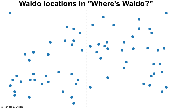
What can “Where’s Waldo?”, the lovable children’s book series of the ‘90s, teach us about designing better page layouts?
A lot, it turns out.
In UX, we use different page layouts to help organize information and guide the users’ eye path. The “F” pattern, for instance, is commonly used for article heavy sites to guide the users’ eye path downward while supporting headline scanning. Reddit, Google News and Buzzfeed all use the “F” pattern layout.
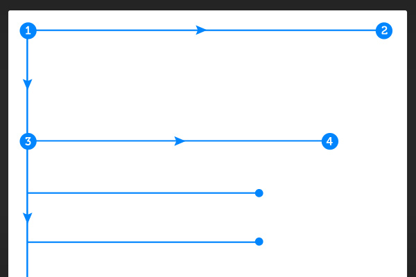
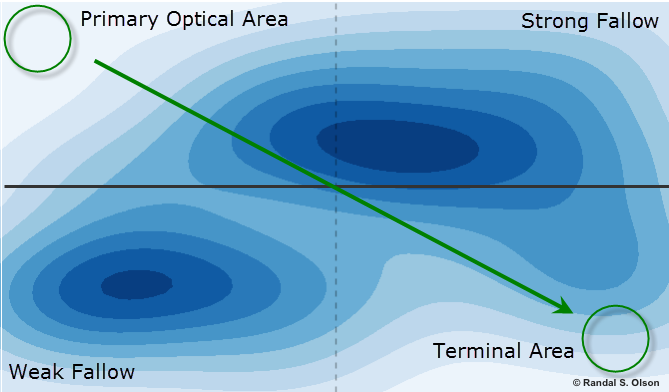
One of the earliest layout patterns, and the one still most commonly used today, is the Gutenberg diagram. Originally conceived in the ‘50s by Edmond C. Arnold to help organize newspaper layouts, the Gutenberg diagram breaks the page down into quadrants and explains how the user interacts visually with each quadrant. In the diagram, the primary optical area is the upper left quadrant where the eye path naturally begins.
The lower right quadrant, the terminal area, is where the eye path ends. Gravity pulls the eyes diagonally between the two quadrants leaving the upper right and lower left quadrants largely out of the eye path.
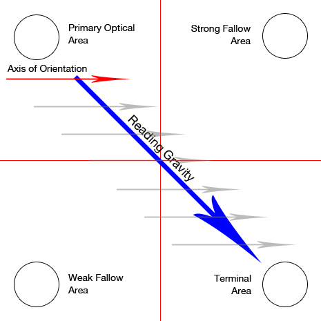
While it is very western centric, the Gutenberg diagram makes sense. We read top to bottom, left to right, so our eyes are naturally drawn to the upper left of a page when first looking at it. As we scan the page, our eyes end up at the bottom right of the page.
We’re taught to follow this general eye path as soon as we learn to read. Even today, we utilize this pattern when designing web pages because it leverages our tendencies to follow that eye path. It’s rare to find a web site where the company logo isn’t in the upper left corner.
So what does this have to do with Waldo?
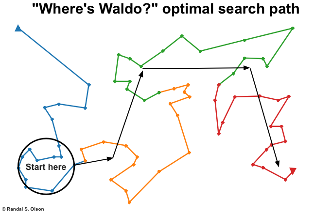
Randy Olson recently published an article on how to find Waldo in under 10 seconds (and trust me, it works.) Olson mapped all of the points where Waldo was hiding in the seven main Where’s Waldo books. Then he ran those points through an algorithm that found the optimal eye path to use to spot Waldo quickly. As part of his research, Olson created a kernel density estimate to illustrate where Waldo is most commonly hiding.
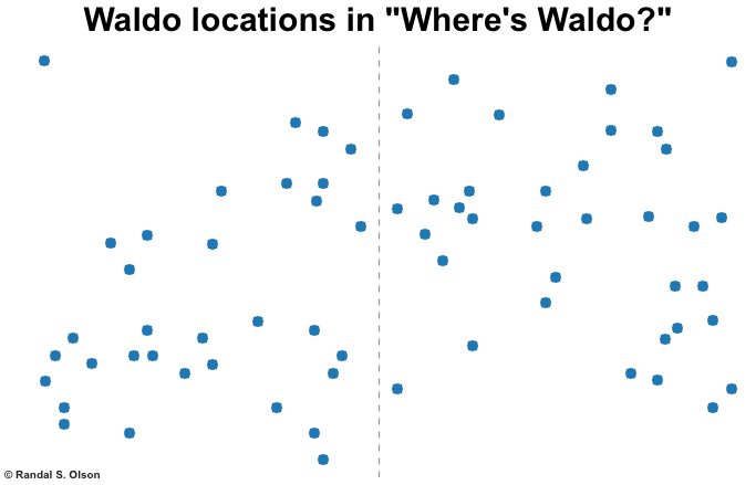

When you overlay the Gutenberg diagram and Olson’s kernel density estimate, something interesting becomes apparent; the highest density of Waldo’s hiding spots fall within the least viewed quadrants of the page. Waldo is most commonly hiding in the areas our eyes are trained to avoid. In fact, 70% of the time, he’s in the upper right or bottom left quadrants of the page.
What does this teach us about designing page layouts?
If you’re designing a page and want the most important elements to pop out at your visitors, don’t put those elements where Waldo would be hiding.
Use the primary optical area and the terminal area as your main points of reference for important information.
And always remember that no matter what you do, we don’t optimize web pages, we optimize thought sequences. Guide your visitor through a thoughtful conversation. Eye path and page layouts are simply tools to help you do that. But don’t forget that they are simply means, not ends.
Bonus: In case you read this whole thing JUST to find out how to find Waldo in under 10 seconds, 80% of the time, Olson’s optimized eye path to find Waldo is below. Happy hunting.
You might also like:
Prominence: Design and layout lessons from Windows 8
This Just Tested: What is the optimal layout of a product page?
Homepage Testing: 91% conversion lift from new copy and layout


