Marketing Multiple Products: How radical thinking about a multi-product offer led to a 70% increase in conversion
The following research was first published in the MECLABS Quarterly Research Digest, July 2014.
Many companies — large or small, B2C or B2B, ecommerce or subscription — have more than one product. If you fall into this category, you face a common challenge: finding the best way to market multiple products. You could take a couple of approaches:
- Pack your pages with as many products as possible, hoping that the sheer numbers will pump up conversions
- Slim down to the bare minimum, hoping to focus your prospects’ attention on just one product
Certainly, we can make experienced guesses based on intuition at the effectiveness of these approaches. But at the end of the day, that is not what MECLABS is about — nor you, we expect. We want hard numbers to guide our thinking, not intuition. This led us to an extremely interesting experiment and three key principles to observe when marketing multiple products.
Experiment: Which product presentation would increase revenue?
This experiment, Test Protocol 1903 in the MECLABS Research Library, was conducted on behalf of our Research Partner, an independent manufacturer and distributor of vitamin supplements. Prospects only reached the page we tested after filling out a form and clicking a “Get My [Product] Now!” button. When reaching the page, the question prospects had to answer was not, “Do I want to buy this product?” It was more of, “Which version of this product do I want to purchase?”
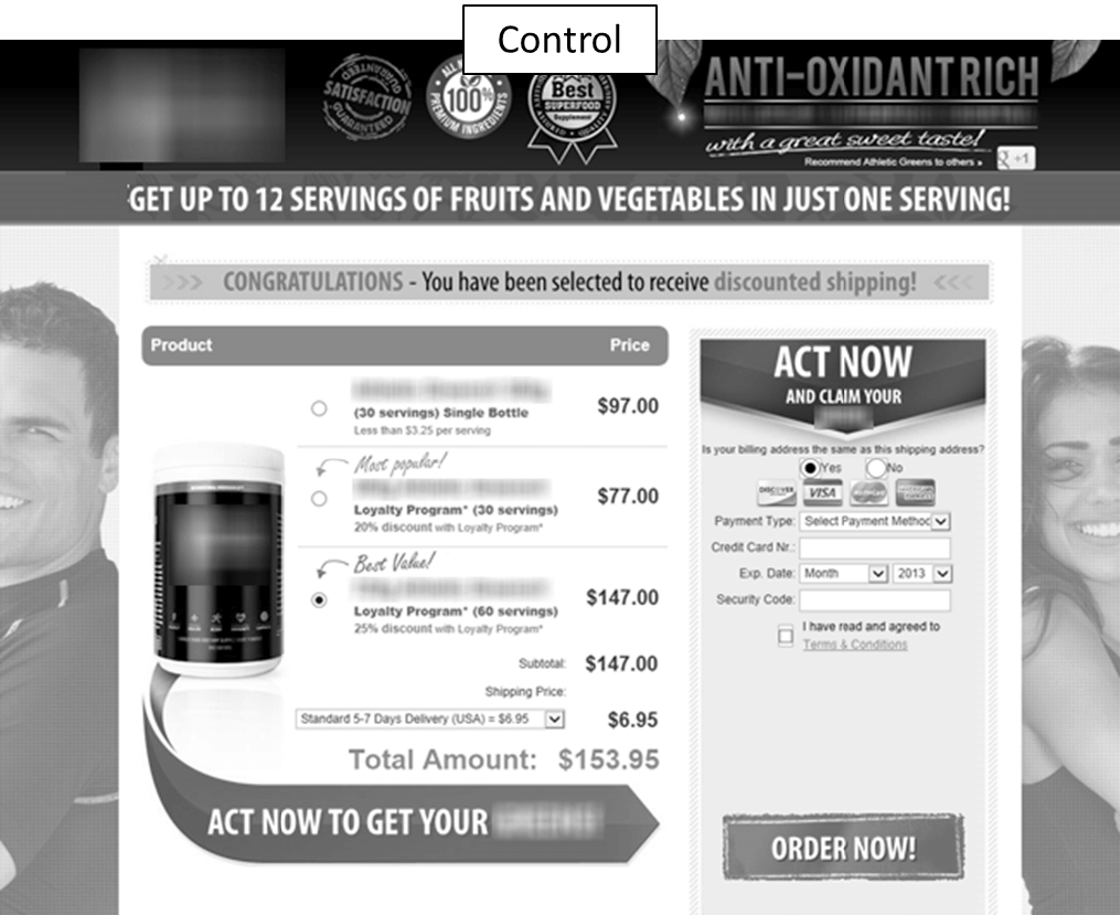
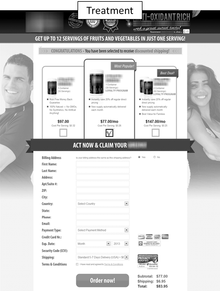
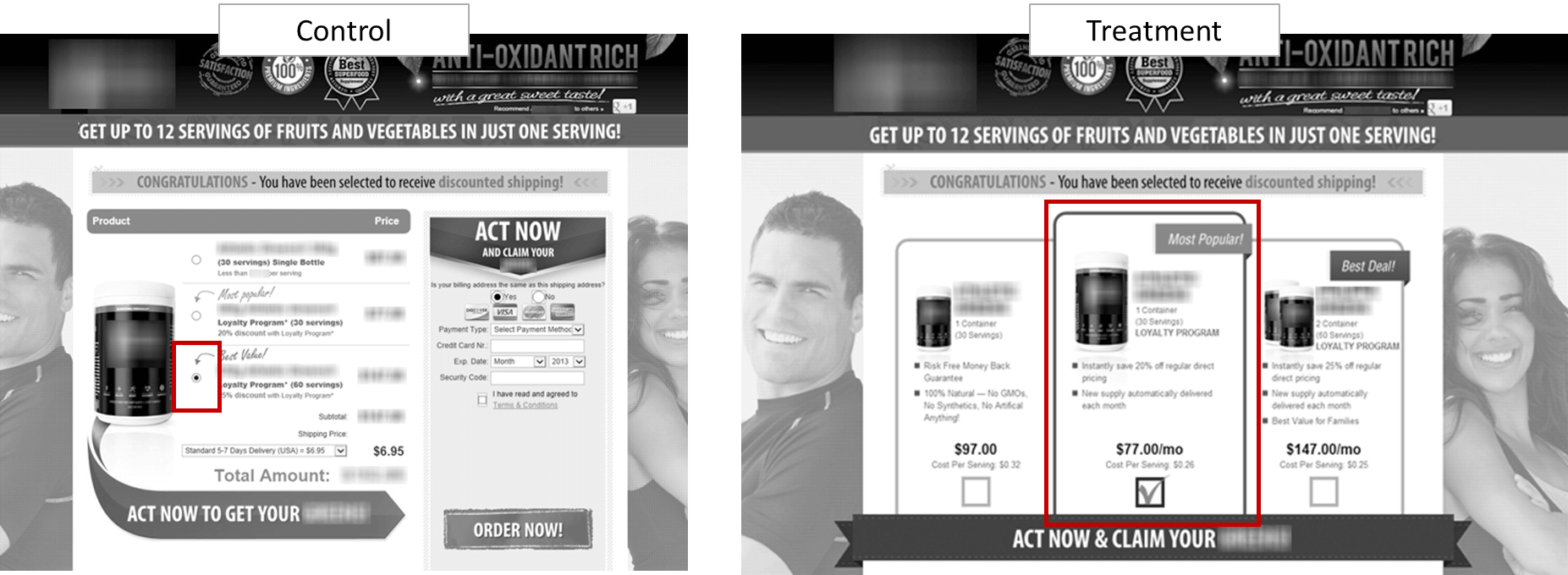
The control page features a standard list format with radio buttons. The “Best Value” option, which is also the most expensive, is pre-checked. The treatment page uses a horizontal matrix that generated lifts in other tests.
Figure 1.1
Figure 1.2
The extensive form beneath the matrix auto-populates, so only the payment information also required on the control page needs to be entered.
Figure 1.3
Figure 1.4
Figure 1.5
Did we see a similar lift in this case? No, the control page outperformed the treatment by 70% in terms of revenue, while conversion changes were insignificant.
Now the ultimate question: Why? A little digging on our part revealed three key principles.
Keys to Marketing Multiple Products
Key Principle #1. People do not buy from product pages; people buy from people. The art of marketing is not conversion; it is conversation.
We’ve covered this idea in many MECLABS Web clinics. The focus of our efforts as marketers cannot be on creating better pages; it must be on creating clearer, more guided conversations.
You want to have a conversation with the customer that allows them to understand the value that is built into the page. The page should be rooted in that value but presented in a thought sequence prospects will understand. By doing so, we’re able to guide them to the action we wish them to take.
Key Principle#2. The goal of a product page is not simply to give prospects more options or products, but to lead them to the “one” option that is most relevant, important and urgent to them.
More options on a single page does not equate to more conversions. We create more conversions by guiding prospects to the best option for them. We do that through the conversations we build on our pages.
Presenting a dozen variations of the same product can be confusing for prospects, especially if there is no product-level value proposition. They may have questions like: Do I want any version of this product? If so, what’s the difference between them all? Which one is right for me?
All this confusion could lead the prospect to leave the page and, ultimately, your website.
We can decrease this confusion and friction by guiding them to the product that best suits them. We’ll learn how to effectively do that through the objectives provided in the next key principle.
Key Principle #3. Therefore, the marketer must use three key objectives when selling multiple products: eliminate, emphasize and express.
Eliminate means to minimize the number of competing choices on your pages as much as possible. Emphasize involves using visual weight to sequence the presentation of products. Lastly, express entails ensuring the product-level value proposition is clearly communicated.
If you can achieve these three objectives, you will have created a conversation that guides a prospect’s thinking and leads them to the best product for them, rather than simply a webpage that presents them with options. In the balance of this article, we will look at how to do this.
Objective #1. Eliminate competing choices
Many times, we unintentionally create too many equally weighted options on a product page. What does this mean? Look at the page depicted in Figure 2.1. On this page, three options make up the sidebar. The marketers hypothesized that they could achieve a lift in conversion by removing the equally weighted choices and simply placing those options in a drop-down box for the user to choose from, as shown in Figure 2.2.
Did it work? Yes, to the tune of a 24% increase in revenue.
Figure 2.1
Figure 2.2
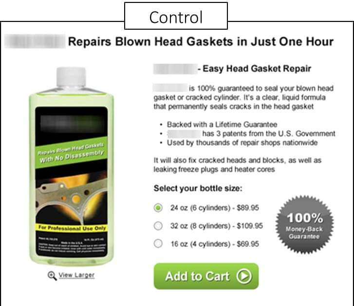
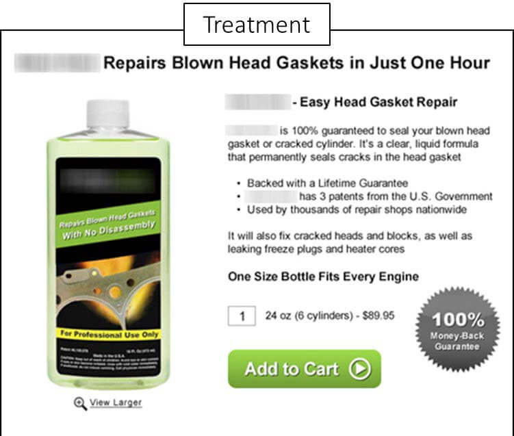
Indeed, by eliminating unnecessary choices, you can increase conversion. However, there is a caveat. It is possible to eliminate too much. In Figure 2.3, you see a page with three size options for a product. We hypothesized that we could increase conversion by simplifying things and just focusing on the most popular size of the product (while eliminating the extra options). That is not how it worked out. Instead, the new page delivered a 35% decrease in conversion.
Figure 2.3
Figure 2.4
Testing new designs is the only way to find out whether you can produce a lift by eliminating competing options, but the research shows in most cases, you can.
To discover whether your pages are good candidates for elimination, ask yourself the following five questions:
- Are the products on my page the ones my customers want?
- Can I visually group my products so they appear as one?
- Can I eliminate one or more competing products?
- Can I segment my traffic in the channel so products are more personalized?
- Is there a gap in my product mix that indicates I have eliminated too much?
Objective #2. Emphasize desired choices
When multiple products or options are necessary, you want to be careful not to make them equally weighted. That can lead to “unsupervised thinking” on the part of the prospect. Rather, you want to guide them to the option that best suits them. In Figure 3.1, the webpage has five options that are equally weighted. There is no guidance. The treatment in Figure 3.2 trims the options down to three, but, more importantly, it also adds emphasis to the option on the right, steering prospects in that direction. The change resulted in a 66% increase in conversions. 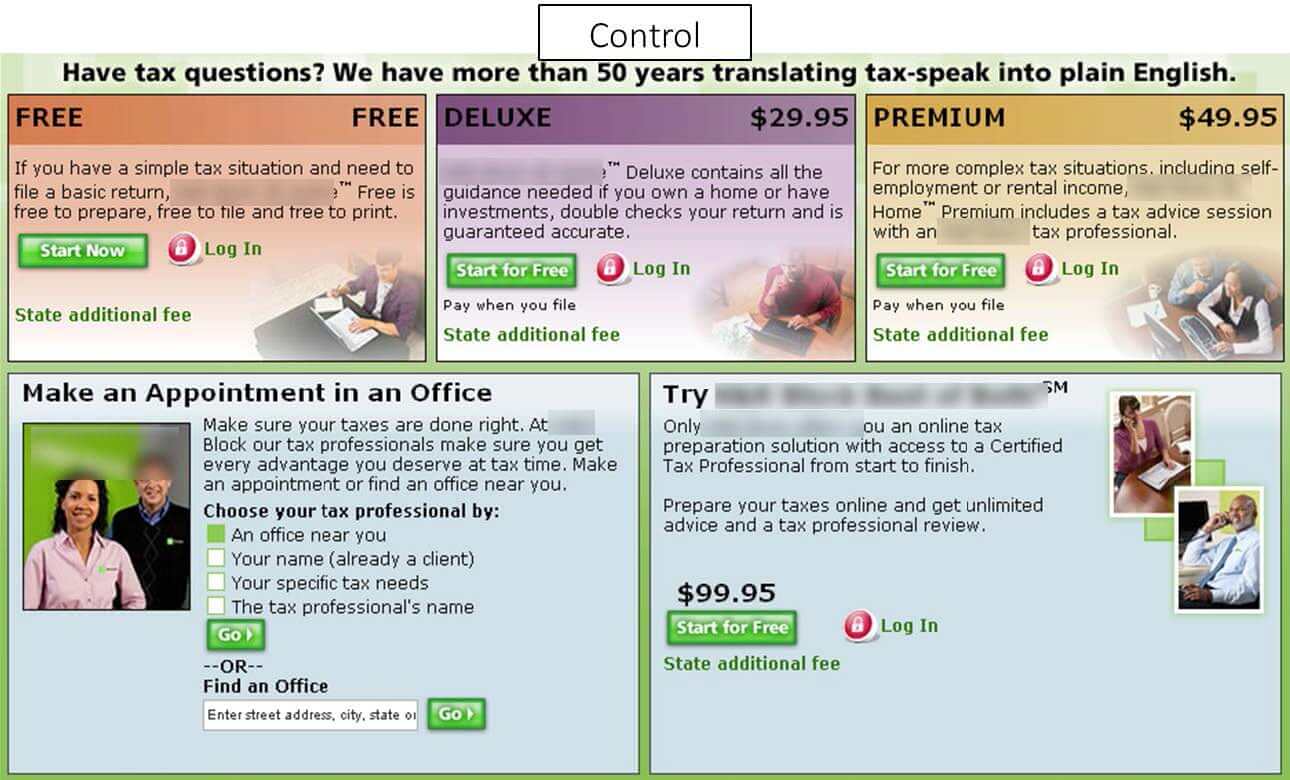
Figure 3.1
If you are not handling emphasis well on your pages, consider the five elements below to get back on track. Of course, test the results.
- Size: How large is the product on the page?
- Shape: Does the shape of the product distinguish it from others?
- Motion: Is there a tasteful way to emphasize the product with motion?
- Color: Does the color of the product distinguish it from others?
- Position: Is the product being emphasized in the main eye-path?
Objective #3. Express product values
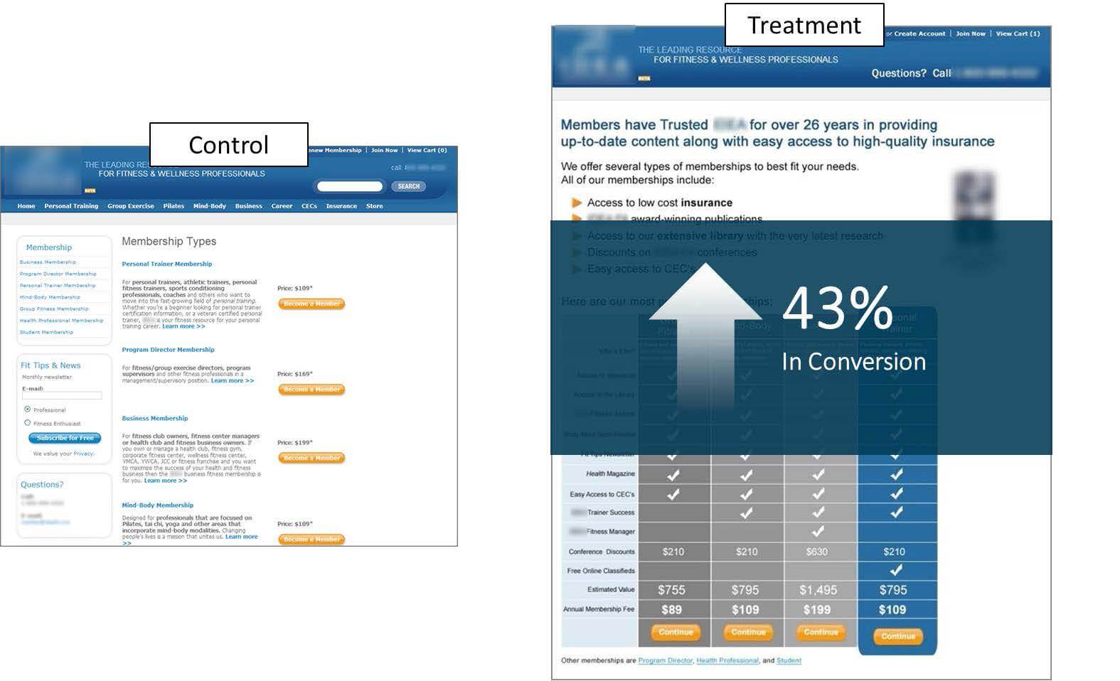
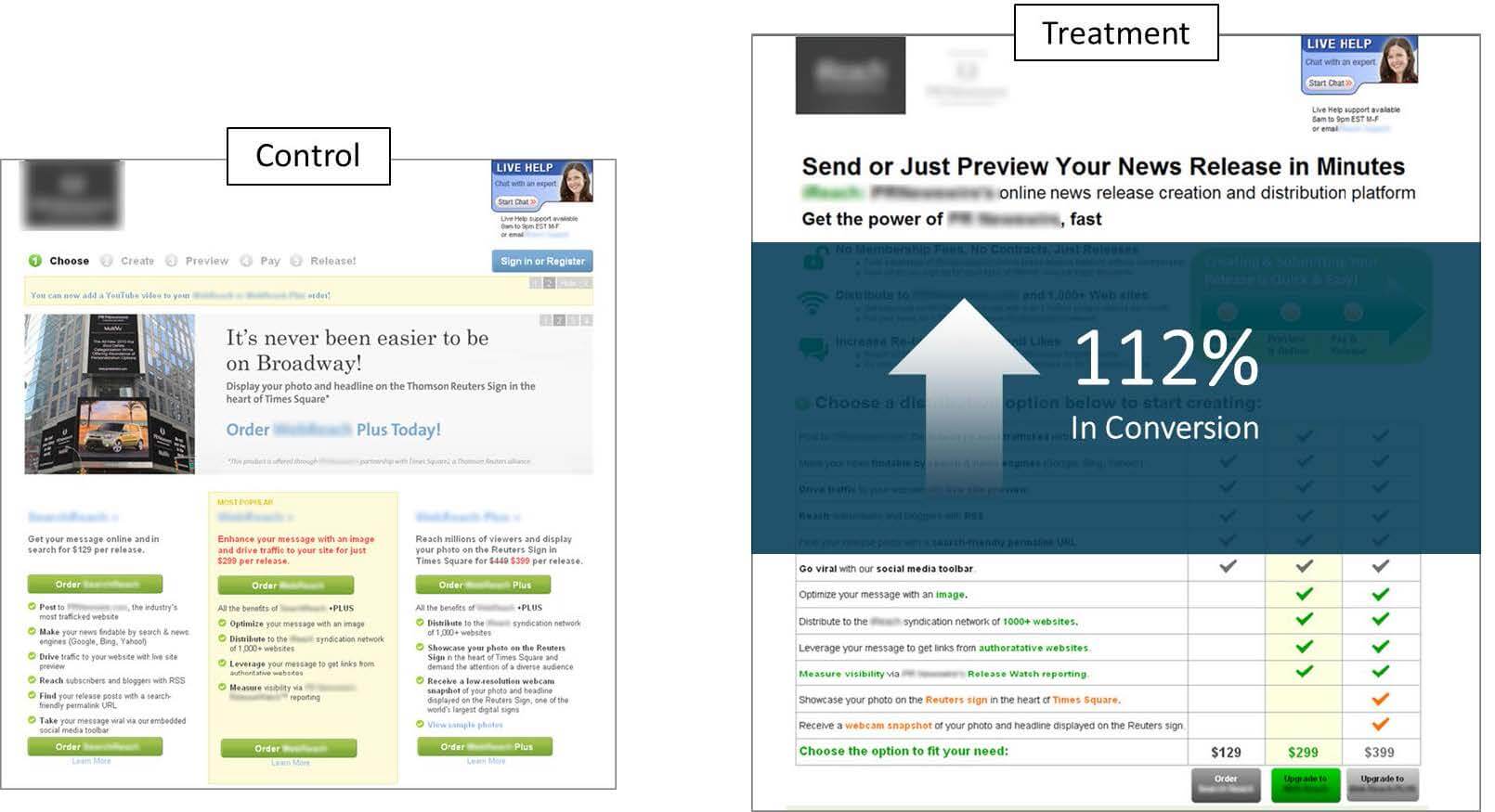
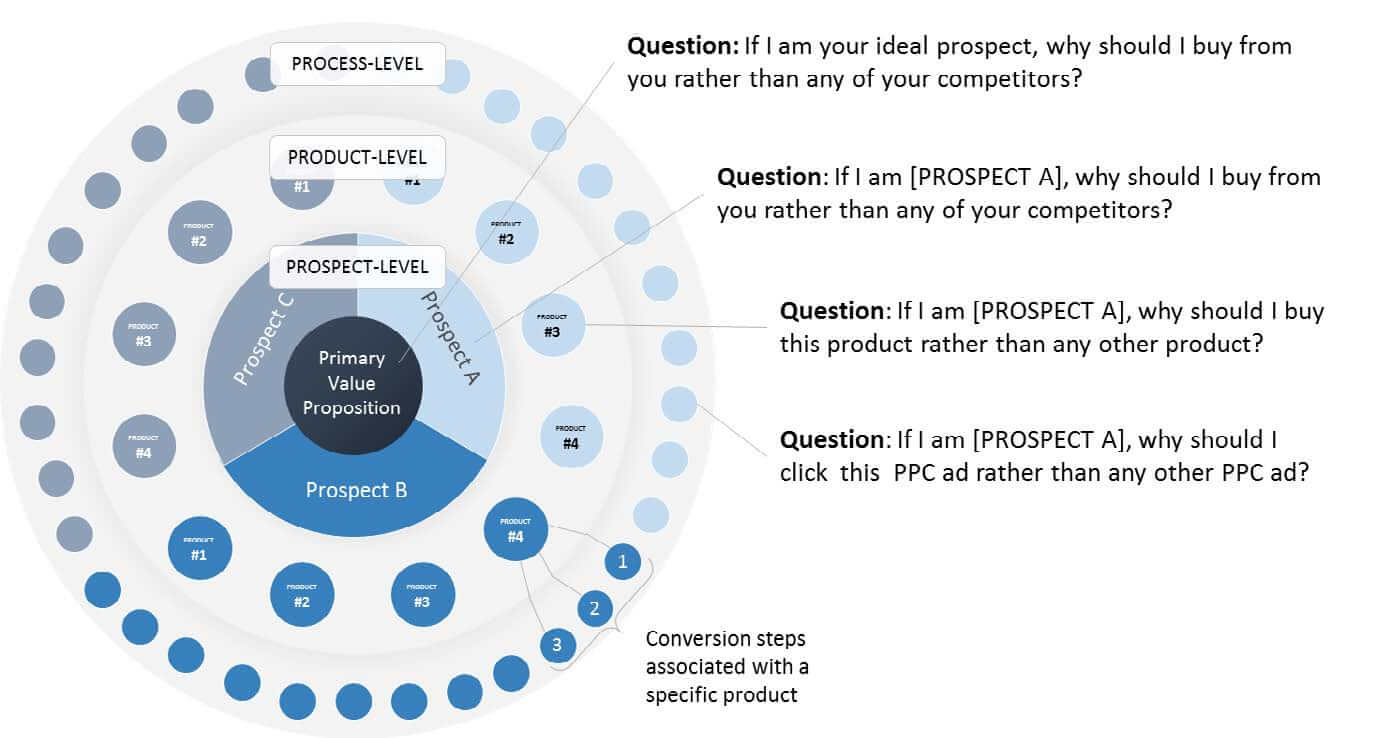
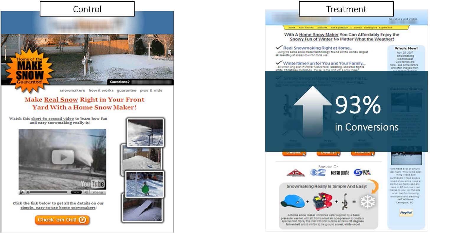
Three levels form a value proposition: process level, product level and prospect level (Figure 4.1). When working with a page consisting of multiple products, it is absolutely critical that the product-level value proposition is crystal clear. That’s the one that explains why a specific product is the best choice in a specific situation. If the product-level value is unclear, prospects will not understand the difference between products or which product best meets their current needs.
Figure 3.2
Figure 4.1 – The Proposition Spectrum
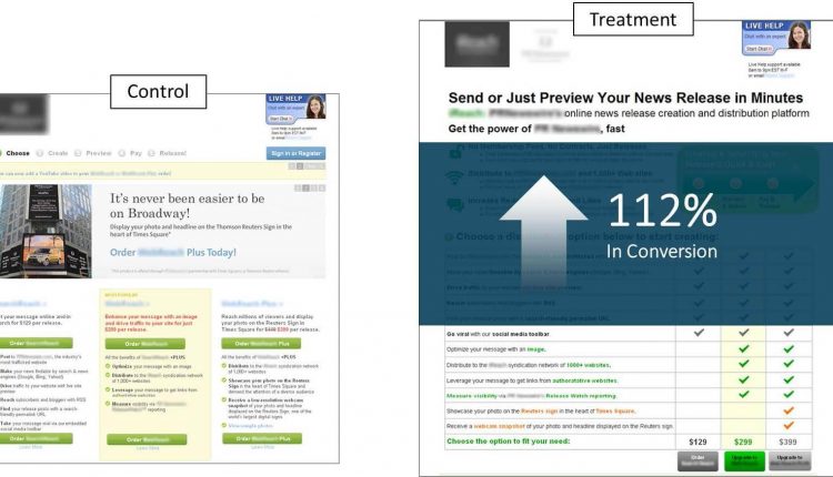
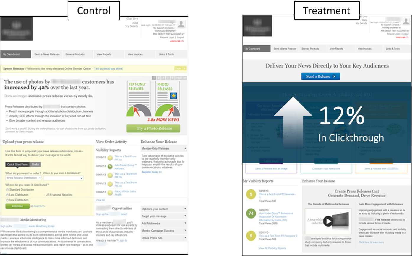
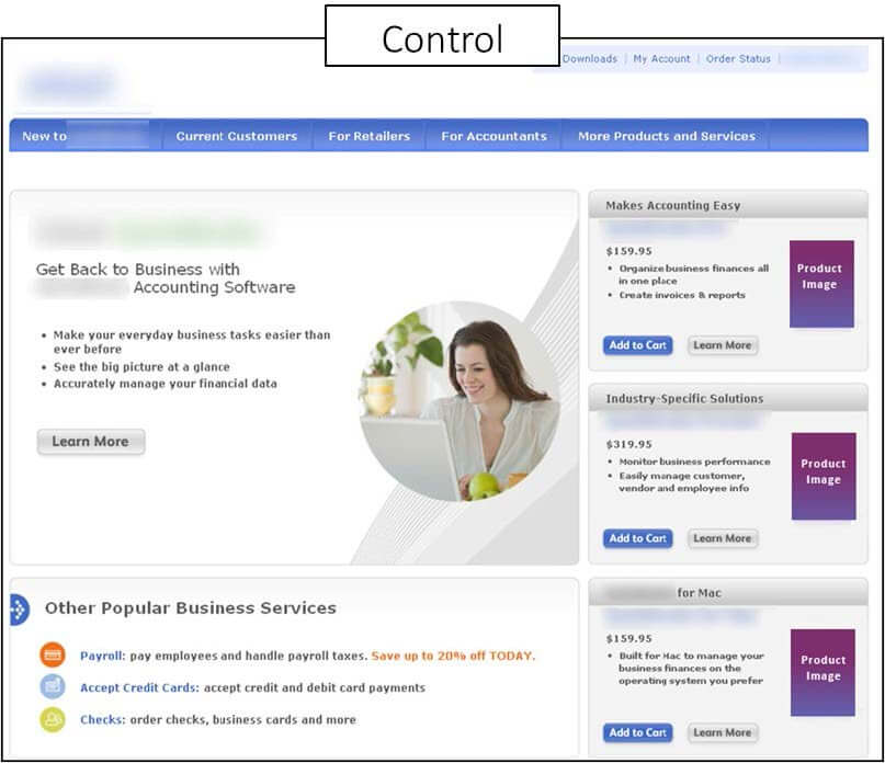
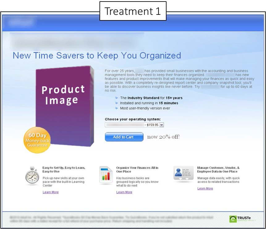
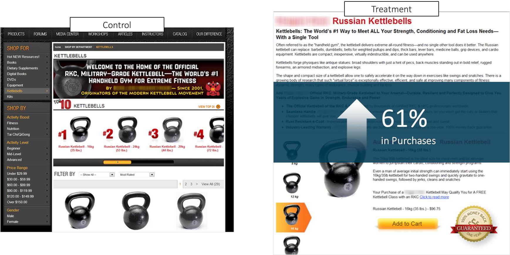
In Figures 4.2 and 4.3, you see the control and treatment pages of a couple recent experiments. The control pages fail to clearly demonstrate the product-level value propositions of the products. The treatments take a more copy-heavy approach, allowing us to really flesh out the specific value propositions for each product. The result was a 61% increase in purchases for the first page and a 93% conversion lift for the second.
Figure 4.2
Figure 4.3
Experiment: How did our treatment meet the three objectives?
Let’s come full circle, back to the experiment that started it all. We wanted to understand why the control page outperformed the treatment that was based on other successful experimentation. Let’s look at how it meets the three objectives outlined previously.
Figure 5.1 and Figure 5.2
Eliminate
We did not eliminate any products from the control to the treatment, so that did not factor into this specific situation.
Emphasize
The control page visually emphasizes the most expensive “best value” version of the product by automatically checking the radio button of that choice. Our treatment, however, visually emphasizes the second “most popular” choice, as noted by the red boxes. This change guided more prospects toward choosing the less expensive option, which explains why conversion was roughly equivalent while revenue significantly decreased.
Express
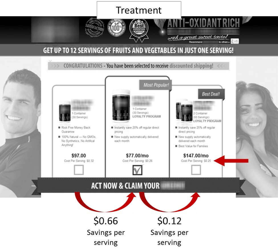
Finally, in the treatment, we added a small “cost per serving” feature to the products. This showed that the “most popular” option produced a $0.66 savings per serving over the cheapest option. However, the “best value” option only produced a $0.12 savings over the middle option.
Figure 5.3
Increasing Conversion on Multiple Product Pages
If you find yourself in the same boat as most marketers (i.e., having to market multiple products), remember these key principles:
First, people do not buy from product pages; people buy from people. The art of marketing is not conversion; it is conversation.
Second, we must understand that our goal is to guide prospects through the multiple products to the “one” option that is most relevant, important and urgent to them.
Third, the marketer must use three key objectives when selling multiple products: eliminate, emphasize and express.
You might also like …
See more experiments in the MECLABS Research Catalog: www.meclabs.com/catalog
See how another Research Partner tested radio buttons and dropdowns against one another
Explore the MarketingExperiments Research Directory to see past clinics
Learn more about product-level value propositions
Download a special report by MarketingExperiments on unsupervised thinking, “No Unsupervised Thinking: How to increase conversion by guiding your audience”
For permissions: research@meclabs.com


